progress.online-video-cutter.com.mp4
LogoProgressBar Library
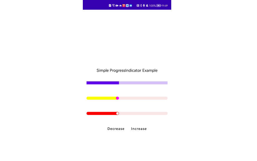
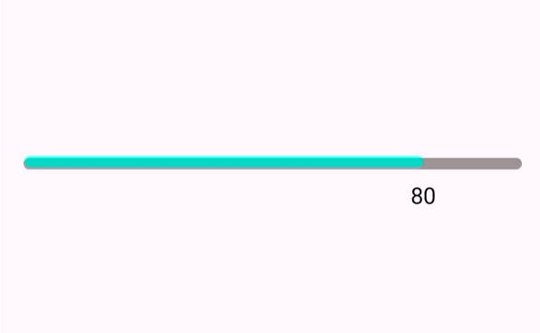
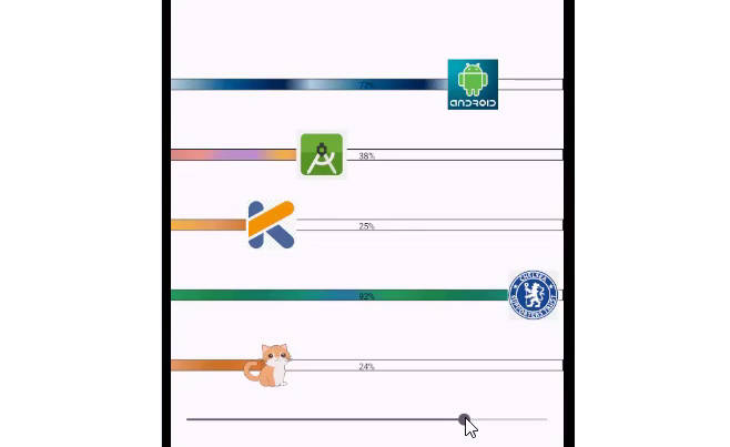
This is a progressbar written in pure Kotlin which can turn any picture to your progressbar pointer or marker. The LogoProgressBar Library is a custom view that displays a progress bar with a customizable color, thickness, marker, and text. The library is written in Kotlin and is compatible with Android API level 26 and higher.
Features
- Set the progress bar color to a single color or a gradient of colors
- Customize the thickness of the progress bar
- Add a marker to the progress bar
- Customize the size and appearance of the marker
- Customize the color and size of the progress bar’s text
- Optionally add a border around the progress bar
Installation
To use the LogoProgressBar library in your Android project, follow these steps:
- Add the following to your project-level
build.gradlefile:
allprojects {
    repositories {
        ...
        maven { url 'https://jitpack.io' }
    }
}
- Add the following to your app-level
build.gradlefile:
dependencies {
    implementation 'com.github.parniyan7:LogoProgressbar:1.0.0'
}
Usage
To use the LogoProgressBar in your Android layout, add the following code:
<com.parniyan.logoprogressbar.ProgressBarView
android:id="@+id/progressBarView"
android:layout_width="match_parent"
android:layout_height="wrap_content"
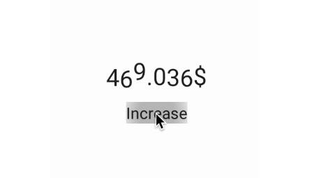
app:progress="50"
app:progressColor="#FF0000"
app:progressThickness="20dp"
app:textColor="#000000"
app:textSize="16sp"
app:borderSize="2dp"
app:borderColor="#000000"
app:markerDrawable="@drawable/ic_marker"
app:markerSize="40dp"
app:progressColors="@array/progress_colors"/>
Then, in your activity or fragment, you can access the view and customize it as follows:
val progressBarView = findViewById<ProgressBarView>(R.id.progressBarView)
progressBarView.setProgress(50f)
progressBarView.setProgressColor(Color.RED)
progressBarView.setProgressColorPalette(resources.getIntArray(R.array.progress_colors))
progressBarView.setProgressBarThickness(20f)
progressBarView.setMarkerDrawable(ContextCompat.getDrawable(this, R.drawable.ic_marker))
progressBarView.setMarkerSize(40f)
progressBarView.setTextColor(Color.BLACK)
progressBarView.setTextSize(16f)
progressBarView.setBorderSize(2f)
progressBarView.setBorderColor(Color.BLACK)
Customization
The LogoProgressBar can be customized using the following attributes:
| Attribute | Description |
|---|---|
progress |
The progress value of the progress bar, ranging from 0 to 100. |
progressColor |
The color of the progress bar. |
progressThickness |
The thickness of the progress bar, in pixels. |
progressColors |
An array of colors to use for the progress bar, creating a gradient effect. |
markerDrawable |
The drawable to use for the marker on the progress bar. |
markerSize |
The size of the marker on the progress bar, in pixels. |
textColor |
The color of the text that shows the progress value on the progress bar. |
textSize |
The size of the text that shows the progress value on the progress bar, in pixels. |
borderSize |
The thickness of the border around the progress bar, in pixels. |
borderColor |
The color of the border around the progress bar. |
useRainBowColor |
Whether to use a rainbow gradient for the progress bar. If true, the progressColors attribute is ignored. |