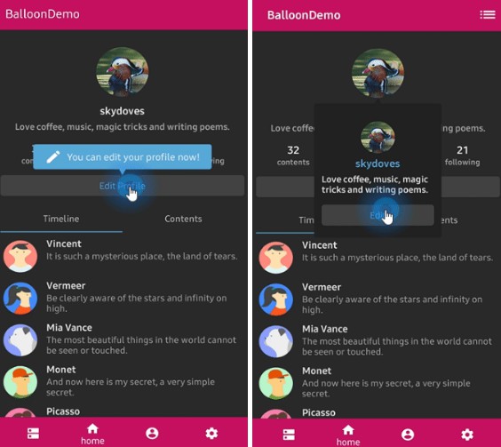
Balloon

A lightweight popup like tooltips, fully customizable with arrow and animations.

Balloonz

Balloonx

Gradle

Add below codes to your root build.gradle file (not your module build.gradle file).

allprojects {
    repositories {
        jcenter()
    }
}

And add a dependency code to your module's build.gradle file.

dependencies {
    implementation "com.github.skydoves:balloon:1.0.0"
}

Usage

Basic Example

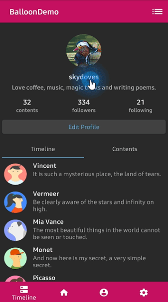
Here is a basic example of implementing balloon popup with icon and text using Balloon.Builder class.

Balloon balloon = Balloon.Builder(baseContext)
    .setArrowSize(10)
    .setArrowOrientation(ArrowOrientation.TOP)
    .setArrowVisible(true)
    .setWidthRatio(1.0f)
    .setHeight(65)
    .setTextSize(15f)
    .setArrowPosition(0.62f)
    .setCornerRadius(4f)
    .setAlpha(0.9f)
    .setText("You can access your profile from on now.")
    .setTextColor(ContextCompat.getColor(baseContext, R.color.white_93))
    .setIconDrawable(ContextCompat.getDrawable(baseContext, R.drawable.ic_profile))
    .setBackgroundColor(ContextCompat.getColor(baseContext, R.color.colorPrimary))
    .setOnBalloonClickListener(onBalloonClickListener)
    .setBalloonAnimation(BalloonAnimation.FADE)
    .setLifecycleOwner(lifecycleOwner)
    .build();

Create using kotlin dsl

This is how to create Balloon instance using kotlin dsl.

val balloon = createBalloon(baseContext) {
  arrowSize = 10
  widthRatio = 1.0f
  height = 65
  arrowPosition = 0.7f
  cornerRadius = 4f
  alpha = 0.9f
  textSize = 15f
  text = "You can access your profile from on now."   
  textColor = ContextCompat.getColor(baseContext, R.color.white_93)
  iconDrawable = ContextCompat.getDrawable(baseContext, R.drawable.ic_profile)
  backgroundColor = ContextCompat.getColor(baseContext, R.color.colorPrimary)
  onBalloonClickListener = balloonClickListener
  balloonAnimation = BalloonAnimation.FADE
  lifecycleOwner = lifecycle
}

Show and dismiss

This is how to show balloon popup and dismiss.

balloon.show(anchor: View) // shows the balloon on the center of an anchor view.
balloon.show(anchor: View, xOff: Int, yOff: Int) // shows the balloon on an anchor view with x-off and y-off.
balloon.showAlignTop(anchor: View) // shows the balloon on an anchor view as the top alignment.
balloon.showAlignTop(anchor: View, xOff: Int, yOff: Int) // shows top alignment with x-off and y-off.
balloon.showAlignBottom(anchor: View) // shows the balloon on an anchor view as the bottom alignment.
balloon.showAlignBottom(anchor: View, xOff: Int, yOff: Int) // shows bottom alignment with x-off and y-off.
balloon.showAlignRight(anchor: View) // shows the balloon on an anchor view as the right alignment.
balloon.showAlignRight(anchor: View, xOff: Int, yOff: Int) // shows right alignment with x-off and y-off.
balloon.showAlignLeft(anchor: View) // shows the balloon on an anchor view as the left alignment.
balloon.showAlignLeft(anchor: View, xOff: Int, yOff: Int) // shows left alignment with x-off and y-off.

Or you can show balloon popup using kotlin extension.
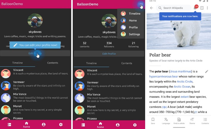
myButtom.showAlignTop(balloon)

Arrow Composition

We can customize the arrow on the balloon popup.

.setArrowVisible(true) // sets the visibility of the arrow.
.setArrowSize(10) // sets the arrow size.
.setArrowPosition(0.8f) // sets the arrow position using the popup size's ratio (0 ~ 1.0)
.setArrowOrientation(ArrowOrientation.TOP) // sets the arrow orientation. top, bottom, left, right
.setArrowDrawable(ContextCompat.getDrawable(baseContext, R.drawable.arrow)) // sets the arrow drawable.

Below previews are implemented using setArrowOrientation and setArrowPosition methods.

setArrowPosition measures the balloon popup size and sets the arrow's position using the ratio value.

Orientation: BOTTOM
Position: 0.62
showAlignTop
Orientation: TOP
Position : 0.5
showAlignBottom
Orientation: LEFT
Position: 0.5
showAlignRight
Orientation: RIGHT
Position: 0.5
showAlignLeft

Text Composition

We can customize the text on the balloon popup.

.setText("You can edit your profile now!")
.setTextSize(15f)
.setTextTypeface(Typeface.BOLD)
.setTextColor(ContextCompat.getColor(baseContext, R.color.white_87))

TextForm

TextFrom is an attribute class that has some attributes about TextView for customizing popup text.

TextForm textForm = TextForm.Builder(context)
    .setText("This is a TextForm")
    .setTextColor(R.color.colorPrimary)
    .setTextSize(14f)
    .setTextTypeFace(Typeface.BOLD)
    .build();

builder.setTextForm(textForm);

This is how to create TextForm using kotlin dsl.

val form = textForm(context) {
  text = "This is a TextForm"
  textColor = ContextCompat.getColor(baseContext, com.skydoves.balloondemo.R.color.white_87)
  textSize = 14f
  textTypeface = Typeface.BOLD
}

Icon Composition

We can customize the icon on the balloon popup.

.setIconSpace(10) // sets right margin of the icon.
.setIconSize(20) // sets size of the icon.
.setIconDrawable(ContextCompat.getDrawable(baseContext, R.drawable.ic_edit)) // sets a drawable resource. 

IconForm

IconForm is an attribute class that has some attributes about ImageView for customizing popup icon.

IconForm.Builder(context)
  .setDrawable(ContextCompat.getDrawable(baseContext, R.drawable.arrow))
  .setIconColor(ContextCompat.getColor(baseContext, R.color.skyblue))
  .setIconSize(20)
  .setIconSpace(12)
  .build()
  
builder.setIconForm(textForm);

This is how to create IconForm using kotlin dsl.

val form = iconForm(context) {
  drawable = ContextCompat.getDrawable(baseContext, R.drawable.arrow)
  iconColor = ContextCompat.getColor(baseContext, R.color.skyblue)
  iconSize = 20
  iconSpace = 12
}

OnBalloonClickListener, OnBalloonDismissListener

We can listen to the balloon popup is clicked or dismissed using listeners.

balloon.setOnBalloonClickListener(new OnBalloonClickListener() {
  @Override
  public void onBalloonClick() {
    // doSomething;
  }
});
    
balloon.setOnBalloonDismissListener(new OnBalloonDismissListener() {
  @Override
  public void onBalloonDismiss() {
    // doSomething;
  }
});

We can simplify it using kotlin.

.setOnBalloonClickListener { Toast.makeText(baseContext, "clicked", Toast.LENGTH_SHORT).show() }
.setOnBalloonDismissListener { Toast.makeText(baseContext, "dismissed", Toast.LENGTH_SHORT).show() }

Customized layout

We can fully customize the ballloon layout using below method.

.setLayout(R.layout.my_ballon_layout)

This is an example of implementing custom balloon popup.

Firstly create an xml layout file like layout_custom_profile on your taste.

val balloon = Balloon.Builder(baseContext)
      .setLayout(R.layout.layout_custom_profile)
      .setArrowSize(10)
      .setArrowOrientation(ArrowOrientation.TOP)
      .setArrowPosition(0.5f)
      .setWidthRatio(0.55f)
      .setHeight(250)
      .setCornerRadius(4f)
      .setBackgroundColor(ContextCompat.getColor(baseContext, R.color.background900))
      .setBalloonAnimation(BalloonAnimation.CIRCULAR)
      .setLifecycleOwner(lifecycleOwner)
      .build()

And next we can get the inflated custom layout using getContentView method.

val button: Button = 
  balloon.getContentView().findViewById(R.id.button_edit)
button.setOnClickListener {
  Toast.makeText(baseContext, "Edit", Toast.LENGTH_SHORT).show()
  balloon.dismiss()
}

Preference

If you want to show-up the balloon popup only once or a specific number of times, here is how to implement it simply.

.setPreferenceName("MyBalloon") // sets preference name of the Balloon.
.setShowTime(3) // show-up three of times the popup. the default value is 1.

But you can implement it more variously using Only.

only("introPopup", times = 3) {
  onDo { balloon.showAlignTop(anchor) }
}

Avoid Memory leak

Dialog, PopupWindow and etc.. have memory leak issue if not dismissed before activity or fragment are destroyed.

But Lifecycles are now integrated with the Support Library since Architecture Components 1.0 Stable released.

So we can solve the memory leak issue so easily.

Just use setLifecycleOwner method. Then dismiss method will be called automatically before activity or fragment would be destroyed.

.setLifecycleOwner(lifecycleOwner)

Balloon builder methods

.setWidth(value: Int)
.setWidthRatio(@FloatRange(from = 0.0, to = 1.0) value: Float)
.setHeight(value: Int)
.setSpace(value: Int)
.setArrowVisible(value: Boolean)
.setArrowSize(value: Int)
.setArrowPosition(@FloatRange(from = 0.0, to = 1.0) value: Float)
.setArrowOrientation(value: ArrowOrientation)
.setArrowDrawable(value: Drawable?)
.setBackgroundColor(value: Int)
.setBackgroundDrawable(value: Drawable?)
.setCornerRadius(value: Float)
.setText(value: String)
.setTextColor(value: Int)
.setTextSize(value: Float)
.setTextTypeface(value: Int)
.setTextForm(value: TextForm)
.setIconDrawable(value: Drawable?)
.setIconSize(value: Int)
.setIconSpace(value: Int)
.setIconForm(value: IconForm)
.setAlpha(@FloatRange(from = 0.0, to = 1.0) value: Float)
.setLayout(@LayoutRes layout: Int)
.setLifecycleOwner(value: LifecycleOwner)
.setBalloonAnimation(value: BalloonAnimation)
.setOnBalloonClickListener(value: OnBalloonClickListener)
.setOnBalloonDismissListener(value: OnBalloonDismissListener)

GitHub