Bubble Navigation
A light-weight library to make beautiful Navigation Bar easily with ton of customization option.
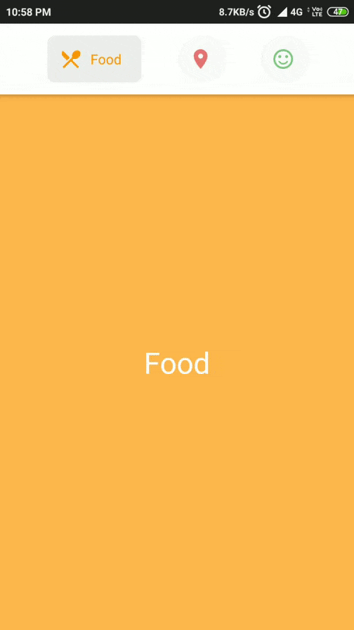
Demos
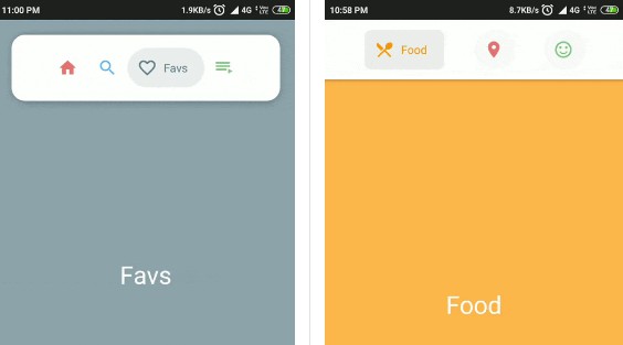
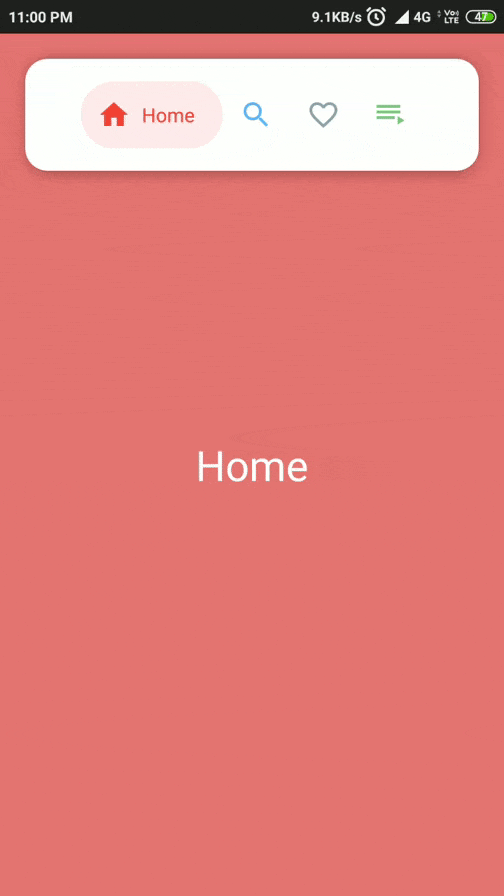
| FloatingTopBarActivity | TopBarActivity |
|---|---|
 |
 |
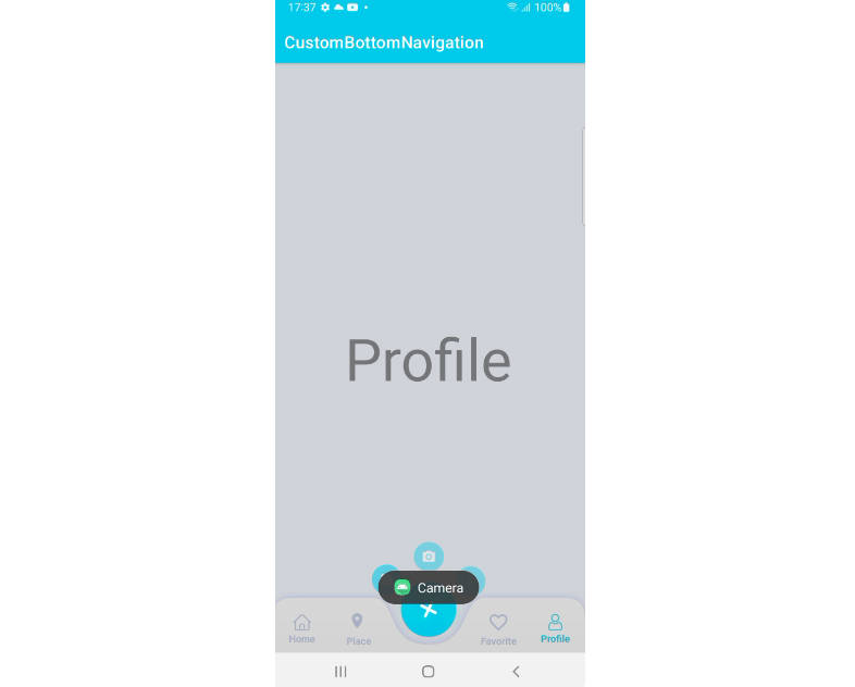
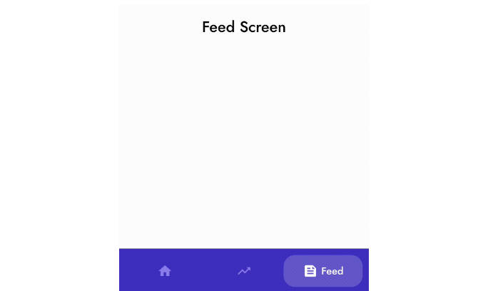
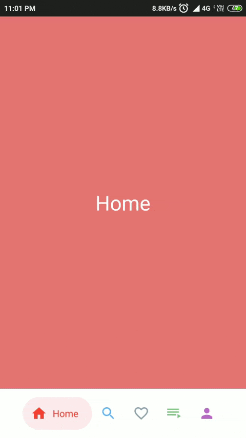
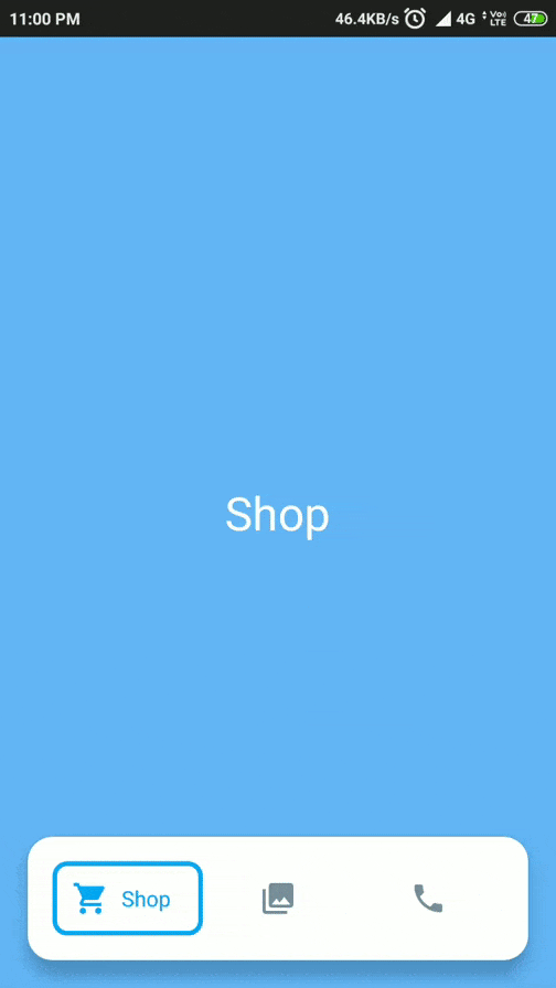
| BottomBarActivity | EqualBottomBarActivity |
|---|---|
 |
 |
Features:
- Support for API Level 16+
- Higly customizable
- Light weight and easy-to-use
- Supports TransitionDrawable for cool state changes
- 2 types of NavigationView for different use cases
- BubbleNavigationConstraintView: supports
spread,insideandpackedmode - BubbleNavigationLinearView: allows equal distribution using weight or packed mode
- BubbleNavigationConstraintView: supports
- Bonus BubbleToggleView to create new UI components, other than navigation
Usage
Check out the Sample app, to see how its implemented.
Gradle
- This library is available on JCenter. To use it, add the following to
build.gradle
XML
| attr | Description |
|---|---|
| bnc_mode | Changes the display mode the child elements |
| - spread : equally distributes the child elements | |
| - packed : elements are packed with center gravity | |
| - inside : inside elements are equally distributed |
OR
Using BubbleToggleView
BuggleToogleView is designed to work as a child component for the BubbleNavigationLinearView and BubbleNavigationConstraintView.
This view can be used independently
- you may use it for your own implementation of NavigationBar
- create new UI components
- or simply use it as toggle view
| attr | Description |
|---|---|
| bt_active | Sets to Active State |
| bt_colorActive | When in Active State, uses this color for the Icon and Title |
| bt_colorInctive | When in Inactive State, uses this color for the Icon and Title |
| bt_icon | Sets the Icon Drawable |
| bt_iconWidth | Updates the Icon Width |
| bt_iconHeigth | Updates the Icon Height |
| bt_title | Sets the Title Text |
| bt_titleSize | Updates the Tilte Text Size in sp |
| bt_shape | Sets the Background Drawable. Use TransitionDrawable to get fade in-out effect when toggling |
| bt_showShapeAlways | If true and using Normal drawable, background shape remains visible always |
| bt_shapeColor | Changes the tint color of the shape. N/A when using TransitionDrawable or showShapeAlways is true. |
| bt_duration | Sets time duration for toggle animation to complete in ms |
| bt_padding | Sets the internal padding in dp |
Note: If you are using normal drawable and the shapes remain same of each Navigation Item, set the same drawable for each item, with different bt_shapeColor to get a similar effect. This might help in lower memory usage and performace improvements.
Activity/Fragment
In Java
Or in Kotlin
| Method | Description |
|---|---|
void setCurrentActiveItem(int position) |
Changes the current active state for the navigation view |
void setTypeface(Typeface typeface) |
Updates the typeface of the text |
void setNavigationChangeListener(BubbleNavigationChangeListener listener) |
Sets the navigation change listener |
int getCurrentActiveItemPosition() |
Returns the current active position |