OtpinVerification

OtpinVerification & Dialog

Description:

Extremely useful library for validating EditText inputs whether by using just the validator (OtpinVerification) for your custom view or using library's extremely resizable & customisable dialog (OtpinDialogCreator)


Features:

  • OtpinVerification for validating your EditTexts from your own layout view
  • OtpinDialogCreator (library's customisable dialog)

Setup.

To get a Git project into your build:

  1. Add the JitPack repository to you root build.gradle at the end of repositories:
allprojects {
    repositories {
	...
	maven { url 'https://jitpack.io' }
    }
}
  1. Add the dependency
dependencies {
    implementation 'com.github.EhmaUgbogo:OtpinVerification:1.0.3'
}

Usage

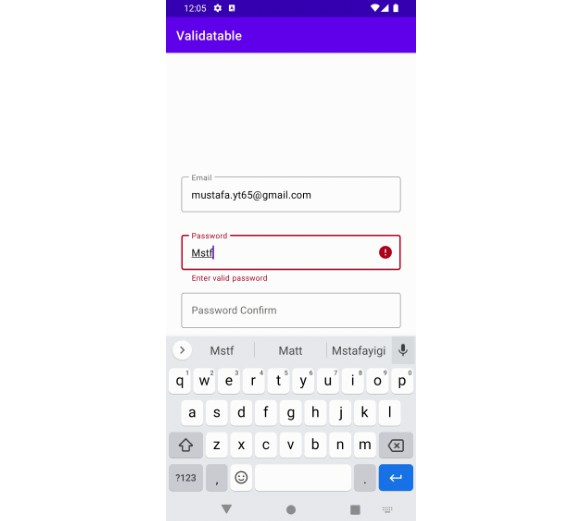
1. OtpinVerification (Use to power your own custom layout view)

  
  val yourEditTexts = listOf(yourEditText1, yourEditText2, yourEditText3,...)
  val inputType = OtpInputType.DIGIT // Library default. if used can be ommited
  
  otpin = OtpinVerification(yourEditTexts, inputType) { validated, percent, otp ->
      // Your code here
  }//.startCountDown(5, countDownListener)
  
  
  otpin.setOtpInputsText(yourOtpText) //SetText at runtime
  
  otpin.clearInputs() //Clear edittexts at runtime
  

Add CountDown


 otpin.startCountDown(minutes, object :OtpCountDownListener{
      override fun onCountDown(sec: Int, minutes: Int, timeFormat: String, onFinish: Boolean) {
            // your code here
            if(onFinish){
                // your code here
            }
      }
 })
 

2. OtpinDialogCreator

Sample1
Sample2
Sample3
Sample4
Sample5
Sample6
Sample7
Sample8

  
  // All operations that can be done on the dialog
  
  otpDialog = OtpinDialogCreator.with(this)
            //.title(title)
            //.customSubtitle("Please provide your card cvv")
            //.customBtnText("Submit")
            //.logo(R.drawable.ic_logo)
            //.cancelable(false)
            //.otpFields(OtpFields.THREE)
            //.inputType(OtpInputType.DIGIT)
            .countDown(5)
            .setCountDownFinishListener { showToast("Count Down completed") }
            .setContinueListener { otpDialog, otp -> continueClicked(otpDialog, otp) }
            .setResendListener {resendClicked(it)}
            .setCancelListener { showToast("Task Cancelled") }
            //.displayMode(OtpDisplay.FullScreen(showToolbar = true))
	    //.autoSubmitOnComplete(hideContinueBtn = false)
            //.excludeResend()
            //.displayOnlyInputFields()
            //.theme(R.style.myOtpDialogTheme)
            //.windowAnimation(R.style.yourWindowStyle)
            //.disableWindowAnimation()
            //.boxShape() // Use styles instead // Not available via runtime now
            .start()
	    
	    
	   otpDialog.setOtpInputsText(yourOtpText) //SetText at runtime
	   
	   otpDialog.dismissDialog() //Dismiss OtpinDialog
	   
	   otpDialog.showMessage(msg, useSnackInsteadOfToast = true) //Show message via SnackBar or Toast
	   
	   otpDialog.hideProgress() // Hide otpDialog progressBar


Styling Used Underneath

OtpinDialogCreator uses the following attr and styles under the hood with values that you can easily adjust to suit your brand

    <!-- TextAppearance-->
    <item name="otpDialogTitleTextAppearance">@style/OtpDialogTitleAppearance</item>
    <item name="otpDialogSubtitleTextAppearance">@style/OtpDialogSubTitleAppearance</item>
    <item name="otpDialogCounterTextAppearance">@style/OtpDialogCounterTextAppearance</item>
    <item name="otpDialogResendTextAppearance">@style/OtpDialogResendTextAppearance</item>
    <!-- Layout -->
    <item name="otpDialogLayoutPadding">4dp</item>
    <item name="otpDialogLayoutCornerRadius">16dp</item>
    <!-- Box Setup -->
    <item name="otpDialogBoxWidth">48dp</item>
    <item name="otpDialogBoxHeight">48dp</item>
    <item name="otpDialogBoxStrokeWidth">1dp</item>
    <item name="otpDialogBoxStrokeWidthFocused">2dp</item>
    <item name="otpDialogBoxSpacing">8dp</item>
    <item name="otpDialogBoxStyle">@style/BoxStyle.Outline</item> <!-- BoxStyle.Outline, BoxStyle.Underline-->
    <!-- Box ShapeAppearance-->
    <item name="otpDialogBoxShape">@style/OtpBoxShape.Normal</item> <!--Normal, Rounded, Cut - Only works for BoxStyle.Outline-->
    <!-- Box EditText Style-->
    <item name="otpDialogBoxEditTextStyle">@style/BoxEditTextStyle</item>
    <!-- Button Style-->
    <item name="otpDialogButtonStyle">@style/OtpDialogButtonStyle.Rounded</item> <!--OtpDialogButtonStyle, OtpDialogButtonStyle.Rounded -->
    <!-- Toolbar -->
    <item name="otpDialogToolbarColor">@color/otp_color_toolbar</item>
    <item name="otpDialogToolbarIconColor">@color/otp_color_toolbar_icon</item>
    <!-- Layout -->
    <item name="otpDialogLayoutPadding">4dp</item>
    <item name="otpDialogLayoutCornerRadius">16dp</item>
    <!-- Window -->
    <item name="otpDialogIsFloating">false</item>
  

Styling Yours

So to style yours simply create a theme that extends otpDialogTheme then use any precreated styles or extend them for further customization.
for example to change the title font & size, see titleAppearance and buttonStyle below.


    <!-- your floating screen otpDialog theme -->
    <style name="myOtpDialogThemeFloating" parent="myOtpDialogTheme">
        <item name="otpDialogIsFloating">true</item>
    </style>

    <!-- your fullscreen otpDialog theme -->
    <style name="myOtpDialogTheme" parent="OtpDialogTheme">
	 <!-- precreated choice -->
        <item name="otpDialogBoxStyle">@style/BoxStyle.Underline</item>
        <item name="otpDialogBoxShape">@style/OtpBoxShape.Rounded</item>
        <item name="otpDialogButtonStyle">@style/OtpDialogButtonStyle</item>
	<item name="otpDialogBoxSpacing">12dp</item>

	    <!-- Customize like so. -->
        <item name="otpDialogTitleTextAppearance">@style/titleAppearance</item>
	<item name="otpDialogButtonStyle">@style/buttonStyle</item>

    </style>

    <style name="titleAppearance" parent="OtpDialogTitleAppearance">
        <item name="fontFamily">@font/poppins_black</item>
    </style>

    <style name="buttonStyle" parent="OtpDialogButtonStyle">
        <item name="fontFamily">@font/poppins_medium</item>
        <item name="cornerRadius">8dp</item>
    </style>

    <!-- See App for more styling examples -->
  
  // Apply your fullscreen theme
  otpDialog = OtpinDialogCreator.with(this)
            .title(title)
            .theme(R.style.myOtpDialogTheme)
            .start()
	    
  // Apply your floating screen theme
  otpDialog = OtpinDialogCreator.with(this)
            .title(title)
	    .displayMode(OtpDisplay.Float)
            .theme(R.style.myOtpDialogThemeFloating)
            .start()
  

Color

For colors add these below to your color.xml


    <color name="otp_color_status_bar">@color/your_color_here</color>
    <color name="otp_color_toolbar">@color/your_color_here</color>
    <color name="otp_color_toolbar_icon">@color/your_color_here</color>
    <color name="otp_color_primary">@color/your_color_here</color>
    <color name="otp_color_widget_active">@color/your_color_here</color>
    <color name="otp_title_color">@color/your_color_here</color>
    <color name="otp_subtitle_color">@color/your_color_here</color>
  

Licence

MIT Licence

Copyright (c) [2021] Ehma Ugbogo

Permission is hereby granted, free of charge, to any person obtaining
a copy of this software and associated documentation files (the
"Software"), to deal in the Software without restriction, including
without limitation the rights to use, copy, modify, merge, publish,
distribute, sublicense, and/or sell copies of the Software, and to
permit persons to whom the Software is furnished to do so, subject to
the following conditions:

The above copyright notice and this permission notice shall be
included in all copies or substantial portions of the Software.

THE SOFTWARE IS PROVIDED "AS IS", WITHOUT WARRANTY OF ANY KIND,
EXPRESS OR IMPLIED, INCLUDING BUT NOT LIMITED TO THE WARRANTIES OF
MERCHANTABILITY, FITNESS FOR A PARTICULAR PURPOSE AND
NONINFRINGEMENT. IN NO EVENT SHALL THE AUTHORS OR COPYRIGHT HOLDERS BE
LIABLE FOR ANY CLAIM, DAMAGES OR OTHER LIABILITY, WHETHER IN AN ACTION
OF CONTRACT, TORT OR OTHERWISE, ARISING FROM, OUT OF OR IN CONNECTION
WITH THE SOFTWARE OR THE USE OR OTHER DEALINGS IN THE SOFTWARE.


Author Info

@EhmaUgbogo

https://github.com/EhmaUgbogo/OtpinVerification