Jetpack Compose Coachmark/Onboarding Library
A library for creating coachmarks or onboarding flows using Jetpack Compose.

Overview
A lightweight jetpack compose library to create onboarding flow for your android app Now provide seamless onboarding experience to end users with just few lines of code
Features
- Create custom coachmarks with ease.
- Highly flexible and extensible.
- Compatible with Jetpack Compose UI components.
Getting Started
In your settings.gradle
dependencyResolutionManagement {
    repositories {
        ...
        maven { url 'https://jitpack.io' }
    }
}
In your module’s build.gradle
dependencies {
    implementation 'com.github.pseudoankit:coachmark:<version>'
}
Usage
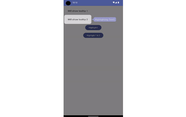
public enum class Keys { Text1, Text2 }

UnifyCoachmark(
    tooltip = { Tooltip(it) },
    overlayEffect = DimOverlayEffect(Color.Black.copy(alpha = .5f)),
    onOverlayClicked = { OverlayClickEvent.GoNext }
) {
    Column(
        modifier = Modifier
            .fillMaxSize()
            .padding(12.dp),
        verticalArrangement = Arrangement.spacedBy(12.dp)
    ) {
        Text(
            text = "Will show tooltip 1",
            modifier = Modifier
                .enableCoachMark(
                    key = Keys.Text1,
                    toolTipPlacement = ToolTipPlacement.End,
                    highlightedViewConfig = HighlightedViewConfig(
                        shape = HighlightedViewConfig.Shape.Rect(12.dp),
                        padding = PaddingValues(8.dp)
                    )
                )
                .padding(16.dp),
            color = Color.Black
        )
        Text(
            text = "Will show tooltip 2",
            modifier = Modifier
                .enableCoachMark(
                    key = Keys.Text2,
                    toolTipPlacement = ToolTipPlacement.End,
                    highlightedViewConfig = HighlightedViewConfig(
                        shape = HighlightedViewConfig.Shape.Rect(12.dp),
                        padding = PaddingValues(8.dp)
                    )
                )
                .padding(16.dp),
            color = Color.Black
        )
        Button(
            onClick = {
                show(Keys.Text1)
            },
            modifier = Modifier.align(Alignment.CenterHorizontally)
        ) {
            Text(text = "Highlight1")
        }
        Button(
            onClick = {
                show(Keys.Text1, Keys.Text2)
            },
            modifier = Modifier.align(Alignment.CenterHorizontally)
        ) {
            Text(text = "Highlight 1 & 2")
        }
    }
}

@Composable
private fun Tooltip(key: CoachMarkKey) {
    when (key) {
        Keys.Text1 -> {
            Balloon(arrow = Arrow.Start()) {
                Text(text = "Highlighting Text1", color = Color.White)
            }
        }

        Keys.Text2 -> {
            Balloon(arrow = Arrow.Start()) {
                Text(text = "Highlighting Text2", color = Color.White)
            }
        }
    }
}