Drag Select Compose
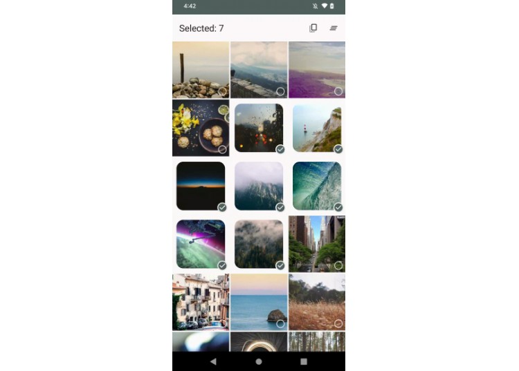
This is a library that allows you to easily implement a “Google Photos”-style multi-selection in your Compose apps.
You can view the KDocs at docs.drag-select-compose.jordond.dev

Inspiration
This library was inspired by this article and the gist.
As well as the drag-select-recyclerview library.
Getting Started
First you need to add jitpack to either your root level build.gradle.kts or
your settings.gradle.kts file:
In build.gradle.kts:
allprojects {
    repositories {
        maven { url = uri("https://jitpack.io") }
    }
}
Or settings.gradle.kts:
dependencyResolutionManagement {
    repositories {
        maven { url = uri("https://jitpack.io") }
    }
}
Then add the dependency to your app level build.gradle.kts file:
dependencies {
    // Includes the core functionality along with all of the optional modules
    implementation("dev.jordond:drag-select-compose:drag-select-compose:1.0.0")

    // Or use the modules you want

    // Core functionality
    implementation("dev.jordond:drag-select-compose:core:1.0.0")

    // Optional extensions for adding semantics and toggle Modifiers to Grid items
    implementation("dev.jordond:drag-select-compose:extensions:1.0.0")

    // Optional wrappers around LazyGrid that implement the selection UI for you
    implementation("dev.jordond:drag-select-compose:grid:1.0.0")
}
Usage
The :core artifact provides a Modifier extension for adding a drag-to-select functionality to your LazyGrid:
fun <Item> Modifier.gridDragSelect(
    items: List<Item>,
    state: DragSelectState<Item>,
    enableAutoScroll: Boolean = true,
    autoScrollThreshold: Float? = null,
    enableHaptics: Boolean = true,
    hapticFeedback: HapticFeedback? = null,
): Modifier
It provides the following functionality:
- Adds a long-press drag gesture to select items.
- Maintains a list of selected items.
- Expose a
inSelectionMode: Booleanwhich you can use to display a unselected state. - If
enableAutoScrollistruethen the list will start to scroll when reaching the top or bottom of the list. - Will trigger a “long-press” haptics if
enableHapticsistrue.
You can then use DragSelectState to render your list of items:
Basic Example
data class Model(
    val id: Int,
    val title: String,
    val imageUrl: String,
)

@Composeable
fun MyGrid(models: List<Model>) {
    val dragSelectState = rememberDragSelectState<Model>()
    LazyVerticalGrid(
        columns = GridCells.Adaptive(minSize = 128.dp),
        state = dragSelectState.lazyGridState,
        verticalArrangement = Arrangement.spacedBy(3.dp),
        horizontalArrangement = Arrangement.spacedBy(3.dp),
        modifier = Modifier.gridDragSelect(
            items = models,
            state = dragSelectState,
        ),
    ) {
        items(models, key = { it.id }) { model ->
            val isSelected by remember { derivedStateOf { dragSelectState.isSelected(model) } }
            val inSelectionMode = dragSelectState.inSelectionMode

            // Define your Model Composeable and use `isSelected` or `inSelectionMode`
        }
    }
}
You can see a full basic example in BasicDragSelectPhotoGrid.
Extensions
Included in the :dragselectcompose and :extensions artifact are a couple extensions on Modifer to easily add support for accessibility semantics and toggling selection while the Grid is in selection mode.
Modifier.dragSelectSemantics()- Adds a long click semantics to the modifier for accessibility.
Modifier.dragSelectToggleable()- Allows you to toggle the item when the Grid is in Selection Mode.
Modifier.dragSelectToggleableItem()- Combines the above two extensions.
@Composeable
fun MyGrid(models: List<Model>) {
    val dragSelectState = rememberDragSelectState<Model>()
    LazyVerticalGrid(
        // ...
    ) {
        items(models, key = { it.id }) { model ->
            // Add semantics and toggleable modifiers
            MyItemContent(
                item = model,
                modifier = Modifier.dragSelectToggleable(
                    state = dragSelectState,
                    item = model,
                ),
            )
        }
    }
}
You can see a full extensions example in ExtensionsDragSelectPhotoGrid.
Wrapper
Included in the :grid artifact is a “all-inclusive” drag-select experience. It includes wrappers around LazyHorizontalGrid and LazyVerticalGrid that takes care of adding the Modifier.gridDragSelect.
When using LazyDragSelectVerticalGrid or LazyDragSelectHorizontalGrid the content() is scoped to a custom scope that provides a helper composable for handling the selection indicator, and animating the padding.
Here is a quick example:
@Composeable
fun MyGrid(models: List<Model>) {
    val dragSelectState = rememberDragSelectState<Model>()

    LazyDragSelectVerticalGrid(
        columns = GridCells.Adaptive(minSize = 128.dp),
        items = models,
        state = dragSelectState,
    ) {
        items(key = { it.id }) { model ->
            SelectableItem(item = model) {
                // Your Composeable for your item
            }
        }
    }
}
Now your item will have an animated padding and clipped shape when selected. As well as displaying indicator icons when the grid is in selection mode, and the item is selected or not.
See the documentation for LazyDragSelectVerticalGrid and SelectableItem for all the options you can customize.
Demo App
A demo app is included in the demo module, run it by following these steps:
git clone git@github.com:jordond/drag-select-compose.git drag-select-compose
cd drag-select-compose
./gradlew assembleRelease
Then install the demo/build/outputs/apk/release/demo-release.apk file on your device.
License
See LICENSE