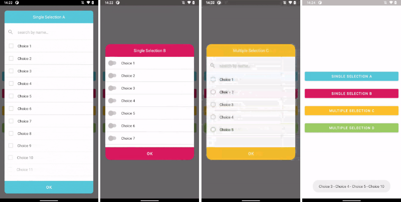
RecyclerPickerDialog
A FragmentDialog implemented with RecyclerView that can accept Single or Multiple selections.
Installation
RecyclerPickerDialog is distributed through Maven Central, Jcenter and Jitpack.
Usage
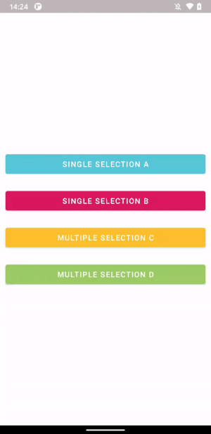
Selection types
Selector types
Custom fields (and default values)
Avoid Memory Leaks
Just add the following line to avoid memory leak if not dismissed before activity or fragment are destroyed:
Themes
To override default theme just create yours by simply extending it and replacing desired color values:
Attributes
You can override the following attributes:
Where:
- colorPrimary > Title and Button background color
- colorOnPrimary > Title and Button text color
- colorSecondary > Dialog and Row background color
- colorEdgeEffect > RecyclerView edge color
- textColorPrimary > Search and Row text color
- textColorSecondary > Search hint and icon color; Horizontal Lines color
- colorSurface > CheckBox, RadioButton and Switch unchecked color
- colorOnSurface > Button background when disabled (note overrides colorSurface)
- colorAccent > CheckBox, RadioButton and Switch checked color; Hint cursor color
- recyclerPickerDialogCornerRadius > Dialog corners radius
Creating new instance:
Show it when desired:
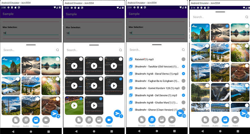
Try out the sample app to see it working!