compose-richtext
A collection of Compose libraries for working with rich text formatting and documents. This repo is currently very experimental and really just proofs-of-concept: there are no tests, some things might be broken or very non-performant, and it's not published on Maven. Once Compose stabilizes, if it's still useful, I might eventually polish it up and actually release something.
richtext-ui
A library of composables for formatting text using higher-level concepts than are supported by
compose foundation, such as "bullet lists" and "headings".
Eventually planning to add support for rendering Markdown.
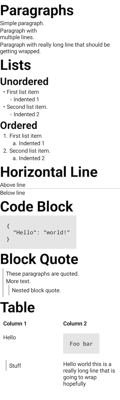
Example
Open the Demo.kt file in the richtext-ui module to play with this.
Looks like this:
printing
A library for using Compose to generated printed documents, using Android's printing services.
There are multiple entry points into this library. See their kdoc for usage and parameter
documentation, and take a look at the samples for example code.
Printable– This is the simplest entry point. It's a composable function that displays its
content normally on screen, but can also print itself.ComposePrintAdapter– This is aPrintDocumentAdapter
that can be used directly with Android's printing APIs to print any composable function.Paged– This is another composable, but doesn't actually have anything to do with printing.
Conceptually it's similar to aScrollableColumn– it lays its contents out at full height, then
can display them at various vertical offsets. However, it also tries to ensure that no composables
are clipped at the bottom, by measuring where all the leaf composables (those without any
children) are located clipping the content before them. It is used by the printing APIs to try to
ensure that composable content looks decent when split into printer pages.
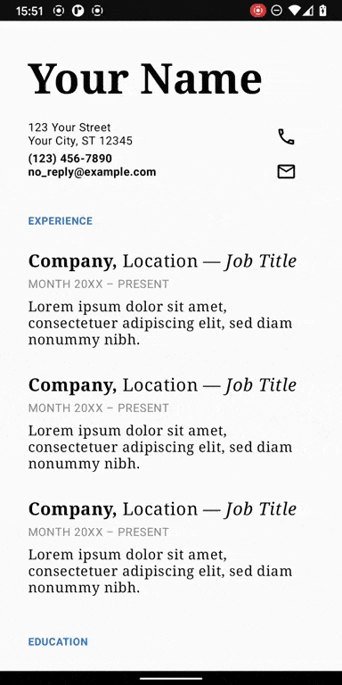
Here's a sample that tries to match the style of one of the Google Docs templates. It looks great
on small phone screens, but also prints:
slideshow
A library for presenting simple Powerpoint-like slideshows from a phone (e.g. you can share your
phone screen to a Google Hangout and present that way). Slides can contain any composable content,
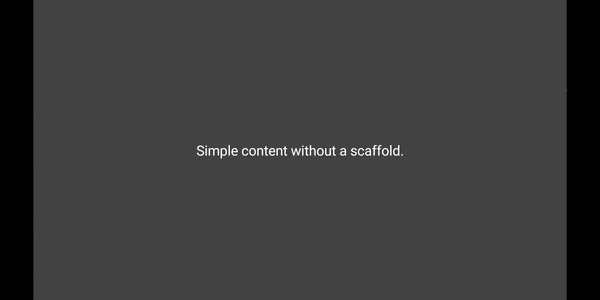
although a few pre-fab scaffolds are provided for common slide layouts.

Setting up a slideshow
There is a single, simple entry point to this library, that takes a vararg of composable functions
that define your slides:
The Slideshow composable will automatically lock your phone to portrait and enter immersive
fullscreen while it's composed. You can tap anywhere on the left or right of the screen to navigate.
Currently the only supported slide transition is crossfade, but it shouldn't be hard to make the
library more pluggable and support more advanced transition libraries (like
this one).
Creating slides
Individual slides are centered by default, but you can put whatever you want in them. The library
has a few scaffolds for common slide layouts that you might find useful.
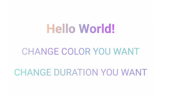
TitleSlide
Very simple: a title and a subtitle, centered.
BodySlide
The BodySlide composable gives you a top header, bottom footer, and middle body slot to put
stuff into.
Slide scaffolds like BodySlide and TitleSlide, as well as some other aspects of slideshow
formatting like background color, are controlled by passing a SlideshowTheme to the Slideshow
composable.
Animating content on a single slide
A corporate presentation wouldn't be a presentation without obtuse visual effects. The
NavigableContentContainer composable is a flexible primitive for building such effects. It takes
a slot inside of which NavigableContent composables define blocks of content that will be
shown or hidden by slide navigation. Each NavigableContent block gets a State<Boolean>
indicating whether content should be shown or not, and is free to show or hide content however it
likes. For example, Compose comes with the AnimatedVisibility composable out of the box, which
plays very nicely with this API. See the SlideshowSample to see it in action.
Running the show
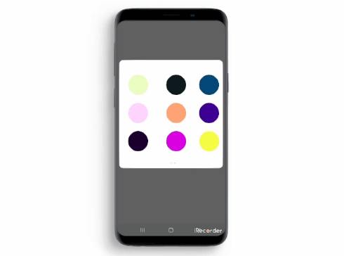
If you're in the middle of a presentation and lose your place, just drag up anywhere on the screen.
A slider and preview will pop up to let you scrub through the deck.