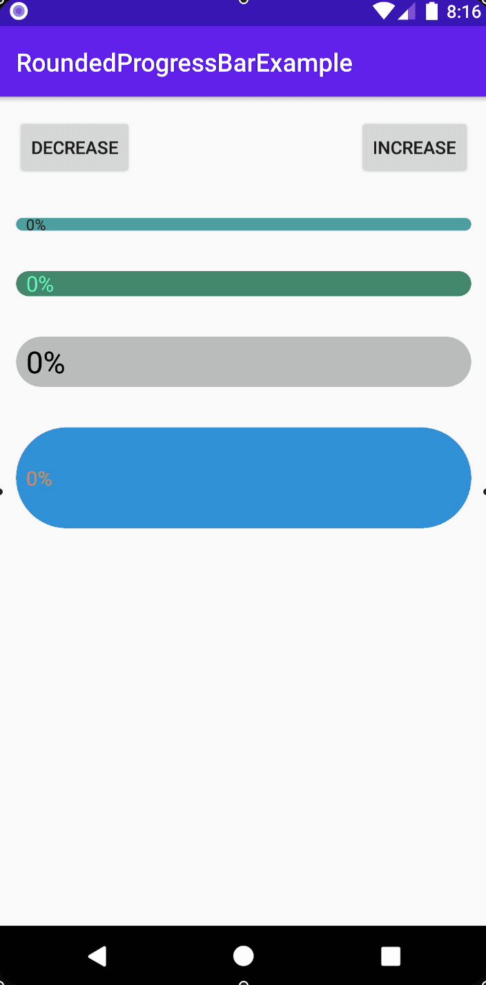
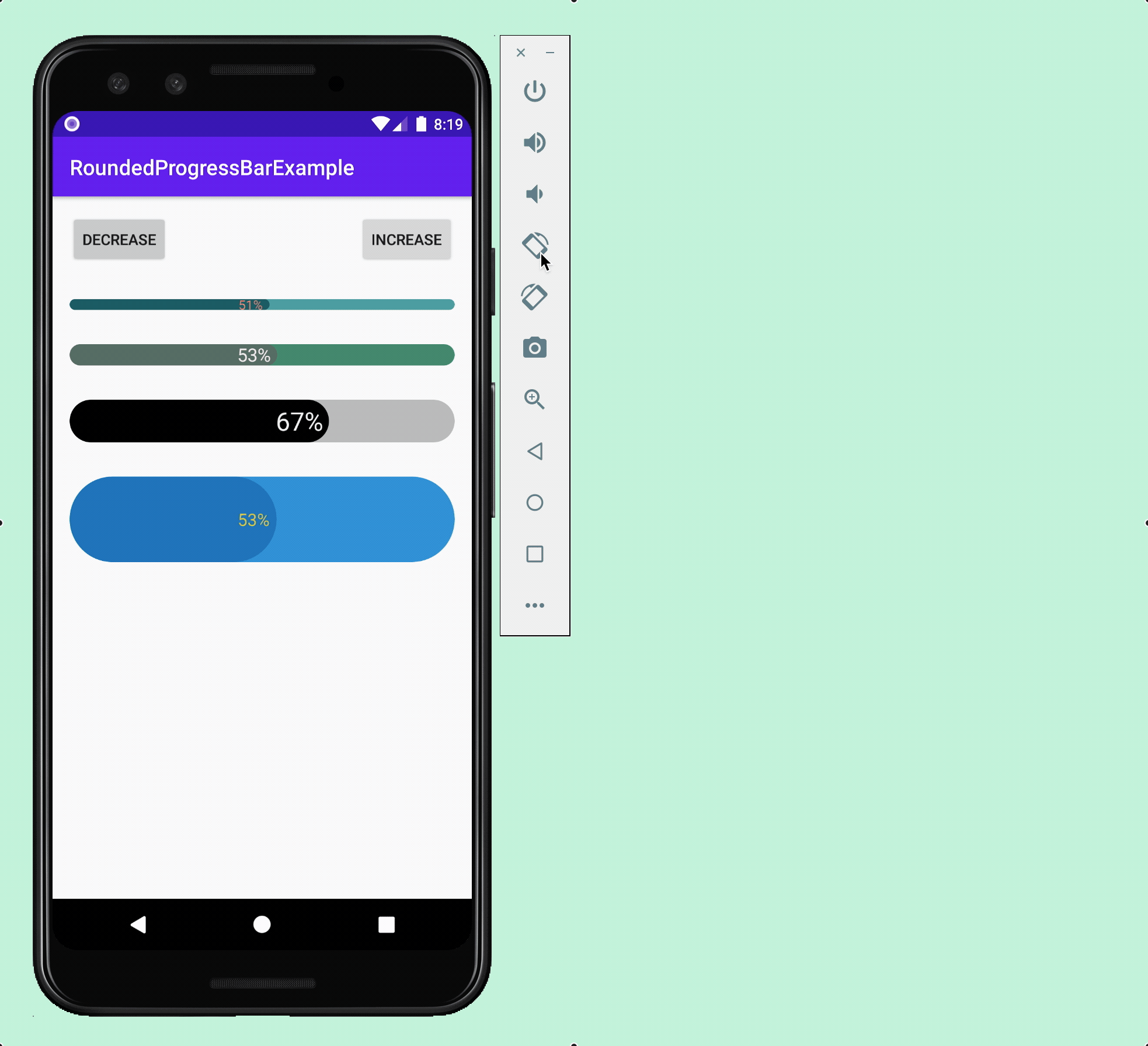
RoundedProgressBar
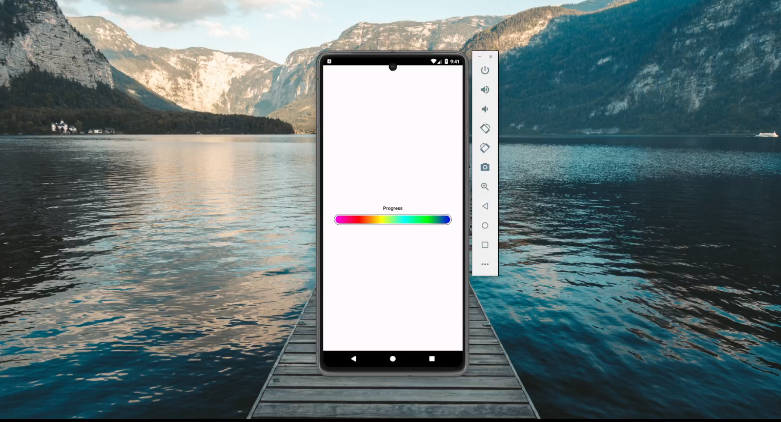
Using the RoundedProgressBar library you have a wide range of customizable options for making progress bars that have rounded edges. Below I've made a gif highlighting just a few examples of different looking progress bars created with this library:
Gradle Setup ⚙️

If you don't have this already, add it to your root build.gradle file:
allprojects {
    repositories {
        ...
        maven { url 'https://jitpack.io' }
    }
}
Then you can add the dependency to your app build.gradle file:
dependencies {
    ...
    implementation 'com.github.MackHartley:RoundedProgressBar:1.0'
}
Features ?
- Percentage complete text displayed on right hand side of progress bar
- Progress bar and progress text animation upon progress change
- The progress bar, background view, progress text and background text can all have different colors
- The progress bar doesn't look weird at lower values (a common issue with progress bar solutions)
- Progress bar can be set to any height and width
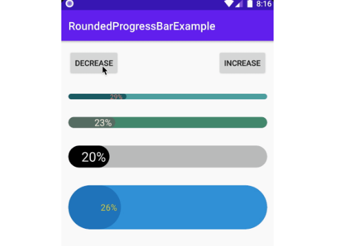
Additionally, the RoundedProgressBar handles all state on config changes including situations where there are multiple progress bars:
Public Methods and Xml Attributes ⌨️
These are the methods which can be called on the RoundedProgressBar class:
setProgressPercentage(progressPercentage: Double, shouldAnimate: Boolean = true)
getProgressPercentage(): Double

setProgressColor(colorRes: Int) // Sets the color of the 'progress' part of the progress bar
setProgressBgColor(colorRes: Int) // Sets the color of the progress bar background

setTextColor(colorRes: Int) // Sets text color for when it is drawn over the progress part of progress bar
setBgTextColor(colorRes: Int) // Sets text color for when it is drawn over the progress bar background
setTextSize(sizeInPixels: Float)
showProgressText(shouldShowProgressText: Boolean) // Hide or show the progress text

setAnimationLength(newAnimationLength: Long)
Each setter is accessible via xml as well. Here I've mapped each setter to its corresponding xml attribute:
| Method | Xml Attribute |
|---|---|
setProgressPercentage(...) |
rpbProgress |
setProgressColor(...) |
rpbProgressColor |
setProgressBgColor(...) |
rpbProgressBgColor |
setTextSize(...) |
rpbTextSize |
setTextColor(...) |
rpbTextColor |
setBgTextColor(...) |
rpbBgTextColor |
showProgressText(...) |
rpbShowProgressText |
setAnimationLength(...) |
rpbAnimationLength |