YCharts
YCharts is a light and extensible chart library for Jetpack Compose system. It comprises two main modules:
YChartslib(Chart components for Jetpack Compose)app(sample app to showcase chart components)
Adding YCharts to your project:
You can add automatically the library via Maven:
Gradle:
implementation 'co.yml:ycharts:1.0.0'
Modules
The following table outlines the modules included in this library:
| Artifact | Description |
|---|---|
axis |
Includes the horizontal and vertical axis components along with the math engines. |
charts |
Includes the all the chart components i.e: Line, Bar, Combined, Pie & Donut etc. also the math engines |
chartcontainer |
Provides the base container to draw any chart inside it with scroll tap feature etc out of the box. |
piechart |
Includes all the 360′ chart components i.e Pie, Donut charts etc. |
Sample app
Included in this repository is a sample app with multiple charts with different styling in each section. Studying the source code of the app will give you a deep understanding of how to use YCharts, including customizing and styling the charts. All of the charts i.e line, bar, groupedBar, pie & donut are implemented in the sample app.
Basic example
Let’s see how we can use the chart components and style them with available customization options.
-
Line Chart:
- Create list of points with x & y co-ordinates using
Pointdata class.
val pointsData: List<Point> = listOf(Point(0f, 40f), Point(1f, 90f), Point(2f, 0f), Point(3f, 60f), Point(4f, 10f))- Initialize X and Y Axis builders using the
AxisDatadata class.
val xAxisData = AxisData.Builder() .axisStepSize(100.dp) .steps(pointsData.size - 1) .labelData { i -> i.toString() } .labelAndAxisLinePadding(15.dp) .build() val yAxisData = AxisData.Builder() .steps(steps) .labelAndAxisLinePadding(20.dp) .labelData { i -> val yScale = 100 / steps (i * yScale).formatToSinglePrecision() }.build()- Initialize the Line chart data with axis and other line related styling using
LineChartDatadata class.
val lineChartData = LineChartData( linePlotData = LinePlotData( lines = listOf( Line( dataPoints = pointsData, LineStyle(), IntersectionPoint(), SelectionHighlightPoint(), ShadowUnderLine(), SelectionHighlightPopUp() ) ), ), xAxisData = xAxisData, yAxisData = yAxisData, gridLines = GridLines() )- Finally use the
LineChartComponent to render the line chart with the above input params.
LineChart(
     modifier = Modifier
         .fillMaxWidth()
         .height(300.dp),
     lineChartData = lineChartData
 )
Line chart looks like this!
- Create list of points with x & y co-ordinates using
-
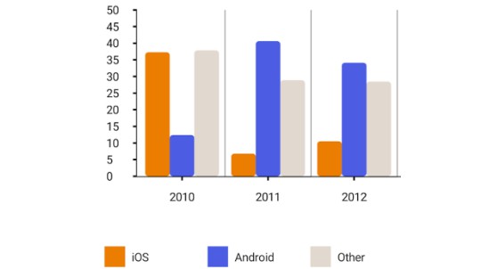
Bar Chart:
-
Create list of barChartData using the random generator extension and
BarDatadata classval barChartData = DataUtils.getBarChartData(barChartListSize, maxRange) -
Initialize X and Y Axis builders using the
AxisDatadata class.
val xAxisData = AxisData.Builder() .axisStepSize(30.dp) .steps(barChartData.size - 1) .bottomPadding(40.dp) .axisLabelAngle(20f) .labelData { index -> barData[index].label } .build() val yAxisData = AxisData.Builder() .steps(yStepSize) .labelAndAxisLinePadding(20.dp) .axisOffset(20.dp) .labelData { index -> (index * (maxRange / yStepSize)).toString() } .build()- Initialize the Bar chart data with axis and other line related styling using
BarChartDatadata class.
val barChartData = BarChartData( chartData = barChartData, xAxisData = xAxisData, yAxisData = yAxisData, paddingBetweenBars = 20.dp, barWidth = 25.dp )- Last, use the
BarChartComponent to render the bar chart with the above input params.
BarChart(modifier = Modifier.height(350.dp), barChartData = barChartData)
Bar chart looks like this!
-
-
Grouped Bar Chart:
-
Create list of grouped combinations of bar chart data using the random generator extension and
BarPlotDatadata classval groupBarPlotData = BarPlotData( groupBarList = DataUtils.getGroupBarChartData( barChartListSize, maxRange, eachGroupBarSize ), barColorPaletteList = getColorPaletteList(barSize) ) -
Initialize X and Y Axis builders using the
AxisDatadata class.
val xAxisData = AxisData.Builder() .axisStepSize(30.dp) .steps(groupBarData.size - 1) .bottomPadding(40.dp) .labelData { index -> groupBarData[index].label } .build() val yAxisData = AxisData.Builder() .steps(yStepSize) .labelAndAxisLinePadding(20.dp) .axisOffset(20.dp) .labelData { index -> (index * (maxRange / yStepSize)).toString() } .build()- Initialize the group bar chart data with axis and other line related styling
using
GroupBarChartDatadata class.
val groupBarChartData = GroupBarChartData( barPlotData = groupBarPlotData, xAxisData = xAxisData, yAxisData = yAxisData )- Use the
GroupBarChartComponent to render the bar chart with the above input params.
GroupBarChart(modifier = Modifier.height(300.dp), groupBarChartData = groupBarChartData)
Grouped Bar chart looks like this!
-
-
Pie Chart:
- Create list of slices using the
PieChartDatadata class.
val pieChartData = PieChartData( slices = listOf( PieChartData.Slice("SciFi", 65f, Color(0xFF333333)), PieChartData.Slice("Comedy", 35f, Color(0xFF666a86)), PieChartData.Slice("Drama", 10f, Color(0xFF95B8D1)), PieChartData.Slice("Romance", 40f, Color(0xFFF53844)) ) )- Initialize the pie chart config with
PieChartConfigdata class inorder to achieve styling and configurations related to pie chart
val pieChartConfig = PieChartConfig( percentVisible = true, isAnimationEnable = true, showSliceLabels = false, animationDuration = 1500 )- Finally, use the
PieChartcomponent to render the chart.
PieChart(modifier = Modifier
         .width(400.dp)
         .height(400.dp),
     pieChartData,
     pieChartConfig
 )
Pie chart looks like this!
- Create list of slices using the
-
Donut Chart:
- Similar to pie chart here we need create list of slices using the
PieChartDatadata class.
val donutChartData = PieChartData( slices = listOf( PieChartData.Slice("HP", 15f, Color(0xFF5F0A87)), PieChartData.Slice("Dell", 30f, Color(0xFF20BF55)), PieChartData.Slice("Lenovo", 40f, Color(0xFFEC9F05)), PieChartData.Slice("Asus", 10f, Color(0xFFF53844)) ) )- Initialize the pie chart config with
PieChartConfigdata class inorder to achieve styling and configurations related to pie chart
val donutChartConfig = PieChartConfig( percentVisible = true, percentageFontSize = 42.sp, strokeWidth = 120f, percentColor = Color.Black, activeSliceAlpha = .9f, isAnimationEnable = true )- Finally, use the
DonutPieChartcomponent to render the chart.
DonutPieChart( modifier = Modifier
         .fillMaxWidth()
         .height(500.dp),
     donutChartData,
     donutChartConfig
 )
Donut chart looks like this!
- Similar to pie chart here we need create list of slices using the
-
Combined Chart:
- Similar to line and bar chart we can combine both entities in one chart, just need to initialize the line and bar plot data using the random generator extension and add styling related to individual component.
  val linePlotData = LinePlotData(
      lines = listOf(
        Line(
            DataUtils.getLineChartData(listSize, maxRange = 100),
            lineStyle = LineStyle(color = Color.Blue),
            intersectionPoint = IntersectionPoint(),
            selectionHighlightPoint = SelectionHighlightPoint(),
            selectionHighlightPopUp = SelectionHighlightPopUp()
        ),
        Line(
            DataUtils.getLineChartData(listSize, maxRange),
            lineStyle = LineStyle(color = Color.Black),
            intersectionPoint = IntersectionPoint(),
            selectionHighlightPoint = SelectionHighlightPoint(),
            selectionHighlightPopUp = SelectionHighlightPopUp()
        )
    )
)

val barPlotData = BarPlotData(
    groupBarList = DataUtils.getGroupBarChartData(listSize, maxValueRange, barSize),
    barStyle = BarStyle(barWidth = 35.dp),
    barColorPaletteList = colorPaletteList
 )
-
Initialize X and Y Axis builders using the
AxisDatadata class.val xAxisData = AxisData.Builder() .axisStepSize(30.dp) .steps(maxOf(barChartData.size - 1, lineChartData.size - 1)) .bottomPadding(40.dp) .labelData { index -> index.toString() } .build() val yAxisData = AxisData.Builder() .steps(yStepSize) .labelAndAxisLinePadding(20.dp) .axisOffset(20.dp) .labelData { index -> (index * (maxRange / yStepSize)).toString() } .build()- Initialize the combined chart config data with
CombinedChartDatadata class inorder to achieve styling and configurations related to same.
- Initialize the combined chart config data with
val combinedChartData = CombinedChartData( combinedPlotDataList = listOf(barPlotData, linePlotData), xAxisData = xAxisData, yAxisData = yAxisData ) “`
- Finally, use the
CombinedChartcomponent to render the chart.CombinedChart( modifier = Modifier.height(400.dp), combinedCharthData = combinedChartData )
_Note_ : To show legends infomartion related to bar, `Legends` component can be used.

Combined bar with line chart looks like this!
Accessibility Support
To interact with your device with touch and spoken feedback, you can turn on the TalkBack screen reader. TalkBack describes the graphs/charts when tapped on the graph container. Compose views by deafult supports accessibility services, but for views drawn using canvas has no straight forward approach as of now, hence all our graph components supports an accessibility popup out of the box that will be shown over the graph with tapped on the container, with all the values described in an order to support accessibility services. User will be able to scroll the popup and find all the points, bars, slices or combined values in a descriptive manner, where user can tap and talkback would read it out loud.

fig (a)

fig (b)
Here fig(a) represents the line graph with the container being highlighted & fig(b) represents the accessibility sheet with all values laid out in detail so that talkback can describe the graph values. *Note*: All the descriptions that are visible in the accessibility popup can be customized to the required string.
License
    Copyright 2022 YCharts

    Licensed under the Apache License, Version 2.0 (the "License");
    you may not use this file except in compliance with the License.
    You may obtain a copy of the License at

        http://www.apache.org/licenses/LICENSE-2.0

    Unless required by applicable law or agreed to in writing, software
    distributed under the License is distributed on an "AS IS" BASIS,
    WITHOUT WARRANTIES OR CONDITIONS OF ANY KIND, either express or implied.
    See the License for the specific language governing permissions and
    limitations under the License.