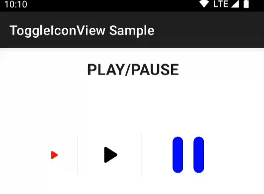

ToggleIconView
ToggleIconView is a collection library of animated two-stage toggle icons for Android.
sample.mp4
Installation
allprojects {
    repositories {
        maven { url "https://jitpack.io" }
    }
}

dependencies {
    implementation "com.github.ozgurg:ToggleIconView:2.0.0"
}
Usage
<!-- See "Built-in icons" section for other icons -->
<og.android.lib.toggleiconview.rounded.PlayPause
    android:layout_width="24dp"
    android:layout_height="24dp" />
API
ToggleIconView, uses AnimatedVectorDrawableCompat under the hood and extends AppCompatImageView. So you can do
anything you can with AppCompatImageView.
Attributes
| Attribute | Description | Type |
|---|---|---|
app:checked |
Sets the initial state of the icon | boolean |
Methods
| Method | Description | Return |
|---|---|---|
toggle() |
Toggles between the checked and unchecked state of the icon | void |
isChecked() |
Returns whether the icon is checked | boolean |
setChecked(checked: Boolean) |
Sets the checked state of the icon | void |
Events
| Event | Description |
|---|---|
onCheckedChanged(toggleIconView: ToggleIconView, isChecked: Boolean) |
Triggers when the ticked state of the icon changed |
Built-in icons
All icons have the same duration and interpolator, but I manually capture their previews; so timings may look different.
| Preview | Package |
|---|---|
 |
[Rounded] PlayPauseog.android.lib.toggleiconview.rounded.PlayPause |
 |
[Rounded] SoundOnOffog.android.lib.toggleiconview.rounded.SoundOnOff |
 |
[Sharp] FlashOnOffog.android.lib.toggleiconview.sharp.FlashOnOff |
How I create my own icon?
1) Create an icon
First, you need to create an AnimatedVectorDrawable icon.
I highly recommend using Shape Shifter.
After creating and exporting your icon, add the icon to your project’s drawable folder.
2) Implement the icon
Just extend ToggleIconView class and set checked and unchecked icon you want to use.
package [PACKAGE_NAME]

import android.content.Context
import android.util.AttributeSet
import og.android.lib.toggleiconview.R
import og.android.lib.toggleiconview.ToggleIconView

class [NAME_YOUR_ICON] @JvmOverloads constructor(
    context: Context,
    attrs: AttributeSet? = null,
    defStyleAttr: Int = 0
) :
    ToggleIconView(
        context, attrs, defStyleAttr,
        R.drawable.[CHECKED_ICON],
        R.drawable.[UNCHECKED_ICON]
    )
Then, use it in your layout.
<[PACKAGE_NAME].[NAME_YOUR_ICON]
    android:layout_width="24dp"
    android:layout_height="24dp" />