DrawableToolbox
The missing DrawableToolbox for Android. Get rid of the boring and always repeated drawable.xml files.
Features
- Create drawables programmatically
- Support
<shape>
,<rotate>
,<scale>
,<ripple>
drawables
Future works
- Support
LayerDrawable
(<layer-list>
) - Please file an issue
Gradle
dependencies {
implementation 'com.github.duanhong169:drawabletoolbox:${latestVersion}'
...
}
Replace
${latestVersion}
with the latest version code. See releases.
Usage
Use the DrawableBuilder
to setup the Drawable
and call build()
to create it.
Please check all the supported APIs in DrawableBuilder.kt.
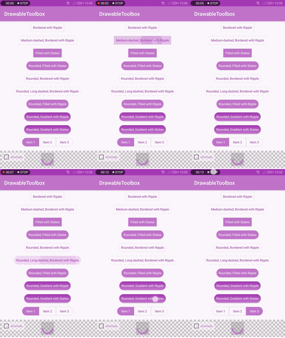
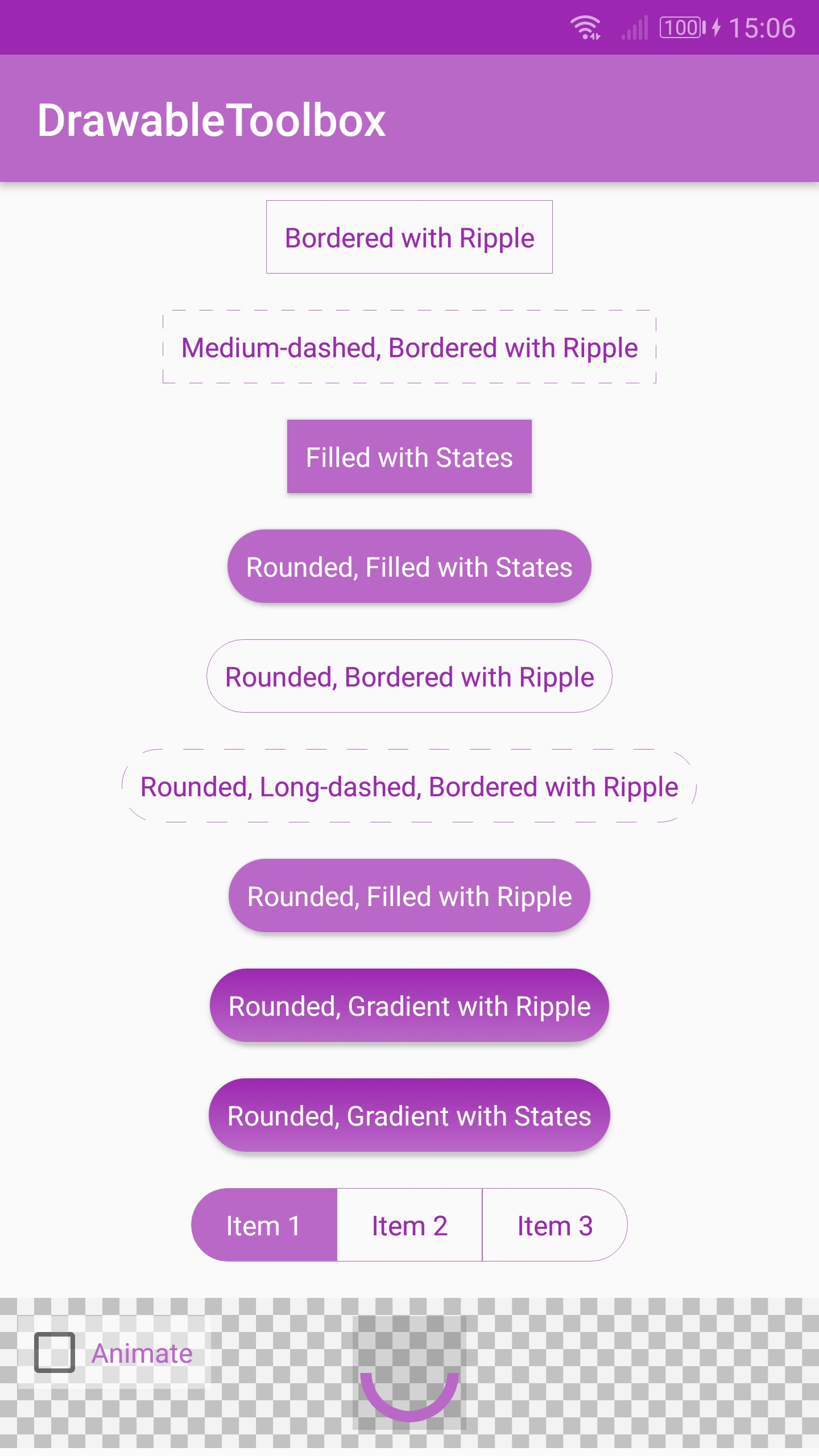
Here are some examples:
Code:
DrawableBuilder()
.rectangle()
.hairlineBordered()
.strokeColor(COLOR_DEFAULT)
.strokeColorPressed(COLOR_PRESSED)
.ripple()
.build()
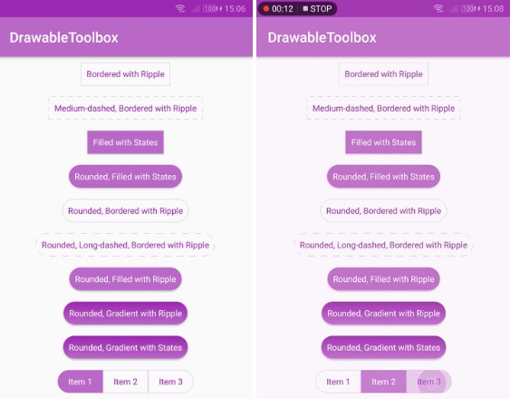
Result:
Code:
DrawableBuilder()
.rectangle()
.hairlineBordered()
.mediumDashed()
.strokeColor(COLOR_DEFAULT)
.strokeColorPressed(COLOR_PRESSED)
.ripple()
.build()
Result:
Code:
DrawableBuilder()
.rectangle()
.rounded()
.solidColor(COLOR_DEFAULT)
.solidColorPressed(COLOR_PRESSED)
.build()
Result:
Code:
DrawableBuilder()
.rectangle()
.hairlineBordered()
.longDashed()
.rounded()
.strokeColor(COLOR_DEFAULT)
.strokeColorPressed(COLOR_PRESSED)
.ripple()
.build()
Result:
Code:
DrawableBuilder()
.rectangle()
.rounded()
.gradient()
.linearGradient()
.angle(90)
.startColor(COLOR_DEFAULT)
.endColor(ContextCompat.getColor(context, R.color.colorPrimaryDark))
.ripple()
.rippleColor(COLOR_PRESSED)
.build()
Result:
Code:
val baseBuilder = DrawableBuilder()
.rectangle()
.rounded()
.gradient()
.gradientType(GradientDrawable.LINEAR_GRADIENT)
.angle(90)
val normalState = baseBuilder
.startColor(COLOR_DEFAULT)
.endColor(ContextCompat.getColor(context, R.color.colorPrimaryDark))
.build()
val pressedState = baseBuilder
.startColor(COLOR_PRESSED)
.endColor(ContextCompat.getColor(context, R.color.colorAccentDark))
.build()
StateListDrawableBuilder()
.normal(normalState)
.pressed(pressedState)
.build()
Result:
Code:
val baseBuilder = DrawableBuilder()
.rectangle()
.rounded()
.hairlineBordered()
.strokeColor(COLOR_DEFAULT)
.solidColorSelected(COLOR_DEFAULT)
.ripple()
return when(type) {
SegmentedControlDrawableSpec.TYPE_LEFT_MOST -> {
baseBuilder.topRightRadius(0)
.bottomRightRadius(0)
.build()
}
SegmentedControlDrawableSpec.TYPE_RIGHT_MOST -> {
baseBuilder.topLeftRadius(0)
.bottomLeftRadius(0)
.build()
}
else -> {
baseBuilder.cornerRadius(0).build()
}
}
Result:
Code:
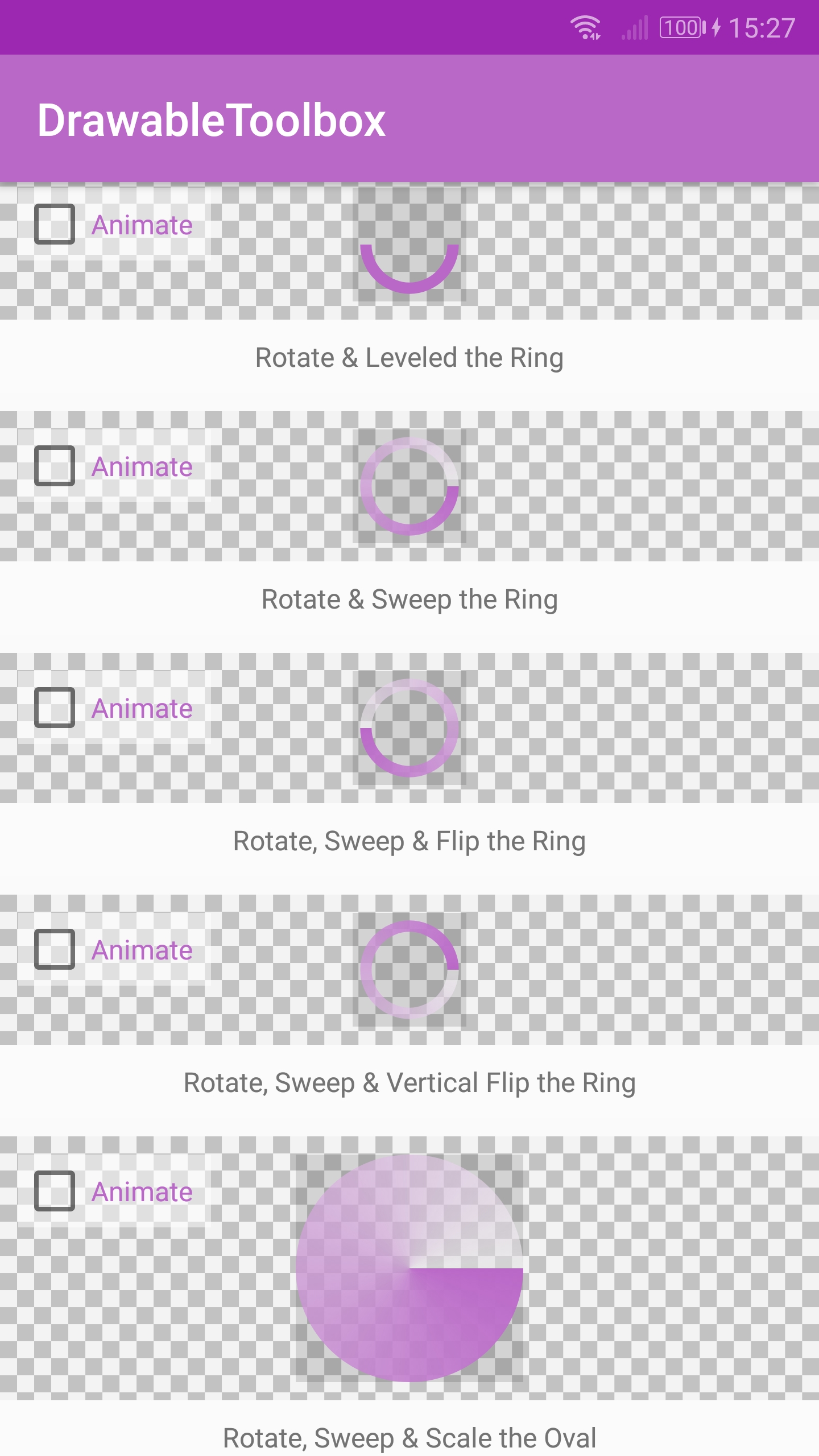
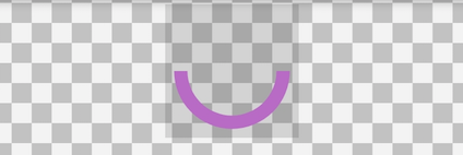
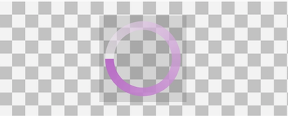
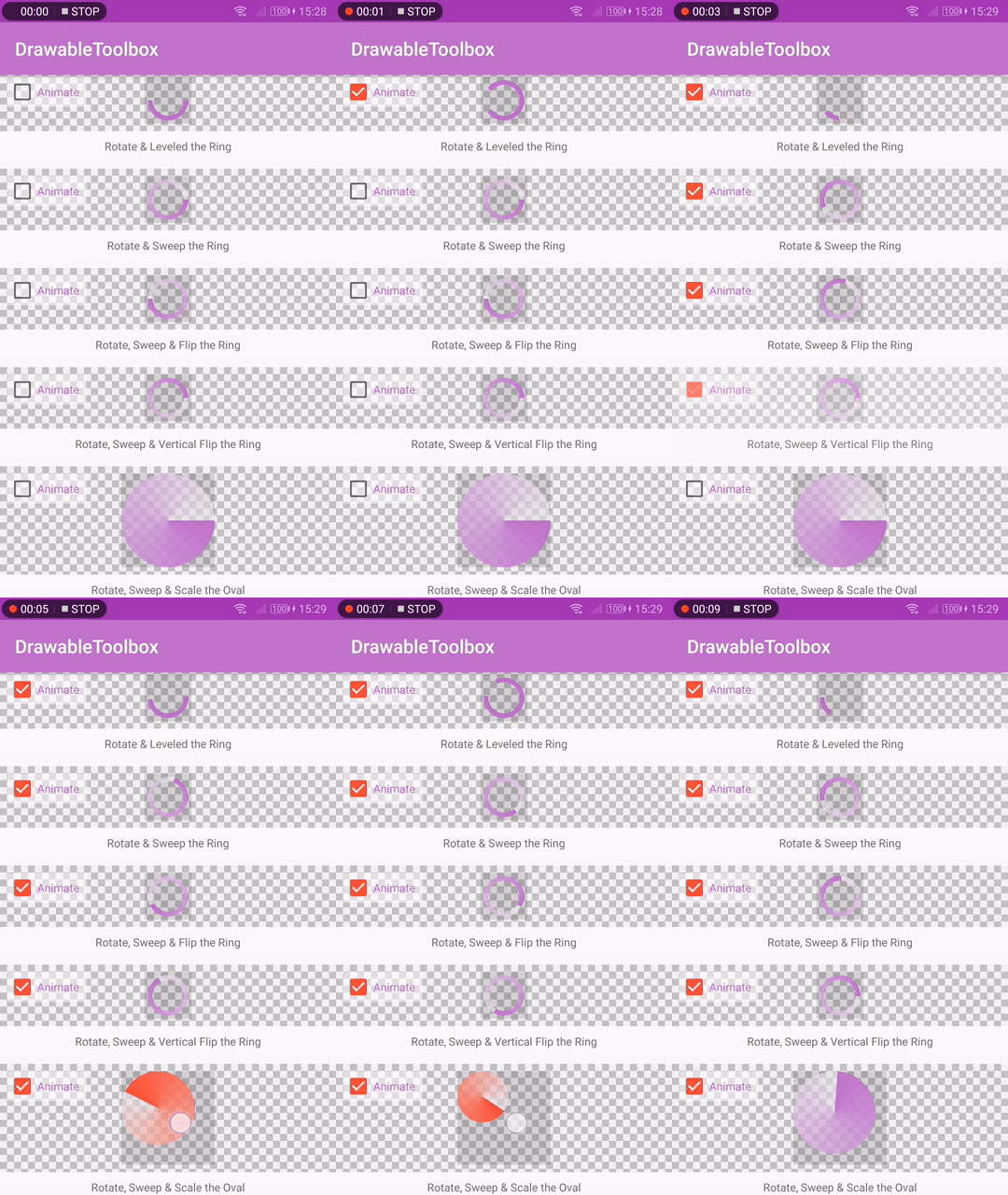
// Rotate & Leveled the Ring
DrawableBuilder()
.size(200)
.ring()
.useLevelForRing()
.solidColor(COLOR_DEFAULT)
.innerRadiusRatio(3f)
.thicknessRatio(10f)
.rotate(0f, 720f)
.build()
Result:
Code:
// Rotate, Sweep & Flip the Ring
DrawableBuilder()
.size(200)
.ring()
.innerRadiusRatio(3f)
.thicknessRatio(10f)
.gradient()
.sweepGradient()
.rotate(0f, 360f)
.flip()
.build()
Result:
Code:
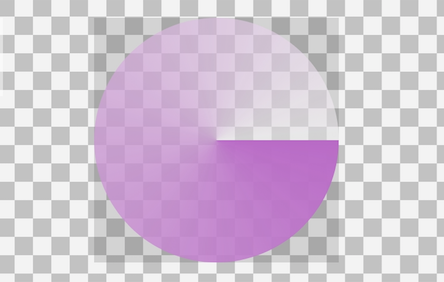
// Rotate, Sweep & Scale the Oval with States
val baseBuilder = DrawableBuilder()
.size(400)
.oval()
.gradient()
.sweepGradient()
.rotate(0f, 360f)
.scale(0.5f)
.scaleGravity(Gravity.START or Gravity.TOP)
val normalState = baseBuilder.build()
val pressedState = baseBuilder
.startColor(COLOR_PRESSED)
.endColor(0x7FFFFFFF)
.build()
StateListDrawableBuilder()
.normal(normalState)
.pressed(pressedState)
.build()
Result:
Please check out the app sample code SampleCodeSnippets.kt for more details.