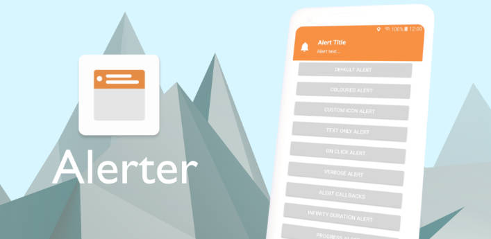
Alerter – An Android Alerter Library, now in Jetpack Compose!
This library aims to overcome the limitations of Toasts and Snackbars, while reducing the complexity of your layouts.
This library originated from Tapado Alerter and modified to make proper usage for Jetpack Compose.

General
With simplicity in mind, the Alerter employs the builder pattern to facilitate easy integration into any app. A customisable Alert View is dynamically added to the Decor View of the Window, overlaying all content.
Install
Include the JitPack.io Maven repo in your project’s build.gradle file
allprojects {
 repositories {
    maven { url "https://jitpack.io" }
 }
}
Then add this dependency to your app’s build.gradle file
dependencies {
    implementation 'com.github.akardas16:Alerter:1.0.6'
}
Usage
Basic Usage
 var showAlert by remember { mutableStateOf(false) }

 Alerter(isShown = showAlert, onChanged = {showAlert = it}) {

                //Your Custom Content

            }
- Use
modifier = Modifier.iconPulse()for icon pulse effect
Alerter with icon, title and message

 var showAlert by remember { mutableStateOf(false) }

 Alerter(isShown = showAlert, onChanged = {showAlert = it},
                backgroundColor = Color(0xFFF69346)) {
                Row(modifier = Modifier
                    .fillMaxWidth()
                    .fillMaxHeight(),
                    horizontalArrangement = Arrangement.Start,
                    verticalAlignment = Alignment.CenterVertically) {

                    Icon(imageVector = Icons.Rounded.Notifications, contentDescription = "",
                        tint = Color.White, modifier = Modifier.padding(start = 12.dp).iconPulse())

                    Column(modifier = Modifier.padding(horizontal = 12.dp)) {
                        Text(text = "Alert Title", color = Color.White, fontWeight = FontWeight.SemiBold, fontSize = 16.sp)
                        Text(text = "Alert text...", color = Color.White, fontSize = 14.sp)

                    }
                }
            }
backgroundColor = Color.Transparentwill seperate UI from status bar.- By default value is
backgroundColor = Color.Transparent(see below example)
Alerter with Coil image library

 var showAlert by remember { mutableStateOf(false) }

 Alerter(isShown = showAlert, onChanged = { showAlert = it }, backgroundColor = Color.Transparent) {

                Row(modifier = Modifier.fillMaxWidth().fillMaxHeight()
                        .background(Color(0xFFE2E1E1),shape = RoundedCornerShape(15.dp))
                        .padding(vertical = 16.dp),
                    horizontalArrangement = Arrangement.Start, verticalAlignment = Alignment.CenterVertically) {

                    //Coil
                    AsyncImage(model = "image url",
                        contentDescription = "person", contentScale = ContentScale.Crop,
                        modifier = Modifier.padding(start = 24.dp)
                            .size(48.dp).clip(CircleShape))

                    Column(modifier = Modifier.padding(horizontal = 12.dp)) {

                        Text(text = "Jane Clark",
                            color = Color.Black.copy(0.7f), fontWeight = FontWeight.SemiBold)

                        Text(text = "You have new message",
                            color = Color.Black.copy(0.7f), fontSize = 14.sp)

                    }

                }
            }

 var showAlert by remember { mutableStateOf(false) }

 Alerter(isShown = showAlert, onChanged = {showAlert = it}, backgroundColor = Color.Transparent) {

                Row(modifier = Modifier.fillMaxWidth().fillMaxHeight()
                    .background(Color(0xFF9499FF), shape = RoundedCornerShape(18.dp))
                    .padding(vertical = 16.dp),
                    horizontalArrangement = Arrangement.Start, verticalAlignment = Alignment.CenterVertically) {

                    Icon(painter = painterResource(id = R.drawable.gift_icon), contentDescription = "",
                        tint = Color.Unspecified, modifier = Modifier.padding(start = 24.dp).size(48.dp))

                    Column(modifier = Modifier.padding(horizontal = 12.dp)) {
                        Text(text = "Gift", color = Color.White, fontWeight = FontWeight.SemiBold)
                        Text(text = "Claim your gift!", color = Color.White, fontSize = 14.sp)
                    }

                    Spacer(modifier = Modifier.weight(1f))
                    Button(onClick = { showAlert4 = !showAlert4 },
                        shape = RoundedCornerShape(8.dp), colors = ButtonDefaults.buttonColors(
                            containerColor = Color(0xFF4C52C7), contentColor = Color.White),
                        modifier = Modifier.padding(end = 24.dp)) {
                        Text(text = "Claim")
                    }
                }
            }
- See available parameters
isShown: Boolean, onChanged: (isShown: Boolean) -> Unit,
  backgroundColor: Color = Color.Transparent, // background color of alerter
  duration:Long = 3000, // Alerter duration
  enableVibration:Boolean = true, // enable/disable vibration
  enableSwipeToDismiss:Boolean = false, // enable/disable swipe to dismiss
  disableOutsideTouch:Boolean = false,  // enable/disable outside touch of alert
  enableInfiniteDuration:Boolean = false, // enable/disable infinite duration
  gravity: Int = Gravity.TOP,  // change alerter gravity TOP, BOTTOM, CENTER
  content: @Composable () -> Unit,
Want to try library quickly?
- Paste
MainActivity.ktfile to your project and see Examples on preview (You may need drawable icons and Coil image library)