AvatarView
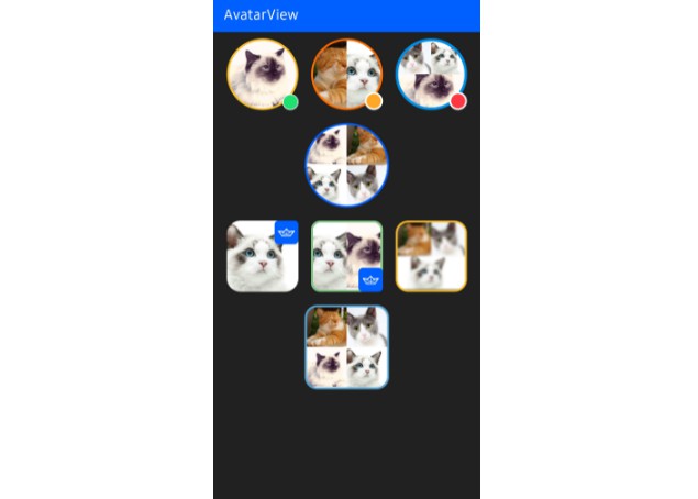
AvatarView supports loading profile images with segmented style, borders, indicators, and initials for Android.


Download
Gradle
Add the below codes to your root build.gradle file (not your module build.gradle file).
allprojects {
    repositories {
        mavenCentral()
    }
}
And add a dependency code to your module‘s build.gradle file.
dependencies {
    implementation "io.getstream.avatarview-coil:1.0.0"
}
Note: The
io.getstream.avatarview-coildependency includes Coil to load images internally. So if you’re using Coil in your project, please make sure you project is using the same Coil version or exclude Coil dependencies to adapt yours.
We’re highly recommend using AvatarView-Coil to load images. However, if you’d more prefer to use Glide, you can use AvatarView-Glide instead.
Usage
First, add the following XML namespace inside your XML layout file.
xmlns:app="http://schemas.android.com/apk/res-auto"
AvatarView in XML layout
You can customize AvatarView in your XML layout by setting attributes.
<io.getstream.avatarview.AvatarView
    android:layout_width="110dp"
    android:layout_height="110dp"
    app:avatarViewBorderColor="@color/yellow"
    app:avatarViewBorderWidth="3dp"
    app:avatarViewIndicatorBorderColor="@color/white"
    app:avatarViewIndicatorBorderSizeCriteria="10"
    app:avatarViewIndicatorColor="@color/md_green_100"
    app:avatarViewIndicatorEnabled="true"
    app:avatarViewIndicatorPosition="bottomRight"
    app:avatarViewIndicatorSizeCriteria="9"
    app:avatarViewInitialsTextStyle="bold"
    app:avatarViewShape="circle" />
Loading Single Image
You can load an image on your AvatarView by using the loadImage method as in the example below:
avatarView.loadImage(data)
The default supported data types are String, Uri, HttpUrl , File, DrawableRes, Drawable, and Bitmap.
You can also set a place holder and request listeners as in the example below:
avatarView.loadImage(
    data = data,
    placeholder = drawable,
    onStart = {
        // started requesting an image
    },
    onComplete = {
        // completed requesting an image
    }
)

Loading Segmented Style Image
AvatarView supports loading up to four images with the segmented style as in the example below:
avatarView.loadImage(
  data = listof(url1, url2, url3, url4)
)
We can set the maximum section size of the avatar when we load multiple images by using the avatarViewMaxSectionSize attribute as in the exmample below:
app:avatarViewMaxSectionSize="4"
The default value is 4, and you can set the segmentation styles on your taste.

PlaceHolder
We can set a placeholder to show a placeholder when loading an image as in the example below:
app:avatarViewPlaceholder="@drawable/stream"
Or we can set a drawable manually on the AvatarView.
avatarView.placeholder = drawable

ErrorPlaceHolder
We can set an error placeholder to show a placeholder when the request failed as in the example below:
app:avatarViewErrorPlaceholder="@drawable/stream"
Or we can set a drawable manually on the AvatarView.
avatarView.errorPlaceholder = drawable
Custom ImageRequest
You can customize the ImageRequest and provide information to load an image as in the example below:
avatarView.loadImage(
  data = data
) {
    crossfade(true)
    crossfade(300)
    transformations(CircleCropTransformation())
    lifecycle(this@MainActivity)
}

Drawing Initials
AvatarView supports drawing up to first two initials. You can draw and customize initials instead of loading an image on the AvatarView as in the example below:
<io.getstream.avatarview.AvatarView
    android:layout_width="110dp"
    android:layout_height="110dp"
    app:avatarViewInitials="AB"
    app:avatarViewInitialsBackgroundColor="@color/skyBlue"
    app:avatarViewInitialsTextColor="@color/white"
    app:avatarViewInitialsTextSize="21sp"
    app:avatarViewInitialsTextSizeRatio="0.33"
    app:avatarViewInitialsTextStyle="bold" />
AvatarCoil
The io.getstream.avatarview-coil dependency supports customizing the internal Coil that called AvatarCoil.
Custom ImageLoader
You can load images with your custom ImageLoader to load AvatarView by setting an ImageLoaderFactory on the AvatarCoil. Then all AvatarView will be loaded by the provided ImageLoader as in example the below:
AvatarCoil.setImageLoader(
    AvatarImageLoaderFactory(context) {
        crossfade(true)
        crossfade(400)
        okHttpClient {
            OkHttpClient.Builder()
                .cache(CoilUtils.createDefaultCache(context))
                .build()
        }
    }
)
Custom AvatarBitmapFactory
Loading custom Avatar bitmaps
Avatar bitmaps are created by the internal bitmap factory called AvatarBitmapFactory. However, you can override the image loading methods and provide your own bitmap loader like the example below:
Note: The
loadAvatarBitmapBlockingmethod takes precedence over this one if both are implemented.
AvatarCoil.setAvatarBitmapFactory(
    object : AvatarBitmapFactory(context) {
        override suspend fun loadAvatarBitmap(data: Any?): Bitmap? {
            return withContext(Dispatchers.IO) {
                val imageResult = context.imageLoader.execute(
                    ImageRequest.Builder(context)
                       .headers(AvatarCoil.imageHeadersProvider.getImageRequestHeaders().toHeaders())
                       .data(data)
                       .build()
                )
                (imageResult.drawable as? BitmapDrawable)?.bitmap
            }
        }
    }
)
If you don’t use coroutines, you can override loadAvatarBitmapBlocking method instead.
AvatarCoil.setAvatarBitmapFactory(
    object : AvatarBitmapFactory(context) {
        override fun loadAvatarBitmapBlocking(): Bitmap? {
            return // return your loaded Bitmap
        }
    }
)
Loading custom Avatar placeholder bitmaps
Basically, you can draw your placeholder drawable by setting the placeholder property on the AvatarView. However, you can provide your own bitmap loader by overriding the loadAvatarPlaceholderBitmap method like the example below:
Note: The
loadAvatarPlaceholderBitmapwill be executed if the previous image request failed. And theloadAvatarPlaceholderBitmapBlockingmethod takes precedence over this one if both are implemented.
AvatarCoil.setAvatarBitmapFactory(
    object : AvatarBitmapFactory(context) {
        override fun loadAvatarPlaceholderBitmap(): Bitmap? {
            return // return your loaded placeholder Bitmap
        }
    }
)
If you don’t use coroutines, you can override loadAvatarPlaceholderBitmapBlocking method instead like the example below:
AvatarCoil.setAvatarBitmapFactory(
    object : AvatarBitmapFactory(context) {
        override fun loadAvatarPlaceholderBitmapBlocking(): Bitmap? {
            return // return your loaded placeholder Bitmap
        }
    }
)
Custom ImageHeadersProvider
If you’re using your own CDN, you can set the imageHeadersProvider on AvatarCoil to load image data with your own header as in the example below:
AvatarCoil.imageHeadersProvider = yourImageHeadersProvider

Stream Integration
We’re highly recommend using the internal AvatarView in the Stream Chat SDK. However if you’d like to integrate this library with it, you can simply integrate with Stream Chat SDK by adding the below dependency:
dependencies {
    implementation "io.getstream.avatarview-stream-integration:$avatarview_version"
}
Next, you should set the StreamAvatarBitmapFactory on the AvatarCoil as in the below:
AvatarCoil.setAvatarBitmapFactory(StreamAvatarBitmapFactory(context))
Basically, it will load the image extra data of the User. But if there’s no valid image data, the initials by the name will be drawn.

Then you can set your User model to the AvatarView as in the example below:
val currentUser = ChatClient.instance().getCurrentUser()
avatarView.setUserData(currentUser)
Also, you can set your Channel model to the AvatarView as in the example below:
avatarView.setChannel(channel)
The channel image will be loaded. But if there is no valid channel image, an image composed of members will be loaded.
AvatarView Attributes
| Attributes | Type | Description |
|---|---|---|
| avatarViewBorderColor | color | AvatarView border color |
| avatarViewBorderRadius | dimension | AvatarView border radius |
| avatarViewBorderWidth | dimension | AvatarView Border width |
| avatarViewInitials | string | AvatarView initials to be drawn instead of an image |
| avatarViewInitialsTextSize | integer | AvatarView initials text size |
| avatarViewInitialsTextSizeRatio | float | AvatarView initials text size ratio following the width size |
| avatarViewInitialsTextColor | color | AvatarView initials text color |
| avatarViewInitialsBackgroundColor | color | AvatarView initials background color |
| avatarViewInitialsTextStyle | enum | AvatarView initials text style |
| avatarViewShape | enum | AvatarView shapes |
| avatarViewIndicatorEnabled | boolean | Sets the visibility of the indicator |
| avatarViewIndicatorPosition | enum | Sets the position of the indicator |
| avatarViewIndicatorColor | color | Color of the indicator |
| avatarViewIndicatorBorderColor | color | Border color of the indicator |
| avatarViewIndicatorSizeCriteria | float | Size criteria of the indicator |
| avatarViewIndicatorBorderSizeCriteria | float | Border Size criteria of the indicator |
| avatarViewSupportRtlEnabled | boolean | Supports RTL layout is enabled or not |
| avatarViewMaxSectionSize | enum | The maximum section size of the avatar when loading multiple images |
| avatarViewPlaceholder | Drawable | A placeholder that should be shown when loading an image |
| avatarViewErrorPlaceholder | Drawable | An error placeholder that should be shown when request failed |

Find this library useful? ❤️
Support it by joining stargazers for this repository. ⭐
Also follow Stream on Twitter for our next creations!
License
Copyright 2021 Stream.IO, Inc. All Rights Reserved.

Licensed under the Apache License, Version 2.0 (the "License");
you may not use this file except in compliance with the License.
You may obtain a copy of the License at

   http://www.apache.org/licenses/LICENSE-2.0

Unless required by applicable law or agreed to in writing, software
distributed under the License is distributed on an "AS IS" BASIS,
WITHOUT WARRANTIES OR CONDITIONS OF ANY KIND, either express or implied.
See the License for the specific language governing permissions and
limitations under the License.