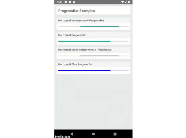
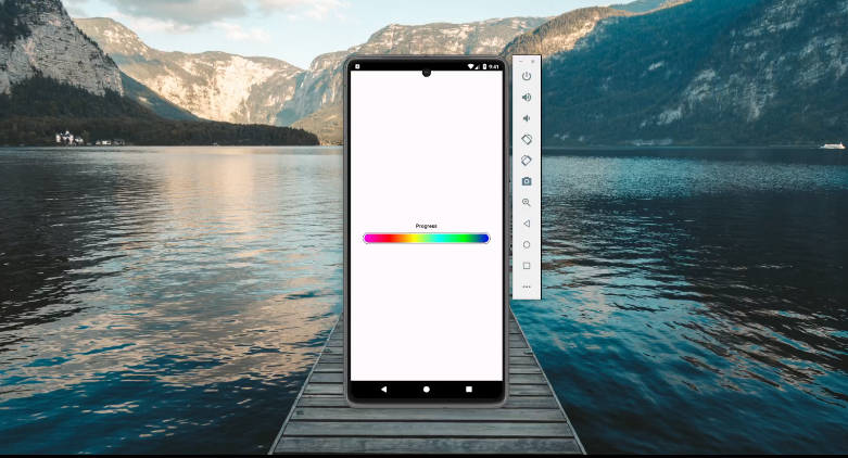
@react-native-community/progress-bar-android
ProgressBar Component for react-native Android.
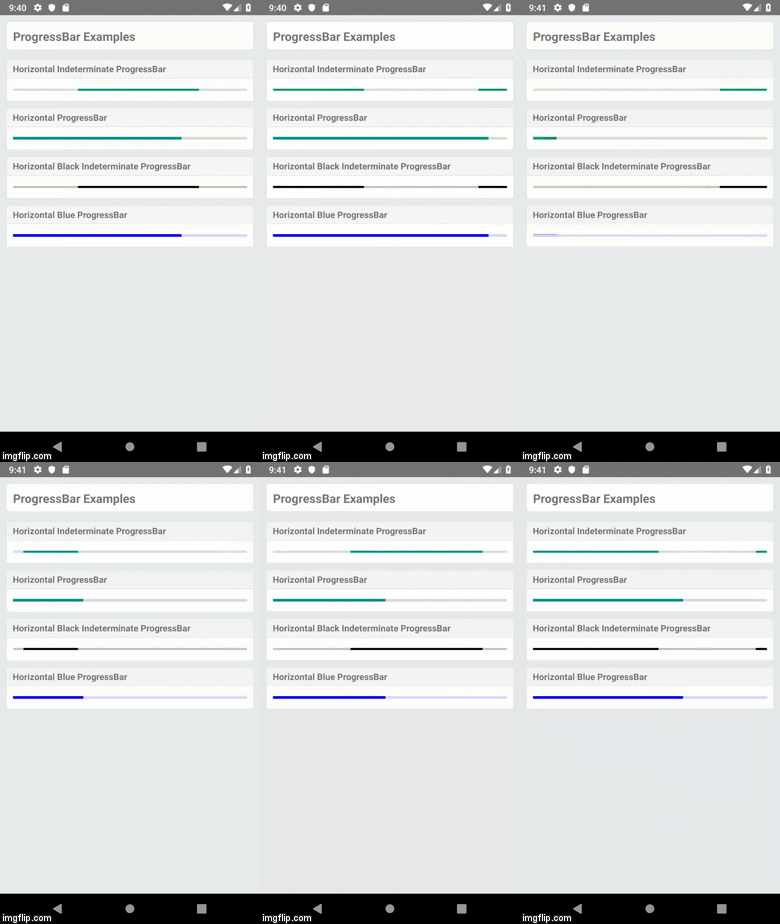
Getting started
npm install @react-native-community/progress-bar-android --save

# or

yarn add @react-native-community/progress-bar-android
Linking
- React Native 0.60+
The package is automatically linked when building the app. All you need to do is:
npx pod-install
- React Native <= 0.59
Run the following commands
$ react-native link @react-native-community/progress-bar-android
Manual installation
Manually linking the library - iOS
- In XCode, in the project navigator, right click
Libraries➜Add Files to [your project's name] - Go to
node_modules➜@react-native-community/progress-bar-androidand addRNCProgressBar.xcodeproj - In XCode, in the project navigator, select your project. Add
libRNCProgressBar.ato your project'sBuild Phases➜Link Binary With Libraries - Run your project (
Cmd+R)
Manually link the library - android
- Open up
android/app/src/main/java/[...]/MainActivity.java
- Add
import com.reactnativecommunity.androidprogressbar.RNCProgressBarPackage;to the imports at the top of the file - Add
new RNCProgressBarPackage()to the list returned by thegetPackages()method
- Append the following lines to
android/settings.gradle:include ':@react-native-community_progress-bar-android' project(':@react-native-community_progress-bar-android').projectDir = new File(rootProject.projectDir, '../../node_modules/@react-native-community/progress-bar-android/android') - Insert the following lines inside the dependencies block in
android/app/build.gradle:implementation project(':@react-native-community_progress-bar-android')
Trying out this package in example
Android
- Install dependencies
- Install dependencies for example folder
- Start the metro bundler
- Build the application
Example
Reference
Props
Inherits View Props.
animating
Whether to show the ProgressBar (true, the default) or hide it (false).
| Type | Required |
|---|---|
| bool | No |
color
Color of the progress bar.
| Type | Required |
|---|---|
| color | No |
indeterminate
If the progress bar will show indeterminate progress. Note that this can only be false if styleAttr is Horizontal, and requires a progress value.
| Type | Required |
|---|---|
| indeterminateType | No |
progress
The progress value (between 0 and 1).
| Type | Required |
|---|---|
| number | No |
styleAttr
Style of the ProgressBar. One of:
- Horizontal
- Normal (default)
- Small
- Large
- Inverse
- SmallInverse
- LargeInverse
| Type | Required |
|---|---|
| enum('Horizontal', 'Normal', 'Small', 'Large', 'Inverse', 'SmallInverse', 'LargeInverse') | No |
testID
Used to locate this view in end-to-end tests.
| Type | Required |
|---|---|
| string | No |
