Mag Otp


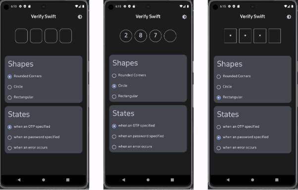
Screenshots


How to integrate into your app?
Integrating the project is simple. All you need to do is follow the below steps
Step 1. Add the JitPack repository to your build file. Add it in your root build.gradle at the end of repositories:
allprojects {
  repositories {
    ...
    maven { url "https://jitpack.io" }
  }
}
Step 2. Add the dependency
dependencies {
    implementation 'com.github.magneto3572:Magotp:release_version'
}
Step 3. After Adding the Dependency, All you need to add OTP composable
a. Use Otp filled for Otp type where you want to set custom background drawable

 OtpComposableFilled(
            heightInDP = 50.dp,
            widthInDp = 50.dp,
            backgroundColor = Color.Transparent,
            cornerRadius =8.dp ,
            passwordToggle = false,
            automaticCapture = true,
            arrangement = Arrangement.SpaceEvenly,
            backgroundDrawable = R.drawable.ic_rectangle_background,
            modifier = Modifier.fillMaxWidth())
        {
            Log.d("LogTag", it.toString())
        }

 b. Use Otp outline composable for otp type where you want focus and unfocus border

  OtpComposableOutlined(
            widthInDp = 50.dp,
            heightInDp = 50.dp,
            backgroundColor = Color.Transparent,
            passwordToggle = false,
            focusColor = Color.Green,
            unfocusColor = Color.DarkGray,
            modifier = Modifier.fillMaxWidth())
            cornerRadius = 8.dp,)
            {
                Log.d("LogTag", it.toString())
            }
Features and property
Automatic Otp capture(Default false) :-
- automaticCapture = true, // True when you want to detect otp automatically with user consent
- automaticCapture = false, // By default it is false
Size :-
- widthInDp = 50.dp, // Size in dp for otp box size
- heightinDp = 50.dp, // Size in dp for otp box size
Color :-
1.backgroundColor = Color.Transparent, // for transparent background else your color choice for box background 2.focusColor = Color.Green, // border Color when user on active box 3.unfocusColor = Color.DarkGray, // border Color when user not on active box
Password Toggle :-
- passwordToggle = false, // if you want to display digit on box
- passwordToggle = true, // if you want to display dot in box for privacy
Modifier :-
- modifier = Modifier.fillMaxWidth()) //Parent Row modfier
Arrangment :-
1.arrangement = Arrangement.SpaceEvenly, // Arrangement in parent row
Corner Radius :-
1.cornerRadius = 8.dp // Border radius for OTP box
OnvalueChange:-
- Return the string when the all the box is filled
OTP composable Type :-
- otpComposableType = ComposableType.TYPE_FOUR // When you want otp composable with four boxes
- otpComposableType = ComposableType.TYPE_SIX // When you want otp composable with six boxes