Compose Material Context Menus
Implementation of context (right-click) menus for Compose Mutliplatform.
 |
 |
|---|---|
 |
 |
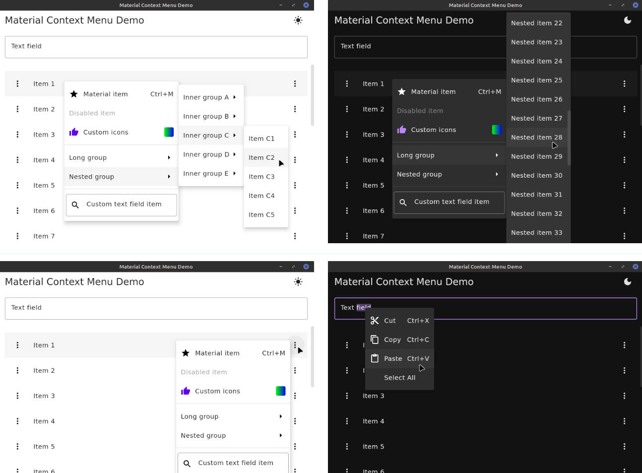
Features
This library is built on top of Compose
Multiplatform’s context menu API
as an alternate ContextMenuRepresentation. In addition to Compose’s functionality, this library
adds:
- Customizable theming, by default compliant with Material 2/3 menus
- Material menu items with icons, enabled/disabled states, and keyboard shortcuts
- Dividers
- Nested sub-menus (see known issues)
- Custom
@Composableitem content - Scroll bars when menu is larger than the window
- Context menus in overflow (triple-dot) buttons
This repository includes a simple demo application to play with the library. Run
with ./gradlew :demo:run.
Known issues
- Important: Menus are immediately closed if a menu group item is clicked. I don’t recommend using groups until this issue is fixed.
- Dropdown height extends slightly beyond the window size if the menu is larger than the window.
Usage
Add the dependency to your project (ensuring that the mavenCentral() repository is included):
implementation("io.github.dzirbel:compose-material-context-menu:0.1.0")
See the :demo project in this repository for usage examples.
Application
Supply a MaterialContextMenuRepresentation as the LocalContextMenuRepresentation at the root of
your application’s composition:
// apply the MaterialTheme first to use its colors in the MaterialContextMenuRepresentation
MaterialTheme(colors = colors) {
    CompositionLocalProvider(
        LocalContextMenuRepresentation provides MaterialContextMenuRepresentation(),
        // optional: use Material text field context menu items, with icons and keyboard shortcuts
        LocalTextContextMenu provides MaterialTextContextMenu,
    ) {
        // application content
    }
}
Styling (dimensions, colors, etc) of the menus can be customized by providing measurements,
colors, etc to MaterialContextMenuRepresentation().
Context menus are created as in the
context menu API,
i.e. with a ContextMenuArea() wrapping the right-clickable content.
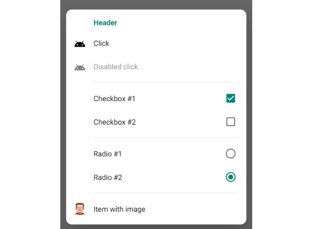
Item types
In addition to the standard ContextMenuItem, this library adds:
MaterialContextMenuItem: an augmented menu item with optionalenabledstate andleadingIcon/trailingIcon- Icons are provided in the
ContextMenuIconinterface, and support icons fromPainter, resource path,ImageVector, orImageBitmap - Icons may also be any generic
@Composablecontent or a list ofContextMenuShortcuts representing keyboard shortcuts
- Icons are provided in the
ContextMenuGroup: a group of menu items, displayed as a nested menu on hoverContextMenuDivider: a divider line between itemsCustomContentContextMenuItem: a menu item with custom@Composablecontent, with standard styling (clickable, etc) appliedGenericContextMenuItem: a menu item with custom@Composablecontent and no standard styling applied
Overflow button
To show context menus with a left-click on an overflow button, this library also provides a
standalone ContextMenuOverflowButton() composable.