NumberPadTimePicker
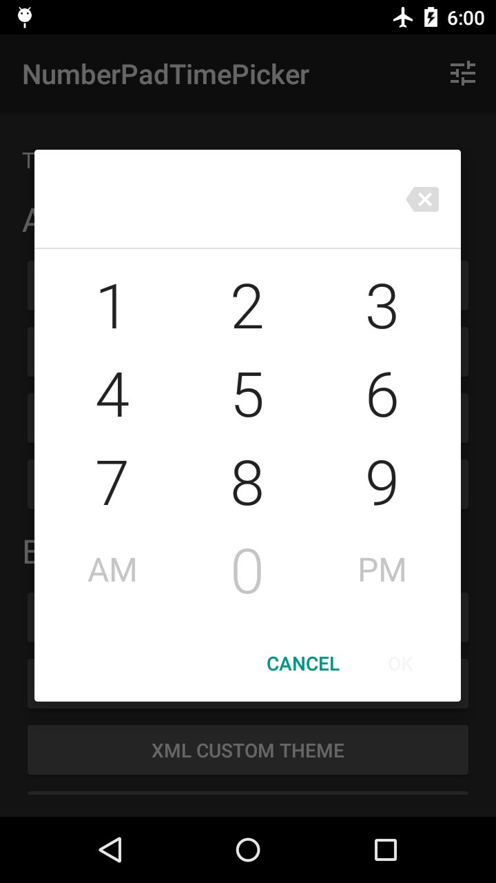
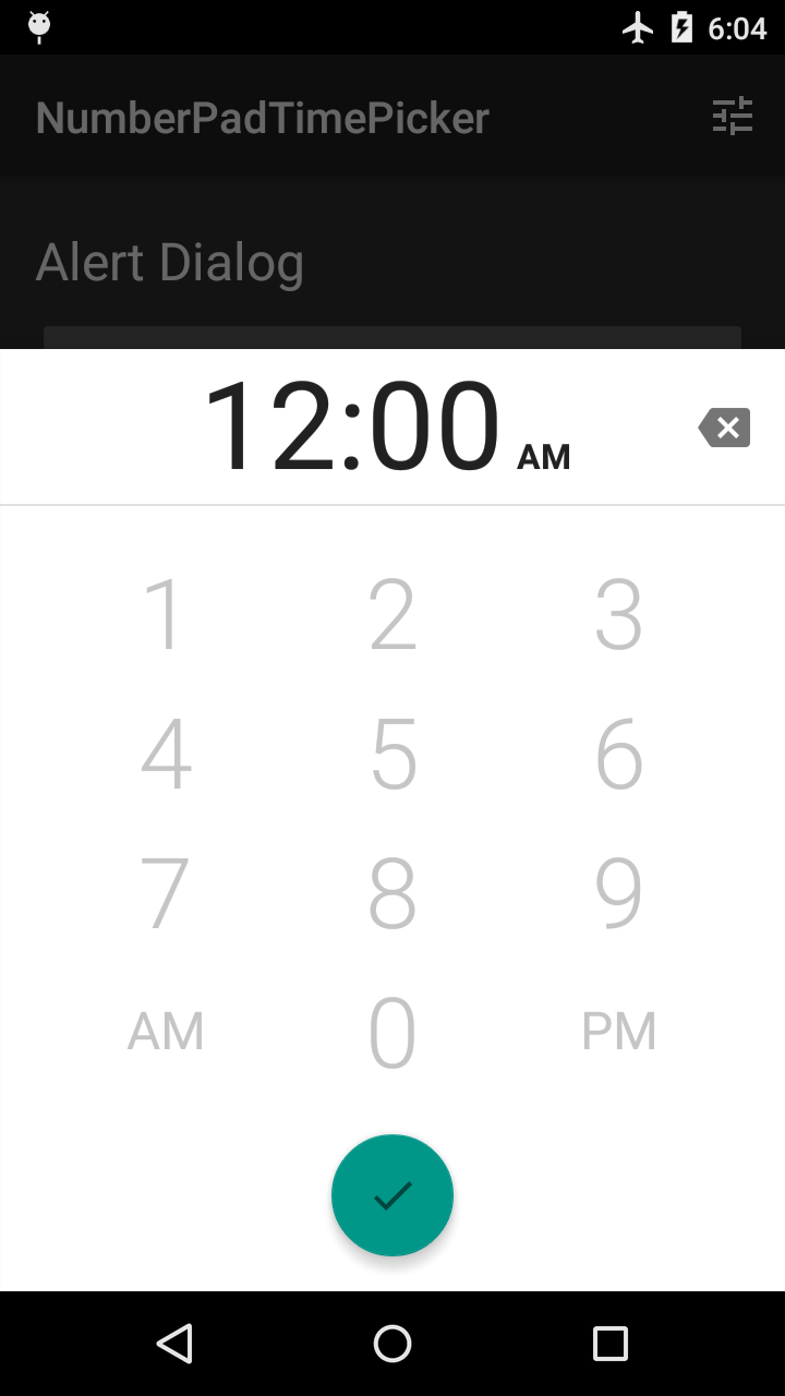
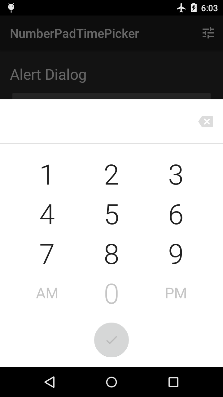
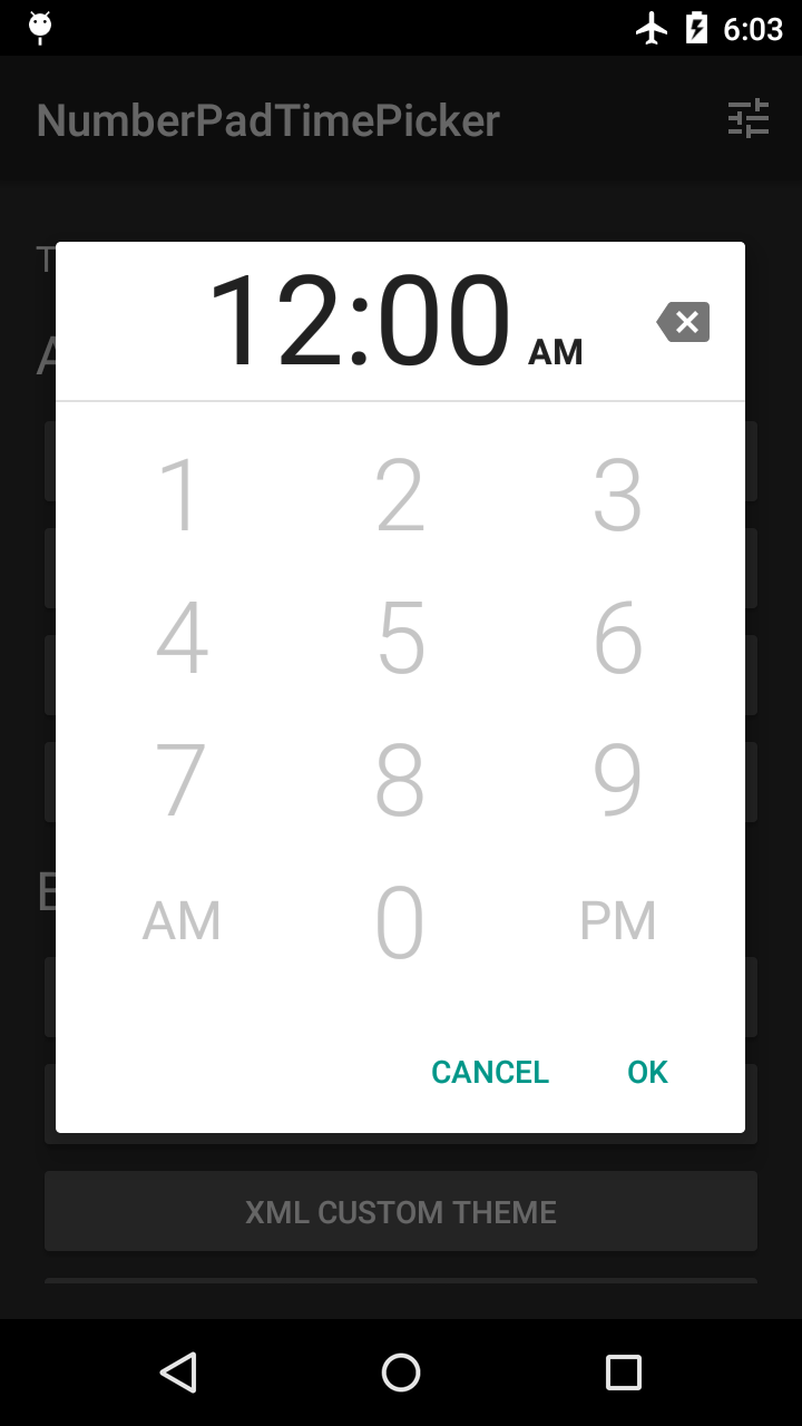
As you type or remove digits, number keys and the "OK" button are enabled or disabled to prevent you from setting invalid times. The time separator (e.g. ":") character is dynamically formatted into the correct position.
Available as an alert dialog, a bottom sheet dialog, and as a plain View.
Sample App
The sample app demos some built-in themes. You can also dynamically customize your own theme with a
limited color palette.
Installation
Usage
Use as Dialog
Implement the android.app.TimePickerDialog.OnTimeSetListener interface.
Obtain an instance of NumberPadTimePickerDialog or BottomSheetNumberPadTimePickerDialog.
You may pass in an optional style resource to use as the dialog's theme. Alternatively, you can
theme the dialog programmatically after you've obtained an instance. See Themes and Styles for a
guide to styling the dialog.
If you want to use the dialog in a DialogFragment, use the support library's
android.support.v4.app.DialogFragment. See the Pickers guide for more information.
Use as View
Using
NumberPadTimePickeras aViewrequires more care to ensure it is sized appropriately
in your layouts. As of version 1.1.0,NumberPadTimePickeris not optimized for small screen
heights (for example, in landscape). If you are affected by this, you'll need to account for this
in a way that is appropriate for your use case.
Add a NumberPadTimePicker to your layout like any other View. However, by itself, it is not
very useful as a widget for time input.
Define an OK Button
For a NumberPadTimePicker to actually be useful for time input, you need to define an "OK"
button somewhere in your screen. For example, this can be a View in your layout or a
MenuItem in your app bar.
For your convenience, this library provides ready-to-use "OK" buttons you can add to the
NumberPadTimePicker instead of defining your own. These are the same buttons that are used
in the dialogs.
In your XML layout, specify the nptp_numberPadTimePickerLayout attribute on your
NumberPadTimePicker with one of these values:
Table 1. Values for the nptp_numberPadTimePickerLayout attribute
| Value | Description |
|---|---|
| standalone | The default value. No additional views will be added to the NumberPadTimePicker. |
| alert | Adds alert-style action buttons ("Cancel", "OK") to the NumberPadTimePicker. |
| bottomSheet | Adds a FloatingActionButton to the NumberPadTimePicker. |
Register OK Button Callbacks
If you are using the alert layout, you may also want to set a click listener on the provided
cancel button:
Themes and Styles
This section describes how to style the NumberPadTimePicker view, which is used in the dialogs
and is available to use in your own layouts.
You can style the view in XML or in code.
NumberPadTimePickerDialog, BottomSheetNumberPadTimePickerDialog, and the
NumberPadTimePicker view all have a method called getThemer(). This returns an object allowing
you to theme the time picker in code by chaining setters.
There are two return types to be aware of: NumberPadTimePickerThemer and
BottomSheetNumberPadTimePickerThemer.
NumberPadTimePickerDialogreturns aNumberPadTimePickerThemer.BottomSheetNumberPadTimePickerDialogreturns aBottomSheetNumberPadTimePickerThemer.NumberPadTimePickerreturns aNumberPadTimePickerThemer, which can possibly be
casted toBottomSheetNumberPadTimePickerThemer.
The following table lists styleable attributes available in all layouts. These correspond
to setters in NumberPadTimePickerThemer.
Table 2. Common styleable attributes
| Attribute | Description |
|---|---|
| nptp_numberPadTimePickerLayout | Determines the presence and appearance of additional dialog buttons. See Table 1 for possible values. |
| nptp_inputTimeTextColor | Text color for the inputted time in the header. |
| nptp_inputAmPmTextColor | Text color for the inputted AM/PM in the header. |
| nptp_backspaceTint | Tint to apply to the backspace icon. This should be a color state list with enabled and disabled states. |
| nptp_numberKeysTextColor | Text color for the number keys. This should be a color state list with enabled and disabled states. |
| nptp_altKeysTextColor | Text color for the "AM"/"PM" keys in 12-hour mode or the ":00"/":30" keys in 24-hour mode. This should be a color state list with enabled and disabled states. |
| nptp_headerBackground | Background of the header containing the inputted time and AM/PM. This can be a color or a drawable. |
| nptp_divider | Divider separating the header from the number pad. This can be a color or a drawable. |
| nptp_numberPadBackground | Background of the number pad. This can be a color or a drawable. |
| nptp_is24HourMode | Whether the number pad should use 24-hour mode. |
The following table lists styleable attributes available only for the bottomSheet layout.
These correspond to setters in BottomSheetNumberPadTimePickerThemer.
Table 3. Bottom sheet styleable attributes
| Attribute | Description |
|---|---|
| nptp_fabBackgroundColor | Background color of the FloatingActionButton. This should be a color state list with enabled and disabled states. |
| nptp_animateFabBackgroundColor | Whether the FloatingActionButton should transition between its enabled and disabled colors. Does not apply if nptp_showFab is set to validTime. |
| nptp_fabRippleColor | Ripple color of the FloatingActionButton when pressed. |
| nptp_animateFabIn | Whether the FloatingActionButton should animate onto the screen when the dialog is shown. Does not apply if nptp_showFab is set to validTime. |
| nptp_showFab | Indicates when the FloatingActionButton should be shown. Either always or validTime. |
| nptp_backspaceLocation | Location of the backspace key. Either header or footer. |
| nptp_fabIconTint | Tint to apply to the icon in the FloatingActionButton. This should be a color state list with enabled and disabled states. |
If you are using NumberPadTimePicker in your own layouts, you may find it convenient to specify
one of the following styles. These styles adjust layout_width and layout_height for multiple
size qualifiers.
NPTP_NumberPadTimePickerStandaloneStyle_FillHeightNPTP_NumberPadTimePickerStandaloneStyle_ExactHeightNPTP_NumberPadTimePickerAlertStyle_FillHeightNPTP_NumberPadTimePickerAlertStyle_ExactHeightNPTP_NumberPadTimePickerBottomSheetStyle_FillHeightNPTP_NumberPadTimePickerBottomSheetStyle_ExactHeight
You can create a theme for a dialog or Activity that uses NumberPadTimePicker.
Create a style resource using the attributes in Table 2 and Table 3. There are default
style resources that you may inherit from:
NPTP_Base_NumberPadTimePickerStandaloneStyleNPTP_Base_NumberPadTimePickerAlertStyleNPTP_Base_NumberPadTimePickerBottomSheetStyle
Set this style resource in your theme using the nptp_numberPadTimePickerStyle attribute.
Obtain an instance of the dialog as described in Use as Dialog. If you don't want to pass
the theme to the dialog's constructor, you can instead specify it in your Activity's theme.