LazyGrid
LazyGrid library for Jetpack Compose.
About
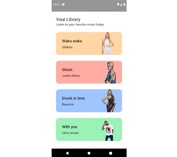
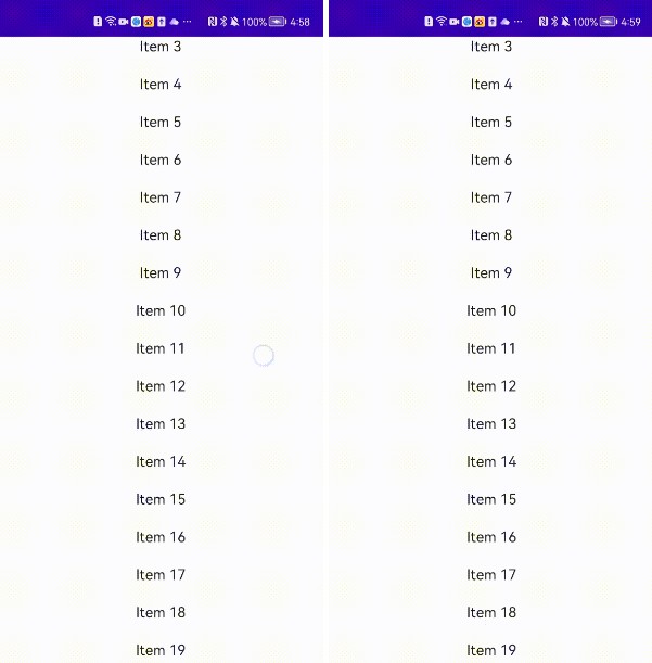
LazyGrid is a grid view implementation for Android’s new and modern UI toolkit Compose. This library is suitable for to display large amount of data, it’ll only compose the rows which are visible in the component’s viewport. It can be used in a LazyColumn to create a grid view.
LazyCollapsibleGrid version has the ability to collapse desired amount of rows with animations. It has some extra parameters but is also lazy and suitable for to display big data.
Metrics
Metrics is the way of measuring the performance of composables. Ideally a composable method should be restartable and skipabble for the compiler to work with best performance. Besides being lazy, LazyGrid and LazyCollapsibleGrid are also restartable and skipabble for better performance for your Android application.
Demo
FillSize
All items of row shares the full width equally without any spaces.
| LazyGrid | LazyCollapsibleGrid |
|---|---|
 |
 |
FixedSize
Items placed with a fixed width and spaced equally according to remaining space.
| LazyGrid | LazyCollapsibleGrid |
|---|---|
 |
 |
SpacedBy
Items spaced by a fixed space and share the remaining width equally.
| LazyGrid | LazyCollapsibleGrid |
|---|---|
 |
 |
Setup
Gradle
allprojects {
    repositories {
        maven { url 'https://jitpack.io' }
    }
}

dependencies {
    implementation 'com.github.yusufarisoy:lazy-grid:1.0.0'
}
Composable
LazyColumn(modifier = Modifier.fillMaxSize()) {
    LazyGrid(
        rows = listOf(),
        elementPerRow = 4,
        itemPlacementType = ItemPlacementType.FixedSize(itemWidth = 80.dp),
        contentPadding = PaddingValues(horizontal = 16.dp)
    ) { item, modifier ->
        CustomGridItem(item, modifier)
    }

    // Collapsible
    var isExpanded by remember { mutableStateOf(false) }

    LazyCollapsibleGrid(
        rows = listOf(),
        collapsibleRows = listOf(),
        elementPerRow = 3,
        itemPlacementType = ItemPlacementType.SpacedBy(space = 16.dp),
        contentPadding = PaddingValues(horizontal = 16.dp),
        isExpanded = isExpanded,
        enterTransition = expandVertically(),
        exitTransition = shrinkVertically(),
        collapseButton = { CustomCollapseButton(onClick = { isExpanded = !isExpanded }) }
    ) { item, modifier ->
        CustomGridItem(item, modifier)
    }
}


