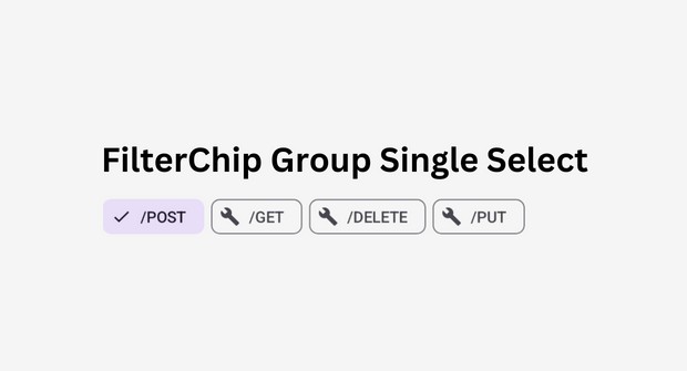
FilterChipGroup-Compose-Android
How to Create FilterChipGroup step-by-step:
-
Define the
FilterChipGroupfunction with parameters:items: A list of strings representing the filter chip labels.defaultSelectedItemIndex: Index of the initially selected item.selectedItemIcon: Representing the icon for the selected item (Optional).itemIcon:Representing the icon for unselected items (Optional).onSelectedChanged: A callback function to be called when the selected item changes, passing the selected index.
Example:
@Composable
fun FilterChipGroup(
    items: List<String>,
    defaultSelectedItemIndex: Int = 0,
    selectedItemIcon: ImageVector = Icons.Filled.Done,
    itemIcon: ImageVector = Icons.Filled.Build,
    onSelectedChanged: (Int) -> Unit = {}
)
-
Create a
selectedItemIndexmutableState to store the currently selected item index. Initialize it with thedefaultSelectedItemIndex.var selectedItemIndex by remember { mutableStateOf(defaultSelectedItemIndex) } -
Create a
LazyRowto display the filter chips horizontally and allow scrolling and createFilterChipsfor all items in theitemslist.LazyRow(userScrollEnabled = true) { items(items.size) { index: Int -> } }
-
Inside the loop, create a
FilterChip:FilterChip( modifier = Modifier.padding(end = 6.dp), selected = items[selectedItemIndex] == items[index], onClick = { selectedItemIndex = index onSelectedChanged(index) }, label = { Text(items[index]) }, leadingIcon = if (items[selectedItemIndex] == items[index]) { { Icon( imageVector = selectedItemIcon, contentDescription = "Localized Description", modifier = Modifier.size(FilterChipDefaults.IconSize) ) } } else { { Icon( imageVector = itemIcon, contentDescription = "Localized description", modifier = Modifier.size(FilterChipDefaults.IconSize) ) } } )
I hope you understand the step-by-step procedure for creating the FilterChipGroup Composable. You can use this function to create a scrollable list of filter chips that can be used as RadioButton with customizable icons and a callback that returns selectedItemIndex for when the selected item changes.


