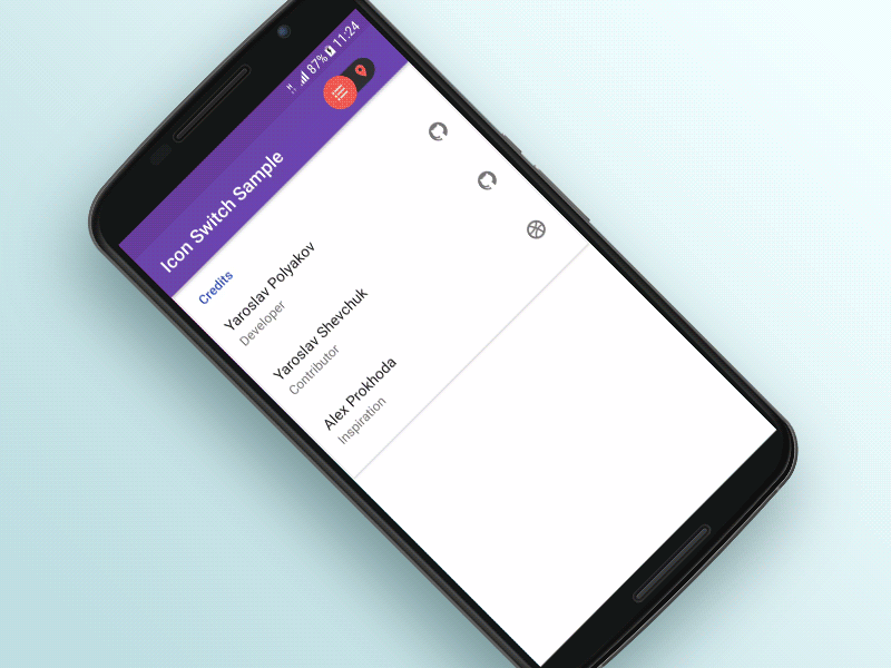
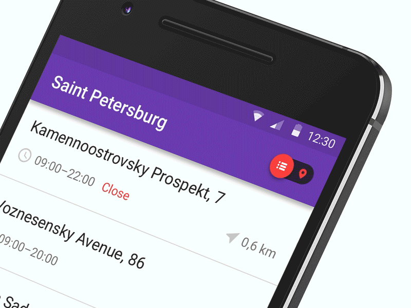
IconSwitch

Switcher in the toolbar changes list view to map view.

3J8gYHy

map_to_list

Gradle

Add this into your dependencies block.

compile 'com.polyak:icon-switch:1.0.0'

Sample

Please see the sample app for a library usage example.

Wiki

Usage:

Simply add an IconSwitch to your view hieararchy. Either programatically or using xml:

<com.polyak.iconswitch.IconSwitch
  android:id="@+id/icon_switch"
  android:layout_width="wrap_content"
  android:layout_height="wrap_content"
  app:isw_icon_left="@drawable/ic_format_list_bulleted_white_18dp"
  app:isw_icon_right="@drawable/ic_location_on_white_18dp" />

API

General

Size of the widget is controlled by the attribute:

<com.polyak.iconswitch.IconSwitch
  android:isw_icon_size="@dimen/your_size" />

Default selection can be set using:

<com.polyak.iconswitch.IconSwitch
  android:isw_default_selection="left|right" />

To control the current state or get information about it, use:

iconSwitch.setChecked();
iconSwitch.getChecked();
iconSwitch.toggle();

Color

To customize colors of the widget, you can use the following self-explanatory attributes:

<com.polyak.iconswitch.IconSwitch
  app:isw_background_color="#fff"
  app:isw_thumb_color_left="#fff"
  app:isw_thumb_color_right="#fff"
  app:isw_inactive_tint_icon_left="#fff"
  app:isw_inactive_tint_icon_right="#fff"
  app:isw_active_tint_icon_left="#fff"
  app:isw_active_tint_icon_right="#fff" />

or setter-methods:

iconSwitch.setBackgroundColor(color);
iconSwitch.setThumbColorLeft(color);
iconSwitch.setThumbColorRight(color);
iconSwitch.setActiveTintIconLeft(color);
iconSwitch.setInactiveTintIconLeft(color);
iconSwitch.setActiveTintIconRight(color);
iconSwitch.setInactiveTintIconRight(color);

Callback

To listen for the check changed events use:

iconSwitch.setCheckedChangeListener(listener);

public interface CheckedChangeListener {
  void onCheckChanged(Checked current);
}

enum Checked { LEFT, RIGHT }

GitHub