
ComposePrefs3
This is the M3 version of ComposePrefs. The M2 version can be found here.
ComposePrefs3 is a preferences library for Jetpack Compose which makes it easy to implement preferences/settings in your Compose Android app. Preferences are created and positioned using an intuitive and easy to use API which follows a similar design to the existing Material3 Composables. ComposePrefs3 uses DataStore to store the actual preference data.
This repository provides a sample application in which creation and use of each preference composable is demonstrated. The main settings screen can be found here .
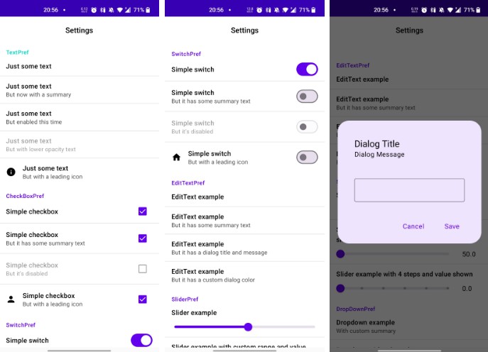
Screenshots of this sample app


Currently supported preference composables
- TextPref: Basic preference which only displays text and can be clicked on.
- CheckBoxPref: Preference with a trailing CheckBox which can be (un)checked.
- SwitchPref: Preference with a trailing Switch which can be (un)checked.
- EditTextPref: Preference which opens a TextField in a dialog for textual user input.
- SliderPref: Preference which displays a Slider to allow for inline numerical user input.
- DropDownPref: Preference which shows entries in a dropdown menu and allows for user selection.
- ListPref: Preference which opens a list of items in a dialog from which the user can select a single entry.
- MultiSelectListPref: Preference which opens a list of items in a dialog from which the user can select multiple entries at once.
There is also support for Groups/Categories which can be created using the prefsGroup function.
Usage is shown below.
Usage
First create a DataStore, for example in your MainActivity.kt:
val Context.dataStore: DataStore<Preferences> by preferencesDataStore(name = "settings")
Next in your actual Preferences/Settings screen, you can create a PrefScreen and pass in your DataStore as you would any other Composable:
PrefsScreen(dataStore = LocalContext.current.dataStore) {
    ..
}
Within the PrefsScreen, you can add individual preference items using prefsItem or add a group
with prefsGroup:
prefsItem { TextPref(title = "Just some text", summary = "Here is some summary text") }


prefsGroup("Custom Group") {
    prefsItem { CheckBoxPref(key = "cb1", title = "Simple checkbox 1") }
    prefsItem { TextPref(title = "Just some text", summary = "Here is some summary text") }
    prefsItem { SwitchPref(key = "sw1", title = "Simple switch 1") }
}
The GroupHeader composable is used to provide the title text of each category. If you’re happy
with the default look you can just provide the text as the first parameter to prefsGroup.
There also exists another overload of prefsGroup where the GroupHeader can be passed in
directly. Currently, the only other parameter GroupHeader supports is text color.
prefsGroup({
    GroupHeader(
        title = "Custom Group",
        color = MaterialTheme.colors.secondary
    )
}) {
    ..
}
Composables
Each preference composable excluding TextPref has a mandatory key parameter. This is the key
that will be used in the DataStore and is equivalent to the key used in previous Android
preference libraries.
You should be using unique keys for each preference. Using the same key for different preferences of the same type will result in their values being the same. Using the same key for different preferences of different types may result in unexpected behaviour.
TextPref
TextPref(title = "Just some text", summary = "But now with a summary")
CheckBoxPref
CheckBoxPref(
    key = "cb1",
    title = "Simple checkbox",
    summary = "But with a leading icon and summary",
    leadingIcon = { Icon(Icons.Filled.Person, "Person") }
)
SwitchPref
SwitchPref(
    key = "sw4",
    title = "Simple switch",
    summary = "But with a leading icon and summary",
    leadingIcon = { Icon(Icons.Filled.Home, "Home") }
)
EditTextPref
EditTextPref(
    key = "et1",
    title = "EditText example",
    summary = "But it has a dialog title and message",
    dialogTitle = "Dialog Title",
    dialogMessage = "Dialog Message"
)
SliderPref
SliderPref(
    key = "sp1",
    title = "Slider example with custom range and value shown on side",
    valueRange = 50f..200f,
    showValue = true
)
DropDownPref
DropDownPref(
    key = "dd1",
    title = "Dropdown with currently selected item as summary",
    useSelectedAsSummary = true,
    entries = mapOf(
        "0" to "Entry 1",
        "1" to "Entry 2",
        "2" to "Entry 3"
    )
)
ListPref
ListPref(
    key = "l1",
    title = "ListPref example",
    summary = "Opens up a dialog of options",
    entries = mapOf(
        "0" to "Entry 1",
        "1" to "Entry 2",
        "2" to "Entry 3",
        "3" to "Entry 4",
        "4" to "Entry 5"
    )
)
MultiSelectListPref
MultiSelectListPref(
    key = "msl1",
    title = "MultiSelectListPref",
    summary = "Pick multiple entries at once",
    entries = mapOf(
        "0" to "Entry 1",
        "1" to "Entry 2",
        "2" to "Entry 3",
        "3" to "Entry 4",
        "4" to "Entry 5"
    )
)
And that’s it! You can create your whole preference screen in this way, and you can modify the individual parameters of each preference composable to achieve the functionality you require. If something is missing, please create an Issue so we can discuss possible solutions.
Download
In your settings.gradle file add the following
maven { url "https://jitpack.io" }
and in your module build.gradle file add the dependencies
implementation "com.github.JamalMulla:ComposePrefs3:<version>" // Current is 1.0.0
implementation "androidx.datastore:datastore-preferences:1.0.0"