FlexInput
Android EditText wrapper to support text/emoji/camera/media input.
Features
- advance overrides to enable custom behaviour/look
- built in media picker
- camera capture for quick pics
- photo/file selector
- gif keyboard entry support
- file/attachment preview
- multi-file support
Used in the Discord android app!
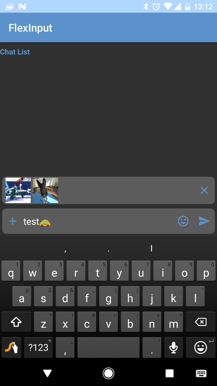
Image Examples
Input mode
| Keyboard | Emojis |
|---|---|
 |
 |
Tabs
| Files | Photos | Camera |
|---|---|---|
 |
 |
 |
Dependencies
Usage
For more details refer to the sample app included in this project.
Gradle
repositories {
    jcenter()
    google()
    maven { url 'http://dl.bintray.com/lytefast/android' }
}

dependencies {
    implementation "com.lytefast:flexinput:0.9.18@aar"
    implementation "com.camerakit:camerakit:$cameraKitVersion"
    implementation "com.camerakit:jpegkit:$cameraKitJpegKitVersion"
}
XML
To use the widget, you can just include it in your layout my_layout.xml:
<fragment
    android:id="@+id/flex_input"
    android:name="com.lytefast.flexinput.fragment.FlexInputFragment"
    android:layout_width="match_parent"
    android:layout_height="wrap_content"
    android:focusable="true"

    app:previewBackground="@drawable/rect_rounded_highlight_alpha_20"
    app:hint="@string/msg_hint"
    app:hintColor="@color/colorHint"

    tools:layout="@layout/flex_input_widget"/>
Setup
Now you need to add some hooks and adapters to make sure everything works. Don't worry there are some default implementations that can just be dropped in.
In MyFragment.java:
@Override
public void onViewCreated(final View view, @Nullable final Bundle savedInstanceState) {
  super.onViewCreated(view, savedInstanceState);

  final InputMethodManager imm =
      (InputMethodManager) getContext().getSystemService(Context.INPUT_METHOD_SERVICE);

  flexInput = (FlexInputFragment) getChildFragmentManager().findFragmentById(R.id.flex_input);
  if (savedInstanceState == null) {
    // Only create fragment on first load
    // UnicodeEmojiCategoryPagerFragment is a default implementation (see sample app)
    flexInput.setEmojiFragment(new UnicodeEmojiCategoryPagerFragment());
  }

  flexInput
      .setContentPages(/* You can add custom PageSuppliers here */)
      .setInputListener(flexInputListener)
      .setFileManager(new SimpleFileManager("com.lytefast.flexinput.fileprovider", "FlexInput"))
      .setKeyboardManager(new KeyboardManager() {
        @Override
        public void requestDisplay() {
          flexInput.requestFocus();
          imm.showSoftInput(flexInput.getView(), InputMethodManager.SHOW_IMPLICIT);
        }

        @Override
        public void requestHide() {
          imm.hideSoftInputFromWindow(flexInput.getView().getWindowToken(), InputMethodManager.HIDE_NOT_ALWAYS);
        }
      });
}

/**
 * Main point of interaction between the {@link FlexInput} widget and the client.
 */
private final InputListener flexInputListener = new InputListener() {
  @Override
  public void onSend(final Editable data, List<? extends Attachment> attachments) {

    Log.d("SAMPLE", "User sent: " + data.toString());

    for (int i = 0; i < attachments.size(); i++) {
      Log.d("SAMPLE", String.format("[%d] Attachment - %s", i, attachments.get(i).displayName)));
    }
  }
};
That's it! Now you have the output string and the attachments (in order) from the user.
Styling Appearance
The widget tries to reuse as much of the app style as possible: icon colors are set via the colorButtonNormal, colorControlActivated, and colorControlHighlight style attributes.
See colors.xml:
<!--These are used within FlexInput. Override to customize.-->
<!-- Defaults for these values are style attr and listed beside the overrides-->
<color name="flexInputIconColor">@color/colorPrimary</color>  <!-- colorButtonNormal -->
<color name="flexInputIconColorActivated">@color/colorPrimaryDark</color>  <!-- colorControlActivated -->
<color name="flexInputIconColorDisabled">#c03f4a54</color>  <!-- colorControlHighlight -->
Or the same attributes in styles.xml.
Sample overrides of interest
<style name="FlexInput.Main" parent="AppTheme">
  <item name="android:background">@color/app_input_background_color</item>
</style>
<style name="FlexInput.AddContent" parent="FlexInput">
  <item name="android:background">@color/flexinput_background</item>
</style>
<style name="FlexInput.AddContent.TabLayout" parent="FlexInput.AddContent.Base.TabLayout">
    <item name="android:background">@drawable/content_tab_background</item>
</style>
<style name="FlexInput.AddContent.Button.Send" parent="FlexInput.AddContent.Button.Base.Send">
  <item name="backgroundTint">@color/send_color</item>
</style>
There are also styles.xml overrides that you can provide. All styles are prefixed by FlexInput. See styles.xml for the full set of styles.
Addtionally there are special app attributes that you may set to customize the appearance of the widget.
previewBackgrounddefines the background for the attachment preview row
Optional Features
private void optionalFeatures() {
  flexInput
      // Can be extended to provide custom previews (e.g. larger preview images, onclick) etc.
      .setAttachmentPreviewAdapter(new AttachmentPreviewAdapter(getContext().getContentResolver()));
}
Power Overrides (Risky)
Additionaly there are some ways to integrate easier with your apps. However these features could potentially cause unforeseen problems. Last warning!
Using a custom EditText:
private void tryRiskyFeatures() {
  final boolean hasCustomEditText = true;
  if (hasCustomEditText) {
    LayoutInflater inflater = LayoutInflater.from(getContext());
    AppCompatEditText myEditText = (AppCompatEditText) inflater.inflate(
        R.layout.my_edit_text_view, (ViewGroup) flexInput.getView(), false);
    flexInput.setEditTextComponent(myEditText);
  }
}
There are other overrides that are possible via extension of FlexInputFragment, custom classes (e.g. AttachmentPreview), or providing your own Fragments to FlexInput.
You can trigger the feature via the sample app to experiment.