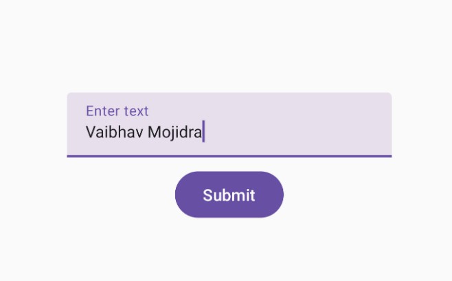
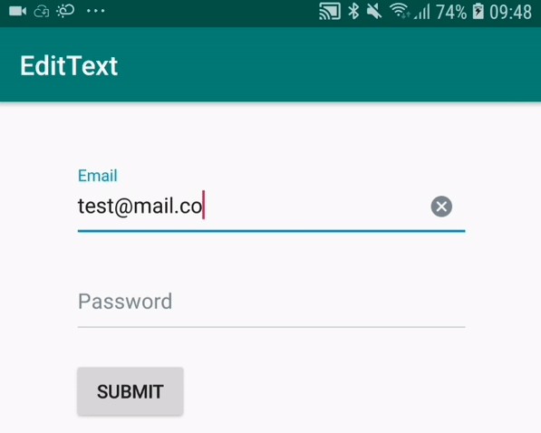
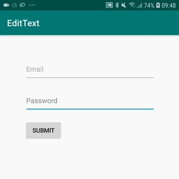
MaterialTextField

Custom EditText which follows the latest Material guidelines with animated underline and custom error settings.

Minimum target SDK: 17. RTL SUPPORTED.

MaterialTextField

Gradle

Make sure you have jitpack.io included in your gradle repositories.

maven { url "https://jitpack.io" }
implementation 'com.github.edgar-zigis:materialtextfield:1.4.4'

Proguard

In order to preserve underline animation, please include this into proguard file.

-keep class com.zigis.materialtextfield.** { *; }

Usage

<com.zigis.materialtextfield.MaterialTextField
    android:id="@+id/mail"
    android:layout_width="match_parent"
    android:layout_height="wrap_content" <!-- default 56dp -->
    android:hint="E-mail"
    android:text="[email protected]"
    app:togglePasswordVisibility="true" <!-- enable password toggle support -->
    app:isMultilineField="true" <!-- enable multiline support -->
    app:underlineHeight="1.5dp" <!-- set underline height -->
    app:isClearEnabled="true" <!-- toggle clear button, default true -->
    app:rightIcon="@drawable/ic_clear" <!-- set custom right icon, default null -->
    app:rightButtonColor="@color/grey" <!-- set right icon tint, default grey -->
    app:cursorDrawableColor="@color/colorAccent" <!-- change cursor, selection & selection handles color -->
    app:defaultHintColor="@android:color/darker_gray" <!-- set inactive hint color -->
    app:activeHintColor="@android:color/holo_blue_dark" <!-- set floating hint color -->
    app:defaultUnderlineColor="@android:color/darker_gray" <!-- set non-focused underline color -->
    app:activeUnderlineColor="@android:color/holo_blue_dark" <!-- set focused underline color -->
    app:errorColor="@android:color/holo_red_dark" /> <!-- set error icon, text and underline color -->

Remarks

At the moment height is automatically overriden to match original Material guideline height. Also consider using margins instead of padding.

GitHub