Description

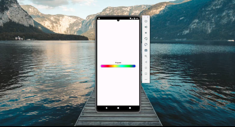
Small library allowing you to make a smooth indeterminate progress bar. You can either user your progress bars and set this drawable or use directly the SmoothProgressBarView.

Live Demo

https://play.google.com/store/apps/details?id=fr.castorflex.android.smoothprogressbar.sample

Integration

The lib is now on Maven Central. All you have to do is add it on your gradle build:

dependencies {
    // of course, do not write x.x.x but the version number
    compile 'com.github.castorflex.smoothprogressbar:library:x.x.x'
    // or
    compile 'com.github.castorflex.smoothprogressbar:library-circular:x.x.x'
}

You can find the last stable version on [Gradle Please]

Or you can try the latest snapshots:

repositories {
    maven { url "https://oss.sonatype.org/content/repositories/snapshots/" }
}

dependencies {
    compile 'com.github.castorflex.smoothprogressbar:library:1.0.1-SNAPSHOT@aar'
    compile 'com.github.castorflex.smoothprogressbar:library-circular:1.0.1-SNAPSHOT@aar'
}

If you really want (or have) to use Eclipse, please look at the forks.

Usage

  • Use directly SmoothProgressBar:
<fr.castorflex.android.smoothprogressbar.SmoothProgressBar
	xmlns:android="http://schemas.android.com/apk/res/android"
	xmlns:app="http://schemas.android.com/apk/res-auto"
    android:layout_width="match_parent"
    android:layout_height="wrap_content"
    android:indeterminate="true"
    app:spb_sections_count="4"
    app:spb_color="#FF0000"
    app:spb_speed="2.0"
    app:spb_stroke_width="4dp"
    app:spb_stroke_separator_length="4dp"
    app:spb_reversed="false"
    app:spb_mirror_mode="false"
    app:spb_progressiveStart_activated="true"
    app:spb_progressiveStart_speed="1.5"
    app:spb_progressiveStop_speed="3.4"
    />

<fr.castorflex.android.circularprogressbar.CircularProgressBar
	xmlns:android="http://schemas.android.com/apk/res/android"
	xmlns:app="http://schemas.android.com/apk/res-auto"
    android:layout_width="match_parent"
    android:layout_height="wrap_content"
    android:indeterminate="true"
    app:cpb_color="#FFee44"
    app:cpb_colors="@array/mycolors"
    app:cpb_rotation_speed="1.0"
    app:cpb_sweep_speed="1.0"
    app:cpb_stroke_width="4dp"
    app:cpb_min_sweep_angle="10"
    app:cpb_max_sweep_angle="300"
    />

Or use styles:

<style name="AppTheme">
    <item name="spbStyle">@style/GNowProgressBar</item>
    <item name="cpbStyle">@style/CircularThemeProgressBar</item>
</style>

<style name="GNowProgressBar" parent="SmoothProgressBar">
    <item name="spb_stroke_separator_length">0dp</item>
    <item name="spb_sections_count">2</item>
    <item name="spb_speed">1.7</item>
    <item name="spb_progressiveStart_speed">2</item>
    <item name="spb_progressiveStop_speed">3.4</item>
    <item name="spb_interpolator">spb_interpolator_acceleratedecelerate</item>
    <item name="spb_mirror_mode">true</item>
    <item name="spb_reversed">true</item>
    <item name="spb_colors">@array/gplus_colors</item>
    <item name="spb_progressiveStart_activated">true</item>
</style>

<style name="CircularThemeProgressBar" parent="android:Widget.Holo.ProgressBar">
        <item name="cpb_color">@color/cpb_default_color</item>
        <item name="cpb_stroke_width">@dimen/cpb_default_stroke_width</item>
        <item name="cpb_min_sweep_angle">@integer/cpb_default_min_sweep_angle</item>
        <item name="cpb_max_sweep_angle">@integer/cpb_default_max_sweep_angle</item>
        <item name="cpb_sweep_speed">@string/cpb_default_sweep_speed</item>
        <item name="cpb_rotation_speed">@string/cpb_default_rotation_speed</item>
</style>

You can find more styles [in the sample app][Sample Themes]

  • Or instantiate a SmoothProgressDrawable/CircularProgressDrawable and set it to your ProgressBar
mProgressBar.setIndeterminateDrawable(new SmoothProgressDrawable.Builder(context)
    .color(0xff0000)
    .interpolator(new DecelerateInterpolator())
    .sectionsCount(4)
    .separatorLength(8)         //You should use Resources#getDimensionPixelSize
    .strokeWidth(8f)            //You should use Resources#getDimension
    .speed(2f)                 //2 times faster
    .progressiveStartSpeed(2)
    .progressiveStopSpeed(3.4f)
    .reversed(false)
    .mirrorMode(false)
    .progressiveStart(true)
    .progressiveStopEndedListener(mListener) //called when the stop animation is over
    .build());
    
mProgressBar.setIndeterminateDrawable(new CircularProgressDrawable
    .Builder(this)
    .colors(getResources().getIntArray(R.array.gplus_colors))
    .sweepSpeed(1f)
    .strokeWidth(mStrokeWidth)
    .style(CircularProgressDrawable.Style.ROUNDED)
    [ ... ]
    .build();

You can also set many colors for one bar (see G+ app)

  • via xml (use the app:spb_colors attribute with a integer-array reference for that)

  • programmatically (use SmoothProgressDrawable.Builder#colors(int[]) method).

GitHub