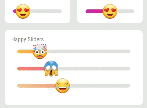
Emoji Slider
A custom made SeekBar heavily inspired by this great widget from Instagram.
| Sample app | Sample usage |
|---|---|
 |
 |
? Installation
Add a dependency to your build.gradle:
It is fully stable, but there might be some changes to the API, like improved naming, or some small changes on functions.
This is the reason it is only 0.3 - this only means it is the third public version, but you can use it fine already.
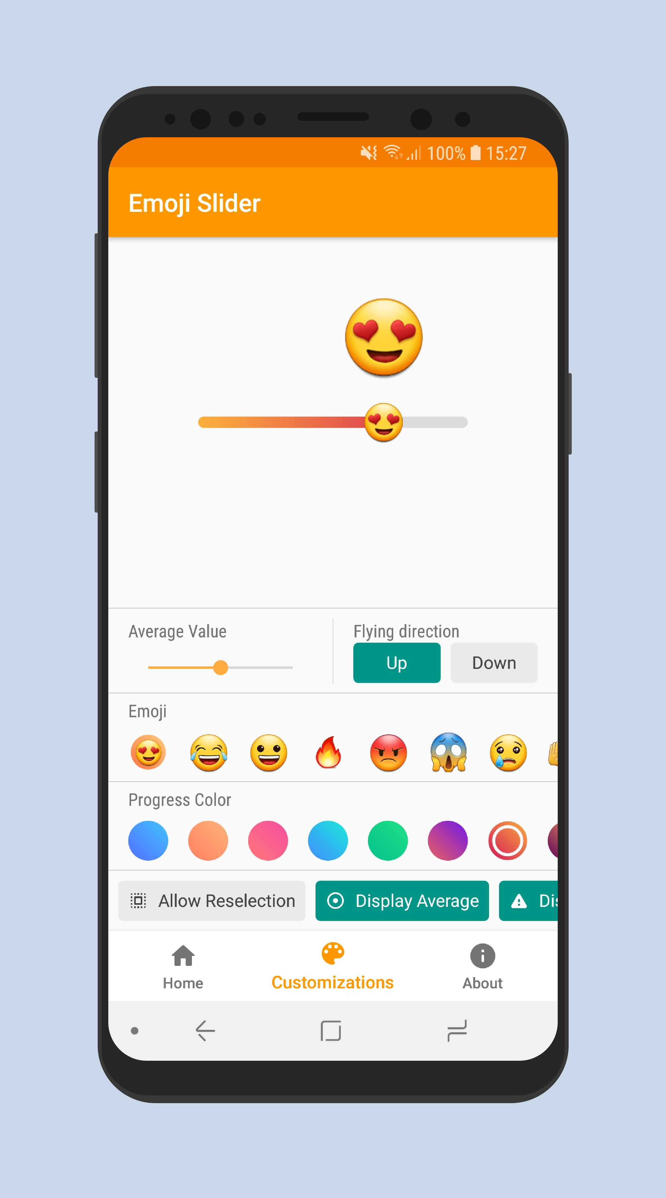
? Features
- Customize with xml using custom handy attributes.
- Customize in your activity, fragment or dialog.
- Creating new widget programmatically.
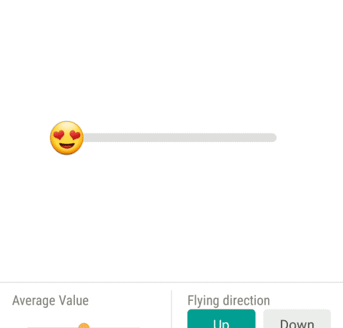
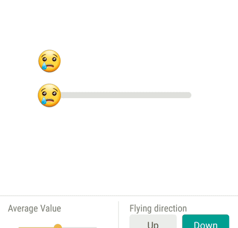
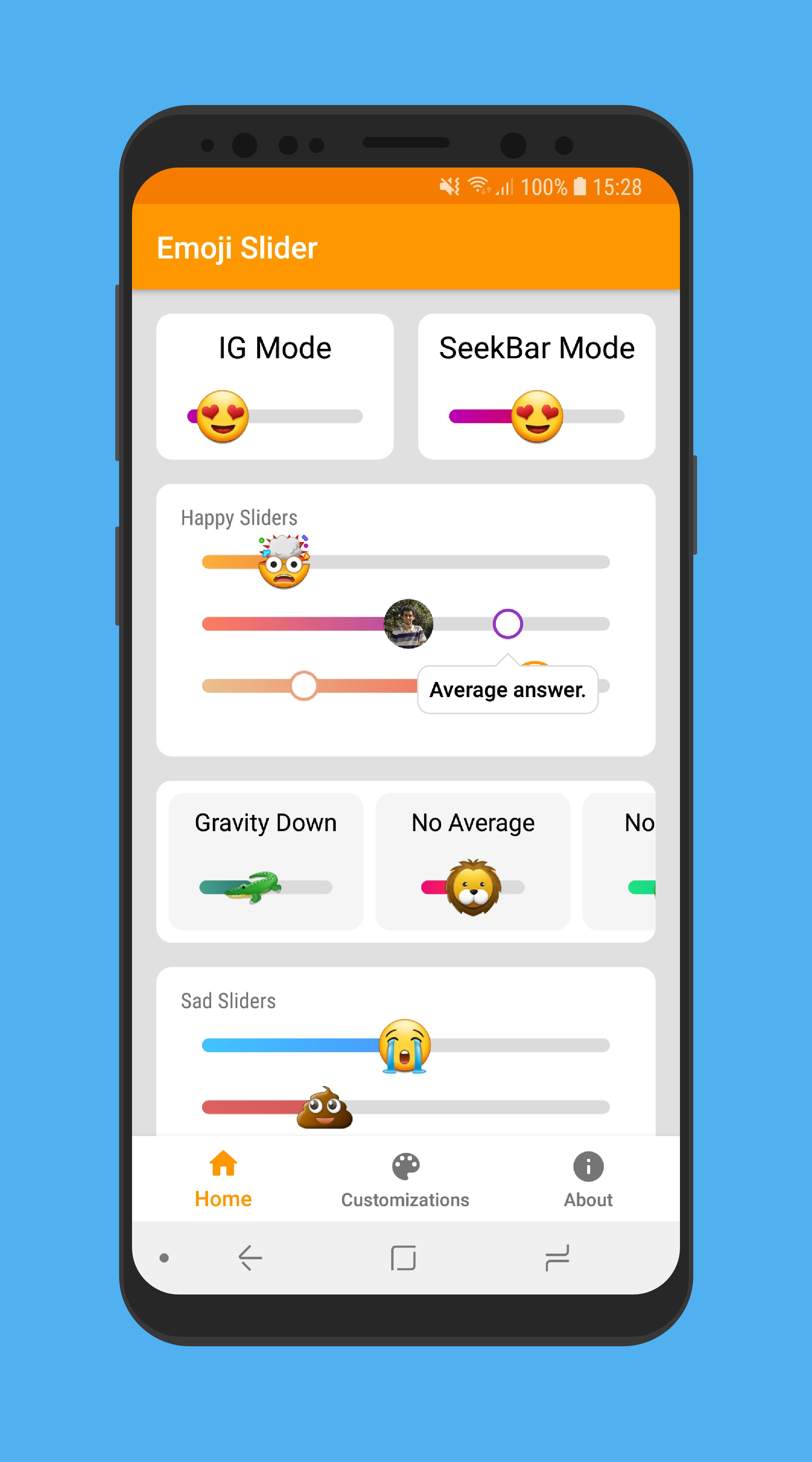
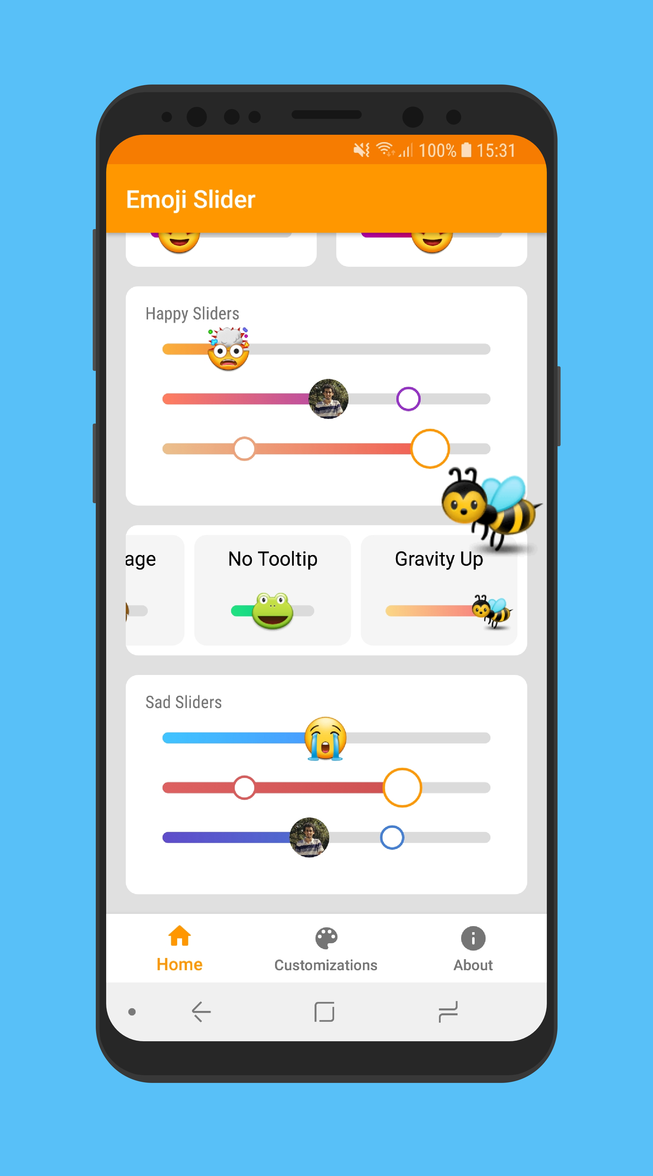
? Reselection Enabled Sample
| Up | Down |
|---|---|
 |
 |
❕ Basic Usage
Place the EmojiSlider in your layout.
Important: if you want to have the emoji floating above the slider when it is pressed/dragged, you need to supply a view, preferably on the foreground, to be drawn and tell the slider who the view is.
Example:
❔ Usage
To track the current position of the slider, set the positionListener, as shown below:
val slider = findViewById<EmojiSlider>(R.id.slider)
slider.positionListener = { p -> Log.d("MainActivity", "current position is: $p" )}
You can also track the beginning and completion of the movement of the slider, using the following properties:
startTrackingListener and stopTrackingListener. Examples below:
slider.startTrackingListener = { /* action on slider touched */ }
slider.stopTrackingListener = { /* action on slider released */ }
Here is a random example in Kotlin:
Here is a random example in Java:
Check the sample app for more. The sample app even shows how to use Glide to load a Bitmap into a round drawable.
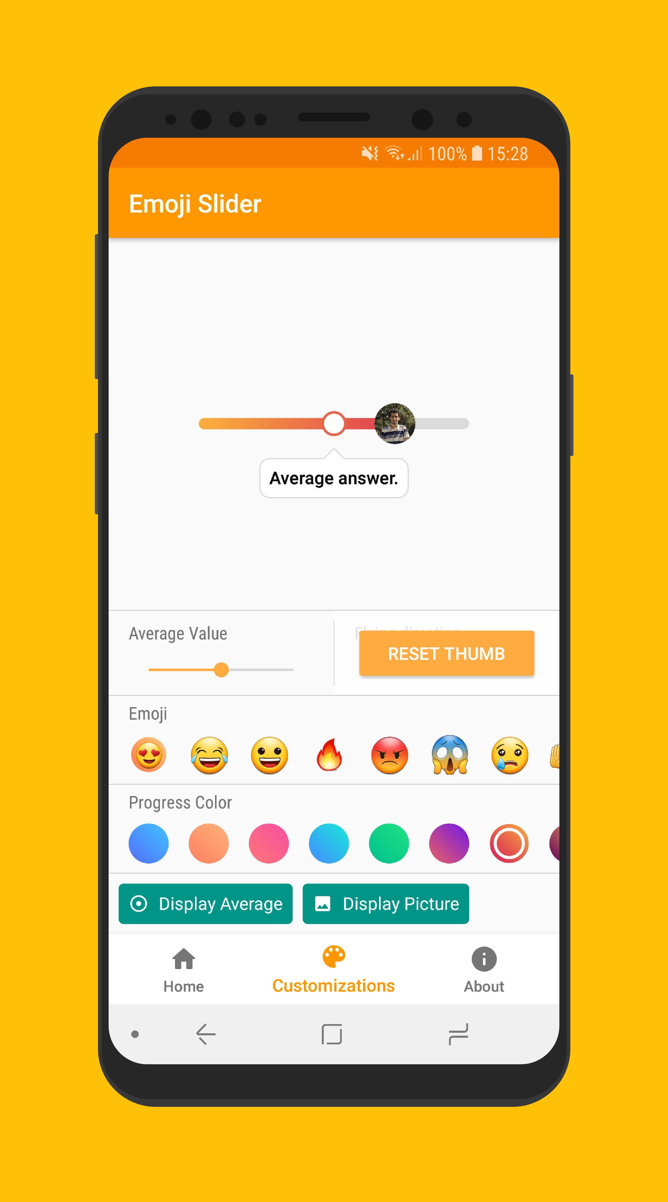
? Customization and Attributes
All customizable attributes for EmojiSlider:
| Attribute Name | Default Value | Description |
|---|---|---|
| app:emoji | ? | The emoji which will be used on the slider |
| app:progress | 0.25f | Initial position for the progress in range from 0.0 to 1.0. |
| app:average_progress | 0.50f | Initial position for the average value in range from 0.0 to 1.0. |
| app:bar_progress_color_start | @color/slider_gradient_start | Color of the start (left side) of the progress bar. |
| app:bar_progress_color_end | @color/slider_gradient_end | Color of the end (right side) of the progress bar |
| app:bar_track_color | @color/slider_track | Color of the bar's track. |
| app:thumb_size_percent_on_pressed | 0.9 | Thumb size automatically shrinks to 90% (0.9) its original size when a touch is detected. This allows to choose another value between 0.0 and 1.0. |
| app:allow_reselection | false | Should the slider behave like the original Emoji Slider or like a SeekBar? When true, it behaves like a SeekBar, so average/profile/result will not be shown. |
| app:is_touch_disabled | false | Allow to disable touch input. |
| app:should_display_tooltip | true | Allow to disable the tooltip when a value is selected. |
| app:tooltip_text | @string/average_answer | The "average answer" text, translated into 40 languages. You can overwrite it using this. |
| app:tooltip_dismiss_timer | 2500 | The tooltip auto hide after some period, in milliseconds. Choose -1 to disable this timer. |
| app:should_display_average | true | Allow to disable the average circle when a value is selected. If this is disabled, tooltip will not be shown even if it is enabled. |
| app:should_display_average | false | Allow to disable the round circle that shows up when a value is selected (usually with user's profile picture). |
| app:register_touches_outside_thumb | true | The original Emoji Slider only registers touch inside the thumb. The SeekBar register on the bar, too. This allows to choose which best suits you. |
| app:particle_direction | up | Should the floating emoji go up or down after finger leaves the bar? |
Of course, some attributes might have better names than others and documentation might not be perfect. If you find anything wrong or weird, let me know.
? Libraries Used
- Facebook's Rebound
- BubbleView
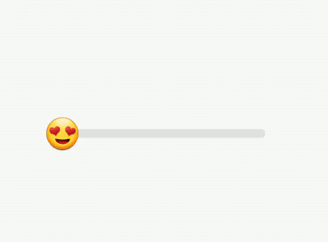
? Screenshots
| Floating | Value Selected |
|---|---|
 |
 |
| Sample | Sample |
|---|---|
 |
 |