SingleDateAndTimePicker
You can now select a date and a time with only one widget !


Usage
Select 2 dates
Display days, months and years

Include in a layout
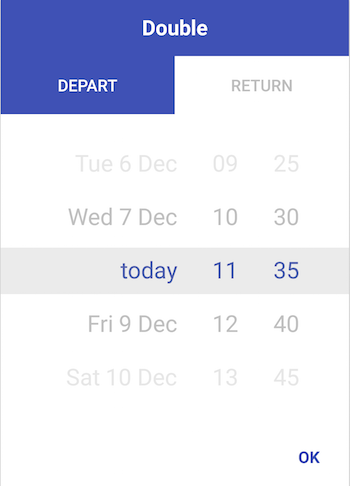
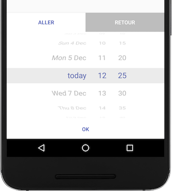
iOS like :P
Customisation
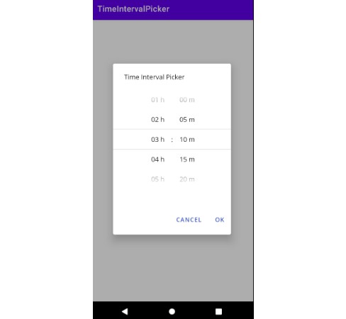
You can change the minutes steps (default : 5min)
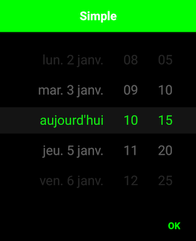
And change some colors
Date range
Require user to select a date between a range
Or simply require user to select a future date
XML
Some/most options are also available via XML:
    <com.github.florent37.singledateandtimepicker.SingleDateAndTimePicker
        android:id="@+id/single_day_picker"
        android:layout_width="wrap_content"
        android:layout_height="wrap_content"
        app:picker_itemSpacing="6dp"
        app:picker_curvedMaxAngle="45"
        app:picker_curved="true"
        app:picker_selectorColor="@android:color/transparent"
        app:picker_stepSizeHours="2"
        app:picker_stepSizeMinutes="5"
        app:picker_cyclic="false"
        app:picker_dayCount="31"
        app:picker_mustBeOnFuture="true"
        app:picker_visibleItemCount="7"
        />
- picker_itemSpacing: Margin between items. Only has effect with
height=wrap-content - picker_curvedMaxAngle sets the max angle of top/bottom items. If 45
then the visible 'window' of the wheel is a 'quarter' of the circle.
If 90 (default) its rolling on a half-circle
Get divider lines around selected by overwriting one or more of
    <color name="picker_default_divider_color">@android:color/transparent</color>
    <dimen name="picker_default_divider_height">1dp</dimen>
    <drawable name="picker_default_divider">@drawable/picker_divider</drawable>
Use in conjuction with
app:picker_selectorColor="@android:color/transparent" on layout.
Download
In your module