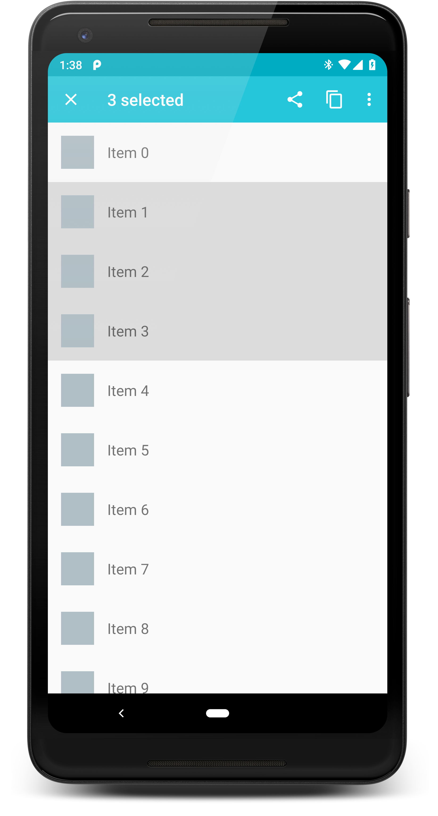
Material Contextual Action Bar
Material CAB allows you to implement a customizable and flexible contextual action bar in your app. The traditional stock CAB on Android is limited to being placed at the top of your Activity, and the navigation drawer cannot go over it. This library lets you choose its exact location, and a toolbar is used, allowing views to be be placed over and under it.
Gradle Dependency
Add Material CAB to your module's build.gradle dependencies block:
Attaching
This library attaches to your Activity by taking the place of a ViewStub in your Activity layout.
For an example, this is the main layout of the sample project:
You attach a Material CAB to the Activity like this:
R.id.cab_stub references the ViewStub, which is replaced with the CAB toolbar.
In addition, you can also pass the ID of a ViewGroup (such as a FrameLayout). The CAB will
get added as a child to that view group.
Configuration
You can configure various properties about your CAB during attachment:
Updating
If you need to update something in a visible CAB, like the title, just attach(...) { } again. The CAB won't be recreated if it's already attached, it will just be invalidated.
Saving and Restoring States
In order to keep the CAB active, and maintain all of its current properties, you have to save and restore
the CAB state during configuration changes.
It works like this in an Activity:
Destroying the CAB
The navigation icon in your CAB toolbar (far left button) will trigger this method, but you
can manually call it whenever you'd like as well:
This will invoke the onDestroy callback. If the callback returns true, any visible CAB will be
hidden.