segmented
A simple Android UI library for segmented controls with material-ish styling.
How to add?
I. In your root build.gradle file add the following:
allprojects {
	repositories {
		...
	    maven { url 'https://jitpack.io' }
	}
}
II. In your build.gradle file add the following dependency:
dependencies {
    implementation 'com.github.creageek:segmented:1.0.0'
}
III. Declare SegmentedButton inside your layout.xml file:
Please, note that SegmentedButton extends from RadioGroup so you can add RadioButton (doesn't need any additional styling) views as a child to fetch the segments.
IV. Declare SegmentedButton in your class.kt.
You can call the view by its id with the power of kotlin-android-extensions plugin or just use findViewById<SegmentedButton>(R.id.segmented):
How to customize?
I. In your layout.xml file you can set a few attrs to SegmentedButton:
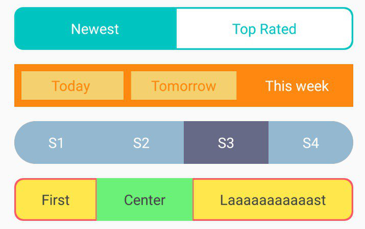
app:textSize- applies text size to all child segments (reference to a dimension).app:segmentHeight- allows you to set segment height (reference to a dimension).app:textColor- allows you to set text color (reference to a color).app:textColorChecked- allows you to set the text color of a checked segment (reference to a color).app:segmentFont- allows you to set a segment's font (reference to a font).app:segmentFontChecked- allows you to set the font of a checked segment (reference to a font).app:segmentColor- allows you to set segment color (reference to a color).app:segmentColorChecked- allows you to set the color of a checked segment (reference to a color).app:rippleColor- allows you to set a segment's ripple color (reference to a color).app:rippleColorChecked- allows you to set ripple color of a checked segment (reference to a color).app:borderColor- allows you to set the color of a segment's border (reference to a color).app:borderWidth- allows you to set a segment's border width (reference to a dimension).app:cornerRadius- allows you to set a segment's corner radius (reference to a dimension).app:spreadType- sets the spread type of aSegmentedButton. Possible values are:wrap(default)evenly
II. By default, if no custom attrs set, these values applied:
- Default
colors.xmlvalues:
- Default
dimens.xmlvalues:
What about contributions?
If you have any ideas, suggestions, or issues, please feel free to create the following issue. I'll be here to help and/or improve SegmentedButton according to your needs (if it doesn't confront the original idea).