Compose Settings
Versions
This library provides a set of Settings like composable items to help android Jetpack Compose developers build complex settings screens without all the boilerplate
Install
allprojects {
    repositories {
        //...
        mavenCentral()
    }
}
Add dependencies:
implementation 'com.github.alorma:compose-settings:$version'
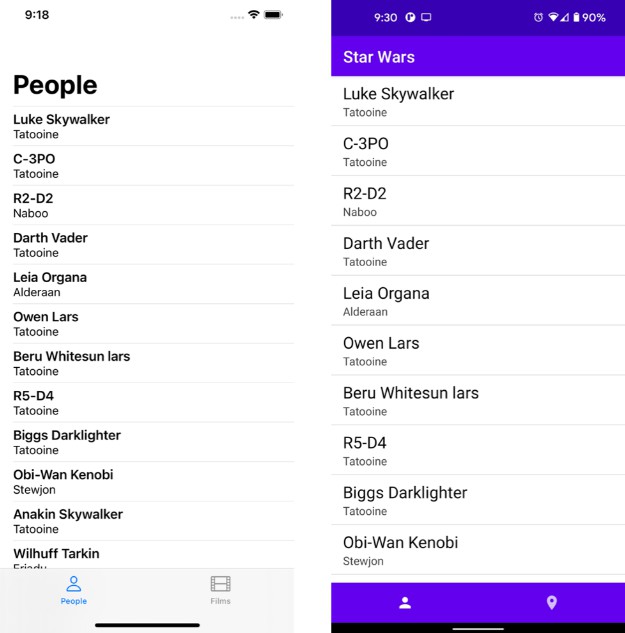
Demo
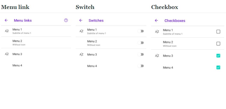
| Menu link | Switch | Checkbox |
|---|---|---|
 |
 |
 |
Usage
This library provide some @Composable items that can be used to build your settings screen.
Scaffold, Column… is not provided by the library, you can place items wherever you want.
Menu Link

This can be used to open another settings screen, open link, show a dialog…
SettingsMenuLink(
    icon = { Icon(imageVector = Icons.Default.Wifi, contentDescription = "Wifi") },
    title = { Text(text = "Hello") },
    subtitle = { Text(text = "This is a longer text") },
    onClick = {},
)
action can be provided:
SettingsMenuLink(
    title = { Text(text = "Menu 4") },
    action = { ... },
)

Switch && Checkboxes


This can be used to enable or disable a feature
SettingsSwitch(
    icon = { Icon(imageVector = Icons.Default.Wifi, contentDescription = "Wifi") },
    title = { Text(text = "Hello") },
    subtitle = { Text(text = "This is a longer text") },
    checked = true,
    onCheckedChange = {},
)
SettingsCheckbox(
    icon = { Icon(imageVector = Icons.Default.Wifi, contentDescription = "Wifi") },
    title = { Text(text = "Hello") },
    subtitle = { Text(text = "This is a longer text") },
    checked = true,
    onCheckedChange = {},
)