SurveyKit-compose
A Server Driven UiKit made with jetpack compose to make beautiful ui’s without extra engineering efforts.
Demo Video
Features
- Ui can be rendered from Backend.
- Each components are solely responsible.
- No coupling between components.
- Easy to customize.
Lessons Learned
Learned the server driven architecture. Also tried to remove all possible coupling and each component is singularly responsible for their usecase.
Roadmap
-
Adding more components support.
-
will add dynamic positioning to the components
Important Notes
- All Widgets need their configs which needs to be extended from WidgetConfig which had some common properties for all configs.
- widgetId should be unique to all widgets.
interface WidgetConfig {
    val widgetId:String // Should be unique
    val topPadding:Int // Should in int i.e if padding is 24dp then = 24
    val bottomPadding:Int
    val startPadding:Int
    val endPadding:Int
    val widgetDimens:WidgetDimens
}

data class WidgetDimens(
    val fillWidth:Boolean?, // If this is given our widget fill cover parent
    val fillHeight:Boolean?,
    val width : Int?, // specifying the widget width
    val height : Int?,
)
Architectural Pattern

All available components
TextWidget
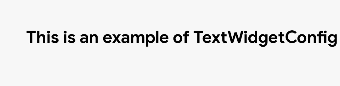
val config = TextWidgetConfig(
        text = "This is an example of TextWidgetConfig",
        topPadding = 30,
        startPadding = 30,
        textConfig = TextConfig(
            color = colorBlack.toHex(),
            fontSize = 20,
            fontWeight = "semiBold"
        ),
        widgetDimens = WidgetDimens(
            true,
            null,
            null,
            100
        )
    )
    TextWidget(config)
ProgressBarWidget
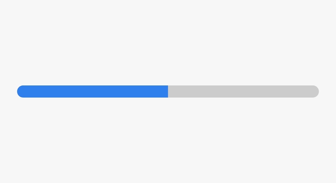
 val config = ProgressBarWidgetConfig(
        progressColor = colorBlue.toHex(),
        bgColor = Color.LightGray.toHex(),
        widgetDimens = WidgetDimens(
            true,
            null,
            null,
            14
        ),
        topPadding = 100,
        bottomPadding = 100
    )
    ProgressBarWidget(progress = { 0.5f }, config = config)
ButtonWidget
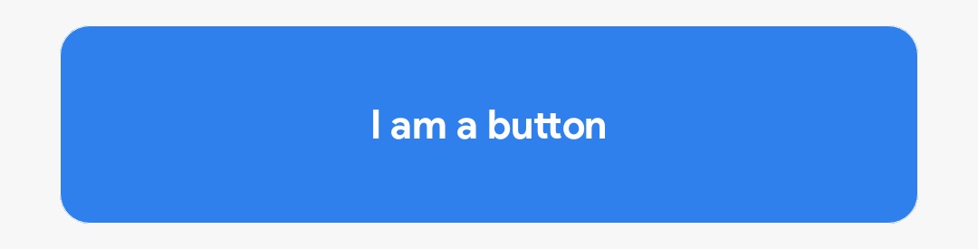
    val config = ButtonWidgetConfig(
        bgColor = colorBlue.toHex(),
        btnText = TextWidgetConfig(
            text = "I am a button", textConfig = TextConfig(
                colorWhite.toHex(), 16, "bold"
            ),
            topPadding = 8,
            bottomPadding = 8
        ),
        borderRadius = 12,
        borderStroke = 0,
        borderColor = colorWhite.toHex(),
        topPadding = 10,
        bottomPadding = 10,
        startPadding = 24,
        endPadding = 24,
        widgetDimens = WidgetDimens(
            fillWidth=true,
            fillHeight = null,
            width = null,
            height = 100
        )
    )
    ButtonWidget(config = config, onCtaClick = {
        //Button is clicked
    })
EditTextWidget
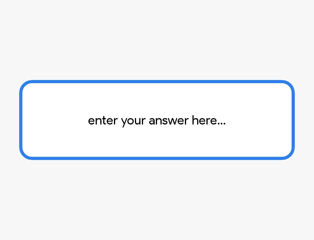
    val config = EditTextWidgetConfig(
        widgetDimens = WidgetDimens(true, fillHeight = false, width = null, height = 300),
        startPadding = 24,
        endPadding = 24,
        topPadding = 100,
        bottomPadding = 100,
        bgColor = colorUnSelected.toHex(),
        borderColor = colorBlue.toHex(),
        borderStroke = 4,
        textColor = "#000000",
    )
    EditTextWidget(config = config, errorString = {""}, userInput = {
        // Here we will get user input in this EditTextWidget
    })
ImageWidget
    val config = ImageWidgetConfig(
        widgetDimens = WidgetDimens(true, fillHeight = false, width = null, height = 300),
        startPadding = 24,
        endPadding = 24,
        topPadding = 10,
        bottomPadding = 10,
        borderColor = colorBlue.toHex(),
        borderStroke = 4,
        borderRadius = 20,
        imageUrl = "https://images.unsplash.com/photo-1574169208507-84376144848b?ixlib=rb-4.0.3&ixid=MnwxMjA3fDB8MHxwaG90by1wYWdlfHx8fGVufDB8fHx8&auto=format&fit=crop&w=879&q=80",
    )
    ImageWidget(config = config)
OptionsWidget
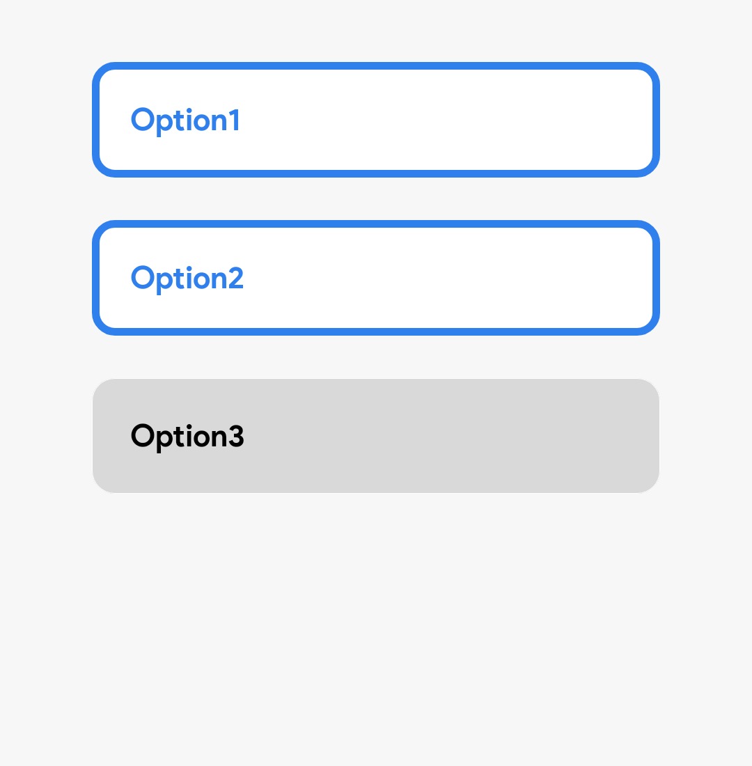
    val config = OptionsWidgetConfig(
        optionsList = listOf("Option1", "Option2", "Option3"),
        unSelectedButtonConfig = ButtonWidgetConfig(
            startPadding = 24,
            endPadding = 24,
            topPadding = 22,
            widgetDimens = WidgetDimens(true),
            btnText = TextWidgetConfig(
                text = "", textConfig = TextConfig(
                    colorUnSelectedText.toHex(), 16, "semiBold"
                ),
                startPadding = 4,
                endPadding = 4,
                topPadding = 12,
                bottomPadding = 12,
                widgetDimens = WidgetDimens(true)
            ),
            bgColor = colorUnSelectedArea.toHex()
        ),
        selectedButtonConfig = ButtonWidgetConfig(
            startPadding = 24,
            endPadding = 24,
            topPadding = 22,
            widgetDimens = WidgetDimens(true),
            btnText = TextWidgetConfig(
                text = "",
                textConfig = TextConfig(
                    colorBlue.toHex(), 16, "semiBold"
                ),
                startPadding = 4,
                endPadding = 4,
                topPadding = 12,
                bottomPadding = 12,
                widgetDimens = WidgetDimens(true)
            ),
            bgColor = colorWhite.toHex(),
            borderStroke = 4,
            borderColor = colorBlue.toHex()
        ),
        widgetDimens = WidgetDimens(true, fillHeight = false, width = null, height = 400),
        startPadding = 24,
        endPadding = 24,
        topPadding = 10,
        bottomPadding = 10,
        multipleSelection = true,
    )
    OptionsWidget(config = config) {
        // Here we'll get the list of string
    }
Usage
This is an example function which uses these widget. In this comp function, widget list is passed from the B.E which we need to construct on frontend first.
@Composable
fun SurveyKit(widgetList: MutableList<List<WidgetConfig>>) {
    val context = LocalContext.current
    // currIdx is an Int representing the index of the current question in a survey.
    var currIdx by rememberSaveable {
        mutableStateOf(0)
    }
    // etInput is a String representing the user input in an EditText
    var etInput by rememberSaveable {
        mutableStateOf("")
    }
    // errorString is a String that stores any error messages generated during the user input validation process.
    var errorString by rememberSaveable {
        mutableStateOf("")
    }
    // currentQuestionNumber is an Int representing the current question number in the survey.
    var currentQuestionNumber by rememberSaveable {
        mutableStateOf(1)
    }
    LazyColumn(
        Modifier.fillMaxSize().background(colorWhite)
    ) {
        items(widgetList.getOrNull(currIdx) ?: emptyList()) { widget->
            when (widget.widgetId) {
                Widgets.CurrentQuestionWidgetId.widgetName -> CurrentQuestionWidget(
                    config = widget as CurrentQuestionWidgetWidgetConfig,
                    currentQuestion = { currentQuestionNumber },
                    totalQuestion =  widgetList.size)
                Widgets.ProgressBarWidgetId.widgetName -> ProgressBarWidget(
                    config = widget as ProgressBarWidgetConfig,
                    progress = { currentQuestionNumber/widgetList.size.toFloat() })
                Widgets.TextWidgetId.widgetName -> TextWidget(config = widget as TextWidgetConfig)
                Widgets.ImageWidgetId.widgetName -> ImageWidget(config = widget as ImageWidgetConfig)
                Widgets.EditTextWidgetId.widgetName -> EditTextWidget(
                    config = widget as EditTextWidgetConfig,
                    errorString = { errorString },
                    userInput = { str ->
                        etInput = str
                        errorString = ""
                    })
                Widgets.CtaButtonWidgetId.widgetName -> ButtonWidget(config = widget as ButtonWidgetConfig) {
                    if (etInput.isEmpty()) {
                        errorString = "Please, enter some answer"
                        return@ButtonWidget
                    }
                    etInput = ""
                    currentQuestionNumber++
                    if (currIdx != widgetList.size - 1) currIdx++
                }
                Widgets.OptionsWidgetId.widgetName -> OptionsWidget(config = widget as OptionsWidgetConfig) {
                    it.toString().toast(context)
                }
            }
        }
    }
}
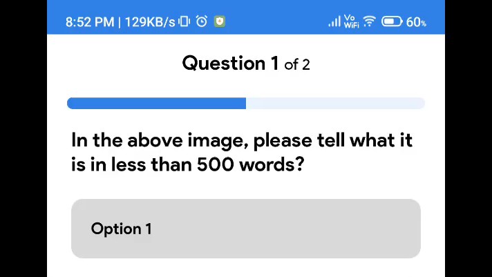
Json to UI example

[
  {
    "bottomPadding": 0,
    "endPadding": 16,
    "prefixText": "Question",
    "primaryTextConfig": {
      "color": "#000000",
      "fontSize": 20,
      "fontWeight": "bold"
    },
    "secondaryTextConfig": {
      "color": "#000000",
      "fontSize": 16,
      "fontWeight": "light"
    },
    "startPadding": 16,
    "topPadding": 16,
    "widgetDimens": {
      "fillHeight": null,
      "fillWidth": true,
      "height": null,
      "width": null
    },
    "widgetId": "cqWidget"
  },
  {
    "bgColor": "#EAF2FD",
    "bottomPadding": 0,
    "endPadding": 20,
    "progressColor": "#2F80ED",
    "startPadding": 20,
    "topPadding": 22,
    "widgetDimens": {
      "fillHeight": null,
      "fillWidth": true,
      "height": 12,
      "width": null
    },
    "widgetId": "pbWidget"
  },
  {
    "bottomPadding": 0,
    "endPadding": 24,
    "startPadding": 24,
    "text": "In the above image, please tell what it is in less than 500 words?",
    "textConfig": {
      "color": "#000000",
      "fontSize": 20,
      "fontWeight": "bold"
    },
    "topPadding": 18,
    "widgetDimens": {
      "fillHeight": null,
      "fillWidth": true,
      "height": null,
      "width": null
    },
    "widgetId": "textWidget"
  },
  {
    "bottomPadding": 0,
    "endPadding": 0,
    "multipleSelection": true,
    "optionsList": [
      "Option 1",
      "Option 2",
      "Option 3",
      "Option 4"
    ],
    "selectedButtonConfig": {
      "bgColor": "#FFFFFF",
      "borderColor": "#2F80ED",
      "borderRadius": 12,
      "borderStroke": 4,
      "bottomPadding": 0,
      "btnText": {
        "bottomPadding": 0,
        "endPadding": 0,
        "startPadding": 0,
        "text": "",
        "textConfig": {
          "color": "#2F80ED",
          "fontSize": 16,
          "fontWeight": "semiBold"
        },
        "topPadding": 0,
        "widgetDimens": {
          "fillHeight": null,
          "fillWidth": true,
          "height": null,
          "width": null
        },
        "widgetId": "textWidget"
      },
      "endPadding": 24,
      "startPadding": 24,
      "topPadding": 22,
      "widgetDimens": {
        "fillHeight": null,
        "fillWidth": true,
        "height": null,
        "width": null
      },
      "widgetId": "ctaButtonWidget"
    },
    "startPadding": 0,
    "topPadding": 0,
    "unSelectedButtonConfig": {
      "bgColor": "#D9D9D9",
      "borderColor": "#FFFFFF",
      "borderRadius": 12,
      "borderStroke": 0,
      "bottomPadding": 0,
      "btnText": {
        "bottomPadding": 0,
        "endPadding": 0,
        "startPadding": 0,
        "text": "",
        "textConfig": {
          "color": "#000000",
          "fontSize": 16,
          "fontWeight": "semiBold"
        },
        "topPadding": 0,
        "widgetDimens": {
          "fillHeight": null,
          "fillWidth": true,
          "height": null,
          "width": null
        },
        "widgetId": "textWidget"
      },
      "endPadding": 24,
      "startPadding": 24,
      "topPadding": 22,
      "widgetDimens": {
        "fillHeight": null,
        "fillWidth": true,
        "height": null,
        "width": null
      },
      "widgetId": "ctaButtonWidget"
    },
    "widgetDimens": {
      "fillHeight": null,
      "fillWidth": true,
      "height": 320,
      "width": null
    },
    "widgetId": "optionsWidget"
  },
  {
    "bgColor": "#FFFFFF",
    "borderColor": "#000000",
    "borderRadius": 16,
    "borderStroke": 2,
    "bottomPadding": 0,
    "endPadding": 24,
    "hintTextConfig": {
      "bottomPadding": 0,
      "endPadding": 0,
      "startPadding": 0,
      "text": "enter your answer here...",
      "textConfig": {
        "color": "#000000",
        "fontSize": 16,
        "fontWeight": "light"
      },
      "topPadding": 0,
      "widgetDimens": {
        "fillHeight": null,
        "fillWidth": null,
        "height": null,
        "width": null
      },
      "widgetId": "textWidget"
    },
    "startPadding": 24,
    "textColor": "#000000",
    "topPadding": 23,
    "widgetDimens": {
      "fillHeight": false,
      "fillWidth": true,
      "height": 300,
      "width": null
    },
    "widgetId": "etWidget"
  },
  {
    "bgColor": "#2F80ED",
    "borderColor": "#FFFFFF",
    "borderRadius": 12,
    "borderStroke": 0,
    "bottomPadding": 32,
    "btnText": {
      "bottomPadding": 0,
      "endPadding": 0,
      "startPadding": 0,
      "text": "Next",
      "textConfig": {
        "color": "#FFFFFF",
        "fontSize": 16,
        "fontWeight": "semiBold"
      },
      "topPadding": 0,
      "widgetDimens": {
        "fillHeight": null,
        "fillWidth": null,
        "height": null,
        "width": null
      },
      "widgetId": "textWidget"
    },
    "endPadding": 24,
    "startPadding": 24,
    "topPadding": 48,
    "widgetDimens": {
      "fillHeight": null,
      "fillWidth": true,
      "height": null,
      "width": null
    },
    "widgetId": "ctaButtonWidget"
  }
]