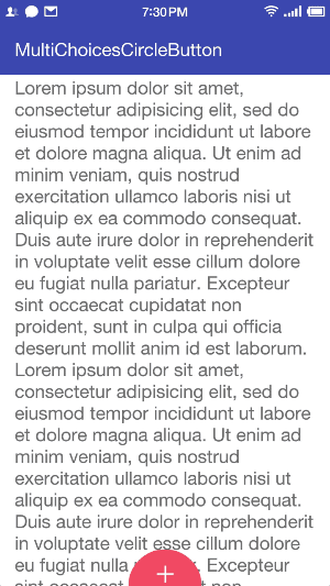
MultiChoicesCircleButton
A multiple-choice button with 3D parallax effect.
Inspired by Nicola Felasquez Felaco's Pubbblish and refer to JustinFincher/JZMultiChoicesCircleButton .
Include MultiChoicesCircleButton to Your Project
With gradle:
Use MultiChoicesCircleButton in Layout File
All attributes:
| Attributes | Format | Default | Description |
|---|---|---|---|
| mccb_icon | drawable | null | The icon of the button. |
| mccb_enableParallax | boolean | true | Enable 3D parallax effect or not. |
| mccb_collapseRadius | dimension | 40dp | The radius of the button when it is collapsed. |
| mccb_expandRadius | dimension | 120dp | The radius of the button when it is expanded. |
| mccb_text | string | null | The tittle of the button. |
| mccb_textSize | string | 35sp | The text size of the button. |
| mccb_textColor | color | white | The text color of the button. |
| mccb_buttonColor | color | #FC516A | The color of the button. |
| mccb_duration | integer | 200ms | Animation duration. |
| mccb_itemRadius | dimension | 20dp | The radius of items. |
| mccb_itemDistanceToCentre | dimension | expandRadius * 2 / 3 | The distance from items' centre to button's centre. |
| mccb_itemBackgroundColor | color | white | The background color of items. |
| mccb_showBackgroundShadow | boolean | true | Whether show shadow when hold the button. |
| mccb_backgroundShadowColor | color | #bb757575 | The shadow's color when hold the button. |
Set Items
Construct the item with its title, icon and angle.