

K?️bweb
Kobweb is an opinionated Kotlin framework for creating websites and web apps, built on top of
Web Compose and inspired by Next.js
and Chakra UI.
@Page
@Composable
fun HomePage() {
  Column(Modifier.fillMaxWidth(), horizontalAlignment = Alignment.CenterHorizontally) {
    Row(Modifier.align(Alignment.End)) {
      var colorMode by rememberColorMode()
      Button(
        onClick = { colorMode = colorMode.opposite() },
        Modifier.clip(Circle())
      ) {
        Box(Modifier.margin(4.px)) {
          // Includes support for Font Awesome icons
          if (colorMode.isLight()) FaSun() else FaMoon()
        }
      }
    }
    H1 {
      Text("Welcome to Kobweb!")
    }
    Row {
      Text("Create rich, dynamic web apps with ease, leveraging ")
      Link("https://kotlinlang.org/", "Kotlin")
      Text(" and ")
      Link("https://compose-web.ui.pages.jetbrains.team/", "Web Compose")
    }
  }
}

Kobweb is still a technology preview, but it’s getting close to ready. Please consider starring the project to
indicate interest, so we know we’re creating something the community wants. How ready is it? ▼
Our goal is to provide:
- an intuitive structure for organizing your Kotlin website or web app
- automatic handling of routing between pages
- a collection of useful batteries included widgets built on top of Web Compose
- an environment built from the ground up around live reloading
- static site exports for improved SEO
- shared, rich types between client and server
- out-of-the-box Markdown support
- an open source foundation that the community can extend
- and much, much more!
Here’s a demo where we create a Web Compose website from scratch with Markdown support and live reloading, in under 10
seconds:
kobweb-demo.mp4
Trying it out yourself
The first step is to get the Kobweb binary. You can download it or build it, so we’ll include instructions for both
approaches.
Download the Kobweb binary
Our binary artifact is hosted on github. To download latest:
$ cd /path/to/applications/kobweb
$ wget https://github.com/varabyte/kobweb/releases/download/v0.9.0/kobweb-0.9.0.zip
$ unzip kobweb-0.9.0.zip
and I recommend adding it to your path, either directly:
$ PATH=$PATH:/path/to/applications/kobweb/kobweb-0.9.0/bin
$ kobweb version # to check it's working
or via symbolic link:
$ cd /path/to/bin # some folder you've created that's in your PATH
$ ln -s /path/to/applications/kobweb/kobweb-0.9.0/bin/kobweb kobweb
Build the Kobweb binary
Although we host Kobweb artifacts on github, it’s easy enough to build your own.
Note: Building Kobweb requires JDK11 or newer. If you don’t already have this set up, the easiest way is to
download a JDK, unzip it somewhere,
and update your JAVA_HOME variable to point at it.
JAVA_HOME=/path/to/jdks/corretto-11.0.12
# ... or whatever version or path you chose
With JAVA_HOME set up, building is just a single Gradle command:
$ cd /path/to/src/root
$ git clone --recurse-submodules https://github.com/varabyte/kobweb
$ cd kobweb
$ ./gradlew :cli:kobweb:installDist
Finally, update your PATH:
$ PATH=$PATH:/path/to/src/root/kobweb/cli/kobweb/build/install/kobweb/bin
$ kobweb version # to check it's working
Create your Kobweb site
$ cd /path/to/projects/
$ kobweb create site
You’ll be asked a few questions required for setting up your project.
You don’t need to create a root folder for your project ahead of time – the setup process will prompt you for one to
create.
When finished, you’ll have a basic project with three pages – a home page, an about page, and a markdown page – and some
components (which are collections of reusable, composable pieces). Your own directory structure should look something
like:
my-project
└── src
    └── jsMain
        ├── kotlin
        │   └── org
        │       └── example
        │           └── myproject
        │               ├── components
        │               │  ├── layouts
        │               │  │  └── PageLayout.kt
        │               │  ├── sections
        │               │  │  └── NavHeader.kt
        │               │  └── widgets
        │               │     └── GoHomeLink.kt
        │               ├── MyApp.kt
        │               └── pages
        │                   ├── About.kt
        │                   └── Index.kt
        └── resources
            └── markdown
                └── Markdown.md
Note that there’s no index.html or routing logic anywhere! We generate that for you automatically when you run Kobweb.
Which brings us to the next section…
Run your Kobweb site
$ cd /path/to/projects/root/your-project
$ kobweb run
This command spins up a webserver at http://localhost:8080. If you want to configure the port, you can do so by editing
your project’s .kobweb/conf.yaml file.
You can open your project in IntelliJ and start editing it. While Kobweb is running, it will detect changes, recompile,
and deploy updates to your site automatically.
Using IntelliJ
If you don’t want to keep a separate terminal window open beside your IDE window, you may prefer alternate solutions.
Terminal tool window
Use the IntelliJ terminal tool window.
You can run kobweb within it, and if you run into a compile error, the stack trace lines will get decorated with
links, making it easy to navigate to the relevant source.
Gradle commands
Run gradle commands directly. kobweb itself delegates to Gradle, but nothing is stopping you from calling the commands
yourself.
To start a Kobweb server, execute the kobwebStart -t command, and to stop it later, use the kobwebStop command. The
-t command (or, --continuous) tells Gradle to watch for file changes, which gives you live loading behavior.
You can read all about IntelliJ’s Gradle integration here, but in
general, you should create two run configurations: one for kobwebStart -t and one for kobwebStop. To do this, start
from these instructions.
NOTE: It looks like someone broke something in IntelliJ. Follow along at
this YouTrack issue to see when it will be resolved.
As a temporary workaround, consider making a “Shell Script” run configuration, set the “Execute” option to
“Script text”, and set the “Script text” to ./gradlew kobwebStart -t
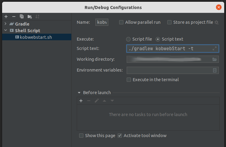
I found unchecking “Execute in the terminal” resulted in a better experience.
Running examples
Kobweb will provide a growing collection of samples for you to learn from. To see what’s available, run:
$ kobweb list

You can create the following Kobweb projects by typing `kobweb create ...`

• examples/jb/counter: A very minimal site with just a counter (based on the Jetbrains tutorial)
• examples/todo: An example TODO app, showcasing client / server interactions
• site: A template for a minimal site that demonstrates the basic features of Kobweb
For example, kobweb create examples/todo will instantiate a TODO app locally.
Basics
Kobweb, at its core, is a handful of classes responsible for trimming away much of the boilerplate around building a Web
Compose app, such as routing and configuring basic CSS styles. It exposes a handful of annotations and utility methods
which your app can use to communicate intent with the framework. These annotations work in conjunction with our Gradle
plugin (com.varabyte.kobweb.application) that handles code and resource generation for you.
Kobweb is also a CLI binary of the same name which provides commands to handle the tedious parts of building and / or
running a Web Compose app. We want to get that stuff out of the way, so you can enjoy focusing on the more interesting
work!
Create a page
Creating a page is easy! It’s just a normal @Composable method. To upgrade your composable to a page, all you need to
do is:
- Define your composable in a file somewhere under the
pagespackage in yourjsMainsource directory. - Annotate it with
@Page
Just from that, Kobweb will create a site entry for you automatically.
For example, if I create the following file:
// jsMain/kotlin/com/example/mysite/pages/admin/Settings.kt

@Page
@Composable
fun SettingsPage() {
    /* ... */
}
this will create a page that I can then visit by going to mysite.com/admin/settings.
Note: The last part of a URL, here settings, is called a slug.
By default, the slug comes from the file name but this behavior can be overridden (more on that shortly).
The file name Index.kt is special. If a page is defined inside such a file, it will be treated as the default page
under that URL. For example, a page defined in .../pages/admin/Index.kt will be visited if the user visits
mysite.com/admin/.
Route Override
If you ever need to change the route generated for a page, you can set the Page annotation’s routeOverride field:
// jsMain/kotlin/com/example/mysite/pages/admin/Settings.kt

@Page(routeOverride = "config")
@Composable
fun SettingsPage() {
    /* ... */
}
The above would create a page you could visit by going to mysite.com/admin/config.
You could potentially even use these overrides to create multiple page methods in the same file, in case that helped
group related behavior together, or generate multiple endpoints that all call to the same final page method.
routeOverride can additionally contain slashes, and if the value begins and/or ends with a slash, that has a special
meaning.
- Begins with a slash – represent the whole route from the root
- Ends with a slash – a slug will still be generated from the filename and appended to the route.
And if you set the override to “index”, that behaves the same as setting the file to Index.kt as described above.
Some examples can clarify these rules (and how they behave when combined). Assuming we’re defining a page for our site
example.com within the file a/b/c/Slug.kt:
| Annotation | Resulting URL |
|---|---|
@Page |
example.com/a/b/c/slug |
@Page("other") |
example.com/a/b/c/other |
@Page("index") |
example.com/a/b/c/ |
@Page("d/e/f/") |
example.com/a/b/c/d/e/f/slug |
@Page("d/e/f/other") |
example.com/a/b/c/d/e/f/other |
@Page("/d/e/f/") |
example.com/d/e/f/slug |
@Page("/") |
example.com/slug |
⚠️ We close this section with a warning – despite the flexibility allowed here, you should not be using this feature
frequently, if at all. A Kobweb project benefits from the fact that a user can easily associate a URL on your site with
a file in your codebase, but this feature allows you to break those assumptions. It is mainly provided to enable
dynamic routing (see the section below) or enabling a URL name that uses characters which don’t belong in Kotlin
filenames.
PackageMapping
If you don’t want to change your slug but you do want to change a part of the route, you don’t have to use a Page
annotation for this. You can also register a package mapping with a PackageMapping file annotation. Doing so looks
like this:
// site/pages/blog/_2022/PackageMapping.kt
@file:PackageMapping("2022")

package site.pages.blog._2022

import com.varabyte.kobweb.core.PackageMapping
As with the Page route overrides, the main reason you’d want to do this is that Java / Kotlin package naming
requirements are much stricter than what you might want to allow in a URL part. site.com/blog/2022/mypost reads way
better than site.com/blog/_2022/mypost.
Page context
Within a page method, you can check the current PageContext to see values relevant to the page that Kobweb has
collected. Fetch it using the rememberPageContext() method.
@Page
@Composable
fun ExamplePage() {
    val ctx = rememberPageContext()
    /* ... */
}
Query parameters
You can use the page context to check the values of any query parameters passed into the current page’s URL.
So if you visit site.com/posts?id=12345&mode=edit, you can check those values from the context with code like:
@Page
@Composable
fun Posts() {
    val ctx = rememberPageContext()
    val postId = ctx.params.getValue("id").toInt()
    val mode = EditMode.from(ctx.params.getValue("mode"))
    /* ... */
}
Dynamic routes
In addition to query parameters, Kobweb supports embedding arguments directly in the URL itself. For example, you might
want to register the path users/{user}/posts/{post} where the end user could type in a specific URL like
users/bitspittle/posts/20211231103156.
You could then read the values out of the URL as if they were query parameters:
// pages/users/user/posts/Post.kt

/* ... */
val ctx = rememberPageContext()
val username = ctx.params.getValue("user")
val postCreationTimestamp = ctx.params.getValue("post")
/* ... */
So how do we set it up? Thankfully, it’s fairly easy.
But first, notice that in the example dynamic route users/{user}/posts/{post} there are actually two different dynamic
parts, one in the middle and one at the tail end. These can be handled by the PackageMapping and Page annotations,
respectively.
PackageMapping
Pay attention to the use of the curly braces in the mapping name! That lets Kobweb know that this is a dynamic package.
// pages/users/user/PackageMapping.kt
@file:PackageMapping("{user}") // or @file:PackageMapping("{}")

package site.pages.users.user

import com.varabyte.kobweb.core.PackageMapping
In the above case, you can save some typing by passing an empty "{}" into the PackageMapping annotation. Just be
aware you need to remember to update any of your pages later if you end up refactoring the code and renaming this
package.
Page
Like PackageMapping, the Page annotation can also take curly braces to indicate a dynamic value.
We can now flesh out the code that we started with at the beginning of the dynamic routes section:
// pages/users/user/posts/Post.kt

@Page("{post}") // Or @Page("{}")
@Composable
fun PostPage() {
    val ctx = rememberPageContext()
    val username = ctx.params.getValue("user")
    val postCreationTimestamp = ctx.params.getValue("post")
    /* ... */
}
Remember that the Page annotation allows you to rewrite the entire route. That value also accepts dynamic parts, so
you could even do something like:
// pages/users/user/posts/Post.kt

@Page("/users/{user}/posts/{post}") // Or @Page("/users/{user}/posts/{}")
@Composable
fun PostPage() {
    /* ... */
}
but with great power comes great responsibility. While it works, you should only use this format in cases where you
absolutely need to (perhaps after a code refactor where you need to support legacy URL paths).
Silk
Silk is a UI layer included with Kobweb and built upon Web Compose. (To learn more about Web Compose, please visit
the official tutorials).
While Web Compose requires you to understand underlying html / css concepts, Silk attempts to abstract a lot of that
away, providing an API more akin to what you might experience developing a Compose app on Android or Desktop. Less
“div, span, flexbox, attrs, styles, classes” and more “Rows, Columns, Boxes, and Modifiers”.
We consider Silk a pretty important part of the Kobweb experience, but it’s worth pointing out that it’s designed as an
optional component. You can absolutely use Kobweb without Silk. You can also interleave Silk and Web Compose without
issue (as Silk, itself, is just composing Web Compose methods).
Inline vs StyleSheet
Before continuing, for those new to the web, it’s worth understanding that there are two ways to set styles on your HTML
elements: inline and stylesheet.
Inline styles are defined on the element tag itself, and in raw HTML might look like:
<div style="background-color:black">
Meanwhile, any given html page can reference a list of stylesheets which can define a bunch of styles, where each style
is tied to a selector (which selects what elements those styles apply to).
A concrete example stylesheet can help here:
body {
  background-color: black;
  color: magenta
}
#title {
  color: yellow
}
And you could use that stylesheet to style the following document:
<body>
  <!-- Div gets background-color from "body" and foreground color from "#title" -->
  <div id="title">
      Yellow on green
  </div>
</body>
There’s no hard and fast rule, but in general, when writing html / css by hand, stylesheets are often preferred over
inline styles as it better maintains a separation of concerns. That is, the html should represent the content of your
site, while the css controls the look and feel.
Of course, sometimes, you need to define the style of a single, specific element only. You can do that by giving it an
ID and then targeting it via an ID selector in your stylesheet (like “#title” in the example above), or you can just
set inline styles on it, which may be far easier.
We’re not writing html / css by hand, however — we’re using Web Compose! So the distinctions discussed up until now are
less important here.
However, there are times when you have to use stylesheets, because without them you can’t define styles for advanced
behaviors (particularly pseudo classes,
pseudo elements, and
media queries, the discussion of
which are outside the scope of this README). So in those cases, it’s good to understand that there’s an occasional
and fundamental difference.
In general, when you pass styles defined on the fly into a composable widget in Silk, those will result in inline
styles, whereas if you use ComponentStyle to define the styles, that will get embedded into the site’s stylesheet.
We’ll talk more about these approaches in the following sections.
// Uses inline styles
Box(Modifier.color(Colors.Red)) { ... }

// Uses a stylesheet
val MyBoxStyle = ComponentStyle("my-box") {
    base { Modifier.Color(Colors.Red) }
}
Box(MyBoxStyle.toModifier()) { ... }
One last note: debugging your page with browser tools may be easier if you lean on stylesheets over inline styles,
because it makes your DOM tree easier to look through without all that extra noise.
Modifier
Silk introduces the Modifier class, in order to provide an experience similar to what you find in Jetpack Compose.
In the world of Web Compose, you can think of a Modifier as a layer on top of CSS styles. So this:
Modifier.background(Colors.Red).color(Colors.Green).padding(200.px)
if passed into a widget composable, like Box:
Box(Modifier.background(Colors.Red).color(Colors.Green).padding(200.px)) {
    Text("Green on red")
}
would generate an HTML tag with a style property like: <div style="background:red;color:green;padding:200px">
attrModifier and styleModifier
There are a bunch of modifier extensions (and they’re growing) provided by Kobweb, like background, color, and
padding above. But there are also two escape hatches into web compose anytime you run into something that’s missing:
attrModifier and styleModifier.
Using them looks like this:
// Modify attributes of an element tag
// e.g. the "a", "b", and "c" in <tag a="..." b="..." c="..." />
Modifier.attrModifier {
    onMouseDown { /* ... */ }
}

// Modify styles of an element tag
// e.g. the "a", "b", and "c" in `<tag style="a:...;b:...;c:..." />
Modifier.styleModifier {
    width(100.percent)
    height(50.percent)
}

// Note: Because "style" itself is an attribute, you can define styles in an attrModifier:
Modifier.attrModifier {
    style {
        width(100.percent)
        height(50.percent)
    }
}
// ... but in the above case, you should use a styleModifier for simplicity
ComponentStyle
With Silk, you can define a style like so, using the base block:
val CustomStyle = ComponentStyle("custom") {
    base {
        Modifier.backgroud(Colors.Red)
    }
}
and convert it to a modifier by using CustomStyle.toModifier(). At this point, you can pass it into any composable
which takes a Modifier parameter:
// Approach #1 (uses inline styles)
Box(Modifier.background(Colors.Red)) { /* ... */ }

// Appraoch #2 (uses stylesheets)
Box(CustomStyle.toModifier()) { /* ... */}
Additional states
So, what’s up with the base block?
True, it looks a bit verbose on its own. However, you can define additional styles that take effect conditionally. The
base style will always apply first, but then additional styles can be applied based on what state the element is in. (If
multiple states are applicable at the same time, they will be applied in the order specified.)
Here, we create a style which is red by default, but green when the mouse hovers over it:
val CustomStyle = ComponentStyle("custom") {
    base {
        Modifier.color(Colors.Red)
    }

    hover {
        Modifier.color(Colors.Green)
    }
}
Kobweb provides a bunch of these state blocks for you for convenience, but for those who are CSS-savvy, you can always
define the CSS rule directly to enable more complex combinations or reference states that Kobweb hasn’t added yet.
For example, this is identical to the above style definition:
val CustomStyle = ComponentStyle("custom") {
    base {
        Modifier.color(Colors.Red)
    }

    cssRule(":hover") {
        Modifier.color(Colors.Green)
    }
}
Breakpoints
There’s a feature in the world of responsive html / css design called breakpoints, which confusingly have nothing to do
with debugging breakpoints, but rather specifying size boundaries where styles change. This is how sites often present
content differently on mobile vs. tablet vs. desktop.
Kobweb provides five breakpoints for your use, named after sizes: “sm”, “md”, “lg”, “xl”. They are initialized with
reasonable values, but you can override them if you want to decide what they mean for your app.
By default, it can be useful to think of:
- no breakpoint – mobile (more specifically, the style will appear the same on mobile as any other device)
- sm – tablets (and larger)
- md – desktops (and larger)
- lg – widescreen (and larger)
- xl – ultra widescreen
You can change the default values by adding an “init silk” block to your code:
@InitSilk
fun initializeBreakpoints(ctx: InitSilkContext) {
    ctx.theme.breakpoints = BreakpointSizes(
        sm = ...,
        md = ...,
        lg = ...,
    )
}
Despite the flexible potential of multiple sizes, many projects will be able to get away just using base styles and occasional
“md” styles.
To reference a breakpoint in a ComponentStyle, just invoke it:
val CustomStyle = ComponentStyle("custom") {
    base {
        Modifier.fontSize(24.px)
    }

    Breakpoint.MD {
        Modifier.fontSize(32.px)
    }
}
Color-mode aware
When you define a ComponentStyle, an optional field is available for you to use called colorMode:
val CustomStyle = ComponentStyle("custom") {
    base {
        Modifier.color(if (colorMode.isLight()) Colors.Red else Colors.Pink)
    }
}
Note that Silk provides a SilkTheme object you can reference in styles. For example, if you want to set your element’s
color to match the color that we use for links, you can reference the SilkTheme.palettes[colorMode] object to do so:
val CustomStyle = ComponentStyle("custom") {
    base {
        Modifier.color(SilkTheme.palettes[colorMode].link.default)
    }
}
SilkTheme contains very simple (e.g. black and white) defaults, but you can override them in an “init silk” method,
perhaps to something that is more brand aware:
@InitSilk
fun overrideSilkTheme(ctx: InitSilkContext) {
    ctx.theme.palettes = SilkPalettes(...)
}
ComponentVariant
With a style, you can also create a variant of that style (that is, additional modifications that are always applied
after the base style is). Here’s an example:
val CustomVariant = CustomStyle.addVariant("example-variant") {
    base {
        Modifier.background(Colors.Green)
    }
}
Variants can be particularly useful if you’re defining a custom widget that has default styles, but you want to give
callers an easy way to deviate from it in special cases.
For example, maybe you define a button widget (perhaps you’re not happy with the one provided by Silk):
val ButtonStyle = ComponentStyle("my-button") { /* ... */ }

// Note: Creates a style called "my-button-outline"
val OutlineButtonVariant = ButtonStyle.addVariant("outline") { /* ... */ }

// Note: Creates a style called "my-button-invert"
val InvertButtonVariant = ButtonStyle.addVariant("invert") { /* ... */ }
The ComponentStyle.toModifier(...) method, mentioned earlier, optionally takes a variant parameter. When passed in,
both styles will be applied. For example, ButtonStyle.toModifier(OutlineButtonVariant) will create a modifier for
styling your element with both the button base style and outline style combined.
Note: Using a variant that was created from a different style will have no effect. In other words,
LinkStyle.toModifier(OutlineButtonVariant) will ignore the button style. We tried to use generics as a fancy way to
enforce this at compile time but ran into limitations with the Compose compiler (see
Web Comopse bug #1333). We may revisit this API design later if
resolved, but until then, don’t do that!
So bringing it all together, you should write code that looks something like this:
@Composable
fun Button(
    modifier: Modifier = Modifier,
    variant: ComponentVariant? = null,
    @Composable content: () -> Unit
) {
    val finalModifier = ButtonStyle.toModifier(variant).then(modifier)
    Box(finalModifier, content)
}
In other words, apply the modifiers in order of base style, then variant, then finally user overrides.
A caller might call your widget one of several ways:
// Approach #1: Use default styling
Button { /* ... */ }

// Approach #1: Tweak default styles with a button variant
Button(variant = OutlineButtonVariant) { /* ... */ }

// Approach #3: Tweak default styles with inline styles
Button(Modifier.background(Colors.Blue)) { /* ... */ }

// Approach #4: Tweak variant styles with inline styles
Button(Modifier.background(Colors.Blue), variant = OutlineButtonVariant) { /* ... */ }
Font Awesome
Kobweb provides the kobweb-silk-icons-fa artifact which you can use in your project if you want access to all the free
Font Awesome icons.
Using it is easy! Search the Font Awesome gallery, choose an
icon, and then call it using the associated Font Awesome icon composable.
For example, if I wanted to add the Kobweb-themed
spider icon, what I could do is call this in my Kobweb code:
FaSpider()
That’s it!
Some icons have a choice between solid and outline versions, such as “Square”
(outline and
filled). In that case, the default choice will be outline mode,
but you can pass in a style enum to control this:
FaSquare(style = IconStyle.FILLED)
All Font Awesome composables accept a modifier parameter, so you can tweak it further:
FaSpider(Modifier.color(Colors.Red))
Note: When you create a project using our site template, Font Awesome icons are included.
Components: Layouts, Sections, and Widgets
Outside of pages, it is common to create reusable, composable parts. While Kobweb doesn’t enforce any particular rule
here, we recommend a convention which, if followed, may make it easier to allow new readers of your codebase to get
around.
First, as a sibling to pages, create a folder called components. Within it, add:
- layouts – High-level composables that provide entire page layouts. Most (all?) of your
@Pagepages will start by
calling a page layout function first. You may only have a single layout for your entire site. - sections – Medium-level composables that represent compound areas inside your pages, organizing a collection of
many children composables. If you have multiple layouts, it’s likely sections would be shared across them. For
example, nav headers and footers are great candidates for this subfolder. - widgets – Low-level composables. Focused UI pieces that you may want to re-use all around your site. For example,
a stylized visitor counter would be a good candidate for this subfolder.
Define API routes
You can define and annotate methods which will generate server endpoints you can interact with. To add one:
- Define your method (optionally
suspendable) in a file somewhere under theapipackage yourjvmMainsource
directory. - The method should take exactly one argument, an
ApiContext. - Annotate it with
@Api
For example, here’s a simple method that echoes back an argument passed into it:
// jvmMain/kotlin/com/example/mysite/api/Echo.kt

@Api
fun echo(ctx: ApiContext) {
    // ctx.req is for the incoming request, ctx.res for responding back to the client

    // Queries are parsed from the URL, e.g. here "/echo?message=..."
    val msg = ctx.req.query["message"] ?: ""
    ctx.res.setBodyText(msg)

    // You could also do something like: `ctx.res.body = ctx.req.body`
    // but using query parameters makes for an easier demo
}
After running your project, you can test the endpoint by visiting mysite.com/api/echo?message=hello
You can also trigger the endpoint in your frontend code by using the extension api property added to the
kotlinx.browser.window class:
@Page
@Composable
fun ApiDemoPage() {
  val coroutineScope = rememberCoroutineScope()

  Button(onClick = {
    coroutineScope.launch {
      println("Echoed: " + window.api.get("echo?message=hello")!!.decodeToString())
    }
  })
}
All the HTTP methods are supported (post, put, etc.). Of course, you can also use window.fetch(...) directly.
Markdown
If you create a markdown file under the jsMain/resources/markdown folder, a corresponding page will be created for you
at build time, using the filename as its path.
For example, if I create the following file:
// jsMain/resources/markdown/docs/tutorial/Kobweb.kt

# Kobweb Tutorial

...
this will create a page that I can then visit by going to mysite.com/docs/tutorial/kobweb
The power of Kotlin + Web Compose is composable interactive components though, not static text! That’s why Kobweb
Markdown support enables extensions to allow this out of the box.
Front Matter
Front Matter is metadata that you can specify at the beginning of your document, like so:
---
title: Tutorial
author: bitspittle
---

...

{{ Signature() }}
These key / value pairs can be queried in your Kotlin @Composable code, via a page’s context:
@Composable
fun Signature() {
    val ctx = rememberPageContext()
    // Markdown front matter value can be a list of strings,
    // but here it's only a single one
    val author = ctx.markdown.frontMatter.getValue("author").single()
    Text("Article by $author")
}
Note: If you’re not seeing ctx.markdown autocomplete, you need to make sure you depend on the
com.varabyte.kobwebx:kobwebx-markdown artifact in your project’s build.gradle.
Root
Within your front matter, there’s a special value which, if set, will be used to render a root @Composable that wraps
the code your markdown file would otherwise create. This is useful for specifying a layout for example:
---
root: .components.layout.DocsLayout
---

# Kobweb Tutorial
The above will generate code like the following:
import com.mysite.components.layout.DocsLayout

@Composable
@Page
fun KobwebPage() {
    DocsLayout {
        H1 {
            Text("Kobweb Tutorial")
        }
    }
}
Kobweb Call
A markdown extension built just for Kobweb, you can surround a path to a @Composable method with double-curly braces
to call it:
# Kobweb Tutorial

...

{{ .components.widgets.VisitorCounter }}
which will generate code for you like the following:
import com.mysite.components.widgets.VisitorCounter

@Composable
@Page
fun KobwebPage() {
    /* ... */
    VisitorCounter()
}
In this way, you can write pages that are mostly static text punctuated with beautiful, interactive components. This
could be a great approach for people who want to write and host their own blogs, for example.
Version Catalogs
The project templates created by Kobweb all embrace Gradle version catalogs, which are (at the time of writing this
README) a relatively new feature, so users may not be aware of it.
There is a file called libs.versions.toml that exists inside your project’s root gradle folder. If you find yourself
wanting to tweak or add new versions to projects you originally created via kobweb create, that’s where you’ll find
them.
For example, here’s the
libs.versions.toml we use for our own
landing site.
To read more about the feature, please check out the
official docs.
Can We Kobweb Yet
Current state: Foundations are in place! You may encounter API gaps.
Kobweb is becoming quite functional. We are already using it to build https://kobweb.varabyte.com and
https://bitspittle.dev (depending on when you’re reading this, they may still be fairly barebones, but these sites will
get more of our full attention as Kobweb is finally stabilizing).
At this point:
- It is easy to set up a new project and get things running quickly.
- The live reloading flow is pretty nice, and you’ll miss it when you switch to projects that don’t have it.
- It supports generating pages from Markdown that can reference your Composable code.
- While it’s not quite server-side rendering, you can export static pages which will get hydrated on load.
- You can use the
Modifierbuilder for a growing number of css properties. - There are silk components available for canvas rendering and generating screen-width-aware behavior.
However, there’s always more to do.
- The API surface is a bit lean in some areas right now, especially around Silk UI components
- The APIs that interact with Web Compose may have some holes in them.
- A lot of detailed documenation is planned to go into the Kobweb site (linked just above) but it isn’t done yet.
I think there’s enough there now to let you do almost anything you’d want to do, as either Kobweb supports it or you can
escape hatch to underlying Web Compose / Kotlin/JS approaches, but there might be some areas where it’s still a bit DIY.
It would be great to get real world experience to hear what issues users are actually running into.
So, should you use Kobweb at this point? If you are…
- playing around with Web Compose for the first time and want to get up and running quickly on a toy project:
- YES!!! Please see the connecting with us ▼ section
below, we’d definitely love to hear from you. Now’s a great time if you’d want to have a voice in the direction of
this project.
- YES!!! Please see the connecting with us ▼ section
- a Kotlin developer who wants to write a small web app or create a new blog from scratch:
- Worth a shot! I think if you evaluate Kobweb at this point, you’ll find a lot to like. You can get in touch
with us at our Discord if you try it and have questions or run into missing features.
- Worth a shot! I think if you evaluate Kobweb at this point, you’ll find a lot to like. You can get in touch
- someone who already has an existing project in progress and wants to integrate Kobweb into it:
- No – this may never be a tenable path.
- a company:
- Probably not (someday, we hope, but not yet)
Advanced
Templates
Kobweb provides its templates in a separate git repository, which is referenced within this project as a submodule for
convenience. To pull down everything, run:
/path/to/src/root
$ git clone --recurse-submodules https://github.com/varabyte/kobweb

# or, if you've already previously cloned kobweb...
/path/to/src/root/kobweb
$ git submodule update --init
What about Multiplatform Widgets?
Jetbrains is working on an experimental project called “multiplatform widgets” which is supposed to bring the Desktop /
Android API to the web. And it may seem like the Kobweb + Silk approach will be obsolete when it is finished.
However, I’ve found there is a fundamental distance between Desktop / Android Compose and Web Compose. Specifically,
Desktop / Android targets render to their own surface, while Web modifies an html / css DOM tree and leaves it up to the
browser to do the final rendering.
This has major implications on how similar the two APIs can get. For example, in Desktop / Android, the order you apply
modifiers matters, while in Web, this action simply sets html style properties under the hood, where order does not
matter.
One approach would be to own the entire rendering pipeline, ditching html / css entirely and targeting a full page
canvas. However, this has several limits:
- robots would lose the ability to crawl and index your site
- your UI will be opaque to the rich suite of dev tools that come bundled with browsers
- you won’t have the ability to style unvisited vs visited links differently (this information is hidden from you by
the browser and can only be set through html / css) - you won’t have the ability to turn elements on / off when printing the page
- accessibility tools for browsers might not work
It would also prevent a developer from making use of the rich ecosystem of Javascript libraries out there that modify
the DOM tree themselves.
For now, I am making a bet that the best way forward is to embrace the web, sticking to html / css, but providing a rich
UI library of widgets that hopefully makes it relatively rare for the developer to worry about it. For example, flexbox
is a very powerful component, but you’ll find it’s much easier to compose Rows and Columns together than trying to
remember if you should be justifying your items or aligning your content, even if Rows and Columns are just creating
the correct html / css for you behind the scenes.
I think there is value in supporting both approaches.
Known Issues
kobweb runsometimes gets stuck when Gradle (running behind it) gets stuck.- Quit kobweb, run
./gradlew --stop, and then try again - Run
./gradlew kobwebGenor./gradlew kobwebStartwith various Gradle debug options to see what’s going on
under the hood (e.g../gradlew kobwebStart --stacktrace)
- Quit kobweb, run
- A running kobweb server occasionally won’t shutdown upon quitting
- The message should indicate the PID
- In a separte terminal, kill the process manually (e.g. on Linux:
kill -9 ...) - Press CTRL-C to kill
kobweb run - Tracking this issue here
Solutions didn’t work? Or you’re encountering issues not listed here? Please consider
leaving feedback ▼!
Connecting with us
- Join our Discord!
- Follow me on Twitter: @bitspittle
- You can send direct queries to my email
Filing issues and leaving feedback
It is still early days, and while we believe we’ve proven the feasibility of this approach at this point, there’s still
plenty of work to do to get to a 1.0 launch! We are hungry for the community’s feedback, so please don’t hesitate to:
- Open an issue
- Contact us (using any of the ways mentioned above) telling us what features you want
- Ask us for guidance, especially as there are no tutorials yet (your questions can help us know what to write first!)
Thank you for your support and interest in Kobweb!