PowerSpinner
A lightweight dropdown popup spinner with an arrow and animations.
Including in your project
Gradle
Add below codes to your root build.gradle file (not your module build.gradle file).
And add a dependency code to your module's build.gradle file.
Usage
Add following XML namespace inside your XML layout file.
PowerSpinnerView
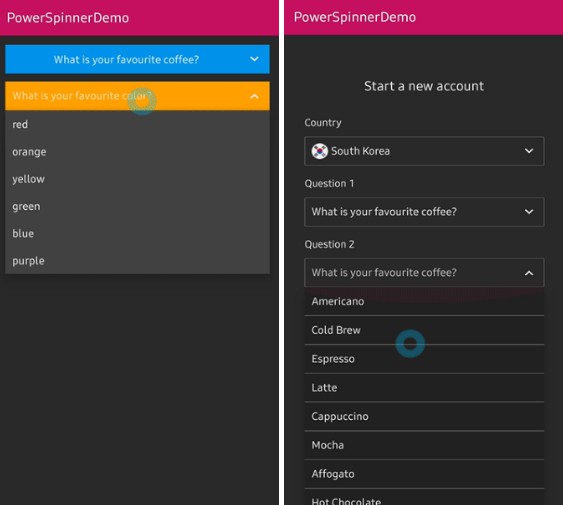
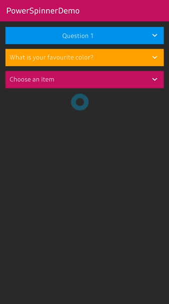
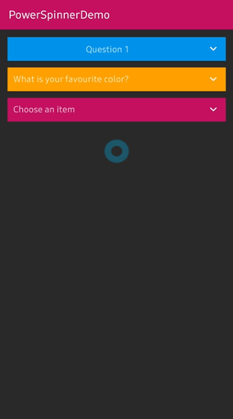
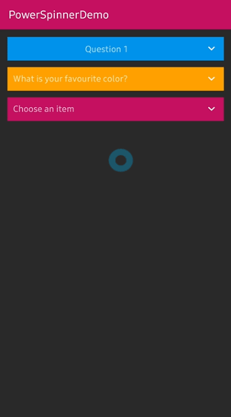
Here is a basic example of implementing PowerSpinnerView.
Basically the PowerSpinnerView extends TextView, so we can use it like a TextView.
You can set the unselected text using hint and textColorHint attributes.
Create using builder class
We can create an instance of PowerSpinnerView using the builder class.
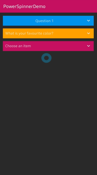
Show and dismiss
Basically, when the PowerSpinnerView is clicked, the spinner popup will be showed and
when an item is selected, the spinner popup will be dismissed.
But you can show and dismiss manually using methods.
And you can set the show and dismiss actions using some listener and attributes.
OnSpinnerItemSelectedListener
Interface definition for a callback to be invoked when selected item on the spinner popup.
Here is the java way.
selectItemByIndex
We can select an item manually or initially using the below method.
SpinnerAnimation
We can customize the showing and dimsmiss animation.
| Dropdown | Fade | Bounce |
|---|---|---|
 |
 |
 |
Customized adapter
We can use our customized adapter and binds to the PowerSpinnerView.
The PowerSpinnerView provides the spinner popup's recyclerview via getSpinnerRecyclerView method.
Here is a sample of the customized adapter.
IconSpinnerAdapter
Basically, this library provides a customized adapter.
We should create an instance of the IconSpinnerAdapter and call setItems using a list of IconSpinnerItem.
Here is the java way.
Customized adapter
Here is a way to customize your adapter for binding the PowerSpinnerView.
Firstly, create a new adapter and viewHolder extending RecyclerView.Adapter and PowerSpinnerInterface<T>.
You shoud override spinnerView, onSpinnerItemSelectedListener fields and setItems, notifyItemSelected methods.
On the customized adapter, you must call spinnerView.notifyItemSelected method when your item is clicked or the spinner item should be changed.
And we can listen to the selected item's information.
Avoid Memory leak
Dialog, PopupWindow and etc.. have memory leak issue if not dismissed before activity or fragment are destroyed.
But Lifecycles are now integrated with the Support Library since Architecture Components 1.0 Stable released.
So we can solve the memory leak issue so easily.
Just use setLifecycleOwner method. Then dismiss method will be called automatically before activity or fragment would be destroyed.
PowerSpinnerView Attributes
| Attributes | Type | Default | Description |
|---|---|---|---|
| spinner_arrow_drawable | Drawable | arrow | arrow drawable. |
| spinner_arrow_show | Boolean | true | sets the visibility of the arrow. |
| spinner_arrow_gravity | SpinnerGravity | end | the gravity of the arrow. |
| spinner_arrow_padding | Dimension | 2dp | padding of the arrow. |
| spinner_arrow_animate | Boolean | true | show arrow rotation animation when showing. |
| spinner_arrow_animate_duration | integer | 250 | the duration of the arrow animation. |
| spinner_divider_show | Boolean | true | show the divider of the popup items. |
| spinner_divider_size | Dimension | 0.5dp | sets the height of the divider. |
| spinner_divider_color | Color | White | sets the color of the divider. |
| spinner_popup_width | Dimension | spinnerView's width | the width of the popup. |
| spinner_popup_height | Dimension | WRAP_CONTENT | the height of the popup. |
| spinner_popup_background | Color | spinnerView's background | the background color of the popup. |
| spinner_popup_animation | SpinnerAnimation | Dropdown | the spinner animation when showing. |
| spinner_popup_animation_style | Style Resource | -1 | sets the customized animation style. |
| spinner_popup_elevation | Dimension | 4dp | the elevation size of the popup. |
| spinner_item_array | String Array Resource | null | sets the items of the popup. |
| spinner_dismiss_notified_select | Boolean | true | sets dismiss when the popup item is selected. |