ComposeRecyclerView
ComposeRecyclerView enables seamless integration of Jetpack Compose composables within traditional RecyclerView. This library addresses performance concerns and resolves issues commonly faced in Compose LazyList implementations. It comes with built-in support for drag-and-drop functionality, making it a versatile solution for dynamic UIs.

Benefits
-
Improved Performance: ComposeRecyclerView optimizes the rendering of Jetpack Compose items within a RecyclerView, providing better performance compared to LazyList implementations.
-
Drag-and-Drop Support: Built-in support for drag-and-drop functionality makes it easy to implement interactive and dynamic user interfaces.
-
Flexible Configuration: Customize the layout, item creation, and callbacks to fit your specific UI requirements.
-
Multi-Item Type Support: Easily handle multiple item types within the same RecyclerView, enhancing the versatility of your UI.
Sample Usage
Integrating ComposeRecyclerView into your Android app is a breeze! Follow these simple steps to get started:
Implement ComposeRecyclerView:
Use the ComposeRecyclerView composable to create a RecyclerView with dynamically generated Compose items.
ComposeRecyclerView(
    modifier = Modifier.fillMaxSize(),
    itemCount = yourTotalItemCount,
    itemBuilder = { index ->
        // Compose content for each item at the specified index
        // Similar to Flutter's ListView.builder() widget
        // Customize this block based on your UI requirements
    },
    onScrollEnd = {
        // Callback triggered when the user reaches the end of the list during scrolling
        // Add your logic to handle the end of the list, such as loading more data
    },
    itemTouchHelperConfig = {
        nonDraggableItemTypes = setOf(yourHeaderItemType)
        onMove = { recyclerView, viewHolder, target ->
            // Handle item move
        }
        onSwiped = { viewHolder, direction ->
            // Handle item swipe
        }
        // Add more customization options as needed
    }
)
Customize as Needed:
Customize the layout, handle item types, and add drag-and-drop functionality based on your project requirements.
itemTypeBuilder = object : ComposeRecyclerViewAdapter.ItemTypeBuilder {
    override fun getItemType(position: Int): Int {
        // Determine the item type based on the position
        // Customize this logic based on your requirements
        return yourItemType
    }
}

onItemMove = { fromPosition, toPosition, itemType ->
    // Update your data structure when an item is moved
    // Customize this block based on your data structure
}

onDragCompleted = { position ->
    // Handle item drag completion (e.g., update the UI or perform an API call)
    // Customize this block based on your requirements
}
Customize Layout (Optional):
You can customize the layout of your RecyclerView as needed.
recyclerView.layoutManager = LinearLayoutManager(context, RecyclerView.VERTICAL, false)
// OR
recyclerView.layoutManager = GridLayoutManager(context, yourSpanCount)
ComposeRecyclerView in Action: Creating Complex UIs with Drag-and-Drop
Sample.Video.mp4
Sample Implementation
const val ITEM_TYPE_FIRST_HEADER = 0
const val ITEM_TYPE_FIRST_LIST_ITEM = 1
const val ITEM_TYPE_SECOND_HEADER = 2
const val ITEM_TYPE_SECOND_LIST_ITEM = 3

class MainActivity : ComponentActivity() {
    override fun onCreate(savedInstanceState: Bundle?) {
        super.onCreate(savedInstanceState)
        setContent {
            ComposeRecyclerViewTheme {
                Surface(
                    modifier = Modifier.fillMaxSize(),
                    color = MaterialTheme.colorScheme.background
                ) {
                    val userDataList = List(20) { index ->
                        UserData(
                            "User ${index + 1}",
                            20 + index,
                            if (index % 2 == 0) "Male" else "Female"
                        )
                    }

                    val otherUsersDataList = List(20) { index ->
                        UserData(
                            "User ${index + 21}",
                            20 + index,
                            if (index % 2 == 0) "Male" else "Female"
                        )
                    }

                    ComposeRecyclerView(
                        modifier = Modifier.fillMaxSize(),
                        itemCount = 1 + userDataList.size + 1 + otherUsersDataList.size,
                        itemBuilder = { index ->
                            if (index == 0) {
                                Box(
                                    modifier = Modifier.fillMaxWidth(),
                                    contentAlignment = Alignment.Center
                                ) {
                                    Text(
                                        "First List Header Composable",
                                        style = MaterialTheme.typography.titleMedium,
                                        modifier = Modifier.padding(16.dp)
                                    )
                                }
                                return@ComposeRecyclerView
                            }

                            val userIndex = index - 1
                            if (userIndex < userDataList.size) {
                                CustomUserItem(user = userDataList[userIndex])
                                return@ComposeRecyclerView
                            }

                            if (userIndex == userDataList.size) {
                                Box(
                                    modifier = Modifier.fillMaxWidth(),
                                    contentAlignment = Alignment.Center
                                ) {
                                    Text(
                                        "Second List Header Composable",
                                        style = MaterialTheme.typography.titleMedium,
                                        modifier = Modifier.padding(16.dp)
                                    )
                                }
                                return@ComposeRecyclerView
                            }

                            val otherUserIndex = index - userDataList.size - 2
                            if (otherUserIndex < otherUsersDataList.size) {
                                CustomUserItem(user = otherUsersDataList[otherUserIndex])
                                return@ComposeRecyclerView
                            }
                        },
                        onItemMove = { fromPosition, toPosition, itemType ->
                            // Update list when an item is moved
                            when (itemType) {
                                ITEM_TYPE_FIRST_HEADER -> {
                                    // Do nothing
                                }

                                ITEM_TYPE_FIRST_LIST_ITEM -> {
                                    val fromIndex = fromPosition - 1
                                    val toIndex = toPosition - 1
                                    Collections.swap(userDataList, fromIndex, toIndex)
                                }

                                ITEM_TYPE_SECOND_HEADER -> {
                                    // Do nothing
                                }

                                // ITEM_TYPE_SECOND_LIST_ITEM
                                else -> {
                                    val fromIndex = fromPosition - userDataList.size - 2
                                    val toIndex = toPosition - userDataList.size - 2
                                    Collections.swap(otherUsersDataList, fromIndex, toIndex)
                                }
                            }
                        },
                        onDragCompleted = {
                            // Update list or do API call when an item drag operation is completed
                            Log.d("MainActivity", "onDragCompleted: $it")
                        },
                        itemTypeBuilder = object : ComposeRecyclerViewAdapter.ItemTypeBuilder {
                            override fun getItemType(position: Int): Int {
                                // Determine the item type based on the position
                                // You can customize this logic based on your requirements
                                return when {
                                    position == 0 -> ITEM_TYPE_FIRST_HEADER // Header type
                                    position <= userDataList.size -> ITEM_TYPE_FIRST_LIST_ITEM // First list item type
                                    position == userDataList.size + 1 -> ITEM_TYPE_SECOND_HEADER // Header type
                                    else -> ITEM_TYPE_SECOND_LIST_ITEM // Second list item type
                                }
                            }
                        },
                        onScrollEnd = {
                            // Do API call when the user reaches the end of the list during scrolling
                            Log.d("MainActivity", "onScrollEnd")
                        },
                        itemTouchHelperConfig = {
                            nonDraggableItemTypes =
                                setOf(ITEM_TYPE_FIRST_HEADER, ITEM_TYPE_SECOND_HEADER)

                            /*onMove = { recyclerView, viewHolder, target ->
                                // Handle item move
                            }
                            onSwiped = { viewHolder, direction ->
                                // Handle item swipe
                            }
                            // Add more customization options as needed*/
                        },
                    ) { recyclerView ->
                        recyclerView.addItemDecoration(
                            DividerItemDecoration(
                                recyclerView.context,
                                DividerItemDecoration.VERTICAL
                            )
                        )

                        // To change layout to grid layout
                        val gridLayoutManager = GridLayoutManager(this, 2).apply {
                            spanSizeLookup = object : GridLayoutManager.SpanSizeLookup() {
                                override fun getSpanSize(position: Int): Int {
                                    return if (position == 0 || position == userDataList.size + 1) {
                                        2 // To show header title at the center of the screen and span across the entire screen
                                    } else {
                                        1
                                    }
                                }
                            }
                        }
                        recyclerView.layoutManager = gridLayoutManager
                    }
                }
            }
        }
    }
}

@Composable
fun CustomUserItem(user: UserData) {
    Card(
        modifier = Modifier
            .fillMaxWidth()
            .padding(16.dp),
        colors = CardDefaults.cardColors(
            containerColor = Color.Black,
            contentColor = Color.White
        ),
        elevation = CardDefaults.cardElevation(
            defaultElevation = 8.dp
        ),
        shape = RoundedCornerShape(8.dp)
    ) {
        Column(
            modifier = Modifier
                .padding(16.dp)
        ) {
            Text(
                text = "Name: ${user.name}",
                style = MaterialTheme.typography.titleMedium,
                color = Color.White
            )
            Spacer(modifier = Modifier.height(8.dp))
            Text(
                text = "Age: ${user.age}",
                style = MaterialTheme.typography.titleMedium,
                color = Color.White
            )
            Spacer(modifier = Modifier.height(8.dp))
            Text(
                text = "Gender: ${user.gender}",
                style = MaterialTheme.typography.titleMedium,
                color = Color.White
            )
        }
    }
}
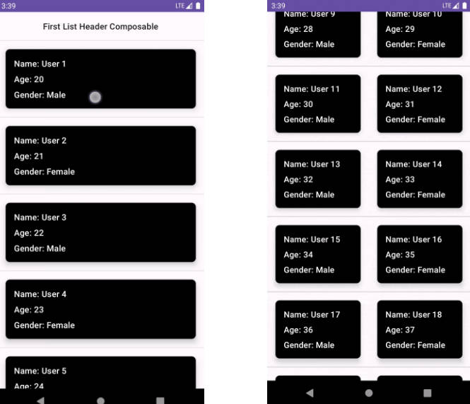
Linear Layout

|
Grid Layout

|
Demo
To see ComposeRecyclerView in action, check out our Sample app.
Bugs and Feedback
For bugs, questions and discussions please use the Github Issues
Credits
ComposeRecyclerView is owned and maintained by the Canopas team. For project updates and releases, you can follow them on Twitter at @canopassoftware.
Acknowledgments
Jetpack Compose Interop Article: We express our appreciation to the Jetpack Compose Interop Article on Medium by Chris Arriola. This article provided valuable insights and guidance on supporting Jetpack Compose in RecyclerView, helping us understand the intricacies of integration and contributing to the realization of our own ideas.
Licence
Copyright 2023 Canopas Software LLP

Licensed under the Apache License, Version 2.0 (the "License");
You won't be using this file except in compliance with the License.
You may obtain a copy of the License at

   http://www.apache.org/licenses/LICENSE-2.0

Unless required by applicable law or agreed to in writing, software
distributed under the License is distributed on an "AS IS" BASIS,
WITHOUT WARRANTIES OR CONDITIONS OF ANY KIND, either express or implied.
See the License for the specific language governing permissions and
limitations under the License.
