CalendarView
A highly customizable calendar library for Android, powered by RecyclerView.
Features
- [x] Single or range selection - The library provides the calendar logic which enables you to implement the view whichever way you like.
- [x] Boundary dates - limit the calendar date range.
- [x] Custom date view - make your day cells look however you want, with any functionality you want.
- [x] Custom calendar view - make your calendar look however you want, with whatever functionality you want.
- [x] Pick any day to be the first day of the week.
- [x] Horizontal or vertical scrolling mode.
- [x] Add headers/footers of any kind on each month.
- [x] Easily scroll to any date or month view using the date.
- [x] Use all RecyclerView customisations(decorators etc) since the CalendarView extends from RecyclerView.
- [x] Design your calendar however you want. The library provides the logic, you provide the views.
Sample project
It's very important to check out the sample app. Most techniques that you would want to implement are already implemented in the examples.
Get the sample app here
Usage
Step 1
The library uses java.time classes via ThreeTenABP for backward compatibility since these classes were added in Java 8. Therefore, you need to initialize ThreeTenABP in your application class.
Add CalendarView to your XML like any other view.
Step 2
Create your day view resource in res/layout/calendar_day_layout.xml.
Create your view container which acts as a view holder for each date cell.
The view passed in here is the inflated day view resource which you provided.
Provide a DayBinder for the CalendarView using your DayViewContainer type.
Step 3
Setup the desired dates in your Fragment or Activity:
And that's all you need for a simple usage!
To add a header or footer to each month, the procedure is the same. Just provide your monthHeaderResource or monthFooterResource attribute, then set the monthHeaderBinder or monthFooterBinder property of the CalendarView.
For more complex usages, please see the sample project.
In the example above, we get the first day of the week from the current locale, however, we can use a specific day regardless of locale by passing in the value DayOfWeek.SUNDAY, DayOfWeek.MONDAY etc
Attributes
XML (All prefixed cv_ for clarity)
-
dayViewResource: The xml resource that is inflated and used as the day cell view. This must be provided.
-
monthHeaderResource: The xml resource is inflated and used as a header for every month.
-
monthFooterResource: The xml resource is inflated and used as a footer for every month.
-
orientation: The calendar orientation, can be
horizontalorvertical. Default isvertical. -
scrollMode: The scrolling behavior of the calendar. Can be
pagedorcontinuous. Ifpaged, the calendar will snap to the nearest month after a scroll or swipe action. Default value iscontinuous. -
outDateStyle: This determines how outDates are generated for you. If
endOfRow, the calendar will generate outDates until it reaches the first end of a row. This means that if a month has 6 rows, it will display 6 rows and if a month has 5 rows, it will display 5 rows. However, if this value is set toendOfGrid, the calendar will generate outDates until it reaches the end of a 6 x 7 grid. This means that all months will have 6 rows.
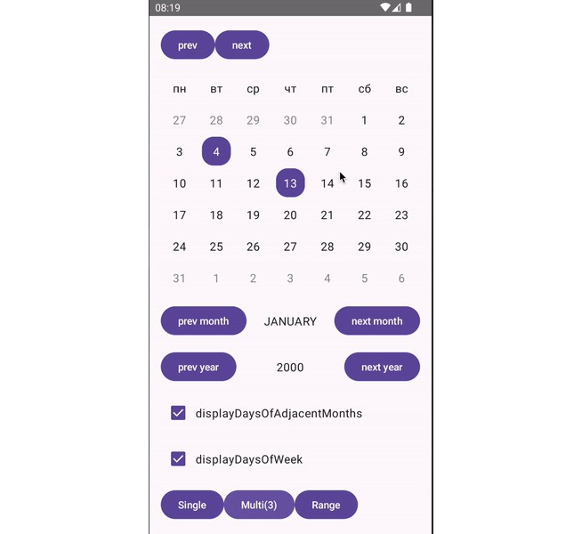
If you are wondering what outDates and inDates mean, let's use the screenshot below as an example.

In the image, the dates with the green annotation are inDates while those with the red annotation are outDates. You can check for this when binding your calendar. To achieve the exact effect on the image, we do this:
inDates have their owner property set to DayOwner.PREVIOUS_MONTH
outDates have their owner property set to DayOwner.NEXT_MONTH
Dates which belong to the month have their owner property set to DayOwner.THIS_MONTH as seen in the code snippet above.
Properties
-
monthScrollListener: Called when the calendar scrolls to a new month. Mostly beneficial if
scrollModeispaged. -
dayBinder: An instance of
DayBinderfor managing day cell views. -
monthHeaderBinder: An instance of
MonthHeaderFooterBinderfor managing header views. -
monthFooterBinder: An instance of
MonthHeaderFooterBinderfor managing footer views. -
dayWidth: The width, in pixels for each day cell view.
-
dayHeight: The height, in pixels for each day cell view.
Note that setting either dayWidth or dayHeight to CalendarView.DAY_SIZE_SQUARE makes the day cells have equal width and height which is basically the width of the calendar divided by 7. DAY_SIZE_SQUARE is the default day width and height value.
Methods
-
scrollToDate(date: LocalDate): Scroll to a specific date on the calendar.
-
scrollToMonth(month: YearMonth): Scroll to a month on the calendar.
-
notifyDateChanged(date: LocalDate): Reload the view for the specified date.
-
notifyMonthChanged(month: YearMonth): Reload the header, body and footer views for the specified month.
-
notifyCalendarChanged(): Reload the entire calendar.
There's no need listing all available methods or repeating the documentation here. Please see the CalendarView class for all properties and methods available with proper documentation.
Made a cool calendar with this library? Share an image here.
Setup
Gradle
Add the JitPack repository to your project level build.gradle:
Add this to your app build.gradle:
Note: <latest-version> value can be found on the JitPack badge above the preview images.