Lighter
A highlight & guide library for android.
Support use in:
- Android native layout(Such as RelativeLayout, FragmentLayout)
- RecyclerView & ListView & GridView & ScrollView
- ViewPager
- Dialog
- Fragment
Features:
- One or more highlighted views can be displayed at one time
- Customizing the paint for highlighting the view
- Customize the shape of the highlighted view and the size of the shape
- Customized tip view display animation
- Custom relative position of the tip view
- Chained display code, simple to use
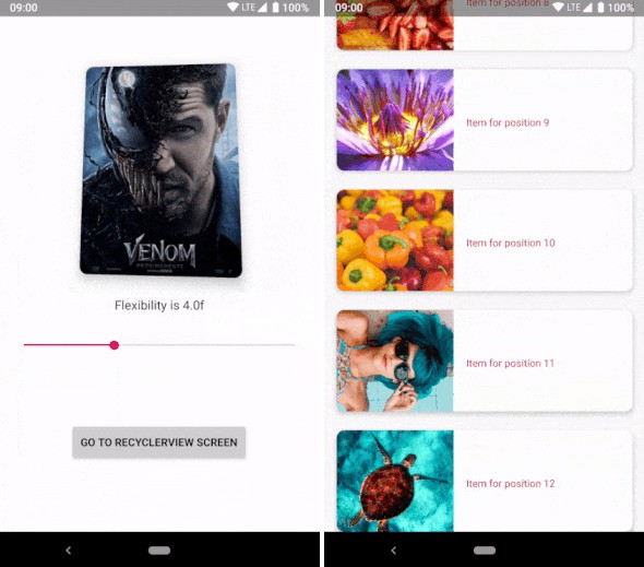
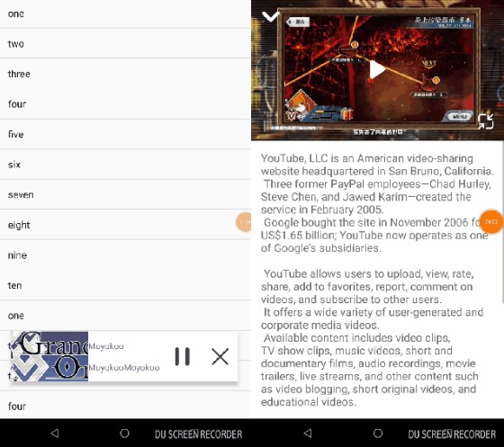
Screenshots


Usage
Gradle
Add it in your app build.gradle at the end of repositories:
Maven
Code
You can specify that the highlighted root view is attached to the activity or viewgroup,
you can use the below code to specify:
Complete call:
When you need to display multiple highlight views at once, call addHighlight(LighterParameter...lighterParameters)
About LighterParameter.Builder
| Method | Description |
|---|---|
| setHighlightedViewId | Set id the highlighted view |
| setHighlightedView | Set the highlighted view |
| setTipLayoutId | Set the layout id of the tip layout |
| setTipView | Set the tip view |
| setLighterShape | Set the shape of the wrapped highlight view |
| setShapeXOffset | Set the x-axis offset of the shape rect |
| setShapeYOffset | Set the y-axis offset of the shape rect |
| setTipViewRelativeDirection | Set the direction of the tip view relative to the highlighted view |
| setTipViewRelativeOffset | Set the offset of the tip view's margin relative to the highlighted view |
| setTipViewDisplayAnimation | Set animation of the tip view when display |
| build | To create a LighterParameter object |
Note:
- setHighlightedViewId & setHighlightedView
- setTipLayoutId & setTipView
For the above two methods, you only need to use one. If you don't use it, an exception will be throwing.
About Shape
| Shape | Description |
|---|---|
| Rect | A rectangular shape with rounded corners and blur radius |
| Circle | A circle shape with blur radius |
| Oval | A oval shape with blur radius |
ShapeXOffset & ShapeYOffset
Refer to the below picture :

About parameter of TipView
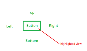
Direction
Refer to the below picture :

Offset
When you specify a direction(the default is left), the offset distance will be based on the direction you specify.
E.g:
Left: The values of topMargin & rightMargin will take effect
Right: The values of topMargin & leftMargin will take effect
Top: If the highlighted view is on the left side of the screen, the values of leftMargin & bottomMargin will take effect. Otherwise, the values of rightMargin & bottomMargin will take effect.
Bottom: If the highlighted view is on the left side of the screen, the values of leftMargin & topMargin will take effect. Otherwise, the values of rightMargin & topMargin will take effect.
Animation
You can set any animation for the tip view.