compose-collapsable
A generic collapsable implementation with dragging and nested scrolling support. This extracts and builds upon logic from the compose material 3 top app bar implementation.
Download
implementation("me.tatarka.compose.collapsable:compose-collapsable:0.1.0")
Usage
This library is made up of a few main parts that you can pick-and-choose for your own collapsing ui implementations.
CollapsableColumn
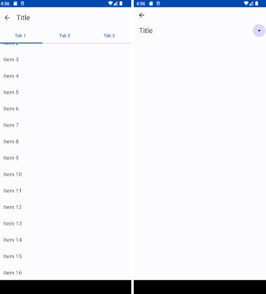
Lays out children in a column, allowing some of them to collapse. This is useful for simple cases like an accordion or a top app bar that hides portions when it scrolls away.


For example, a top app bar which hides it’s title but pins tabs as you scroll the page can be implemented as:
val collapsableBehavior = rememberCollapsableBehavior()
Scaffold(
    modifier = Modifier.nestedScroll(collapsableBehavior.nestedScrollConnection),
    topBar = {
        CollapsableColumn(behavior = collapsableBehavior) {
            TopAppBar(title = { Text("Title") }, modifier = Modifier.collapse())
            TabRow {
               ...
            }
        }
    }
) { padding ->
    LazyColumn(contentPadding = padding) {
        ...
    }
}
CollapsableBehavior
The CollapsableBehavior above has 2 roles. It handles nested scrolling and drags on the
collapsable view itself. You can use these pieces independently in your own implementations. To
handle nested scrolling, use the Modifier.nestedScroll() modifier.
modifier = Modifier.nestedScroll(collapsableBehavior.nestedScrollConnection)
and to handle dragging on the view use the provided Modifier.draggable() modifier.
modifier = Modifier.draggable(collapsableBehavior)
CollapsableState
CollapsableBehavior holds a CollapsableState which manages the actual expand and collapse state.
You can use this state along with the behavior or by itself for your own more complex
collapsing implementations. See the CustomLayoutTopAppBar and ParallaxBackgroundTopAppBar examples
in the sample app.


