CircularProgressView
A fancy CircularProgressView.
Version 1.x
- Nov, 2019 - Added "gradient color" (SweepGradient) for progress
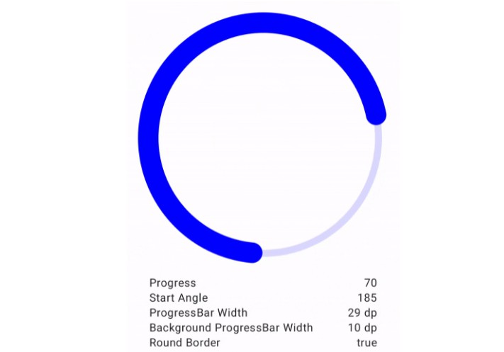
- Apr, 2019 - Added rounded progress
- Jun, 2018 - Added reverse progress
- May, 2018 - Added "multiple-arc-progress"
- February, 2018 - Background alpha enable/disable
- November, 2017 - Progress thumb and animation callback
- September, 2017 - CircularProgressView
Getting started
Include it into your project, for example, as a Gradle dependency:


Usage
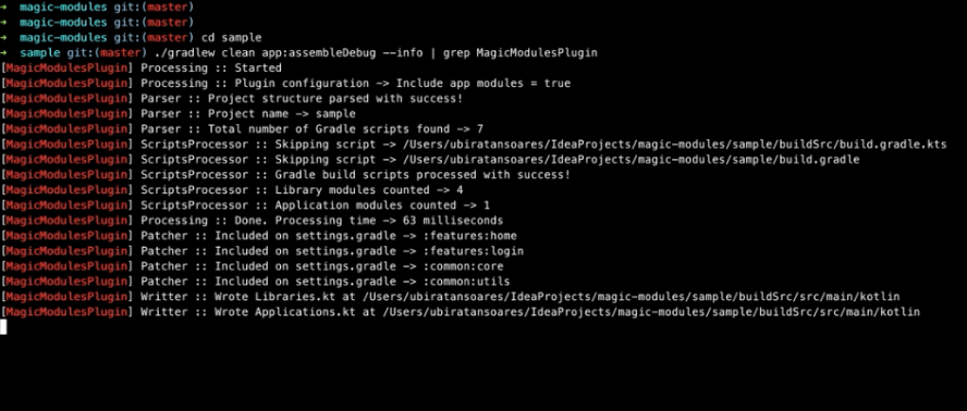
Check out the sample module where you can find a few examples of how to create it by xml or java.
Attributes accepted in xml:
Example:
@BindingAdapters
You can take advantage of Binding Adapters (from Data Binding) to create some helper attributes, example:
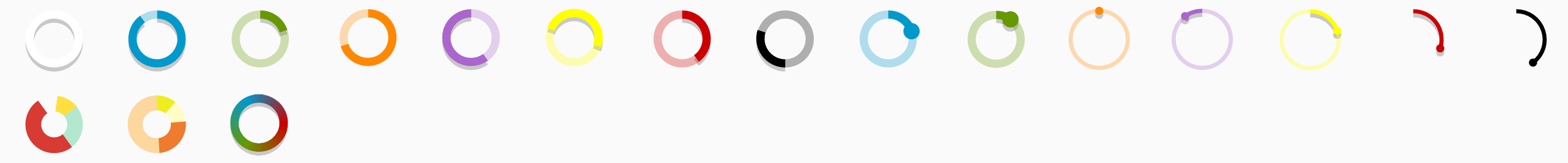
Progress with gradient
For the given array of colors:
The default result will be (left):

To achieve the result on the right side you have two options: either copy the first color and add it as last, or use the helper attribute/method that does that for you:
Finally, you may also use the attribute progressBarColorArrayPositions to pass a float[] positions:
note: when using the helper function and positions[], you'll have to add an extra position for the last one being copied.
There are many methods to help you customize this View by code. For more details checkout the sample app, javadocs or the code itself.
"Multiple Progress" for PieChart

This mode can be used to display a simple pie chart. It will disable the progress thumb, the background color and the progress will not be round.
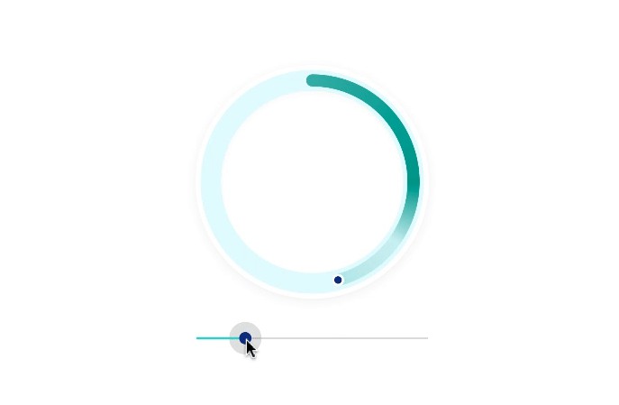
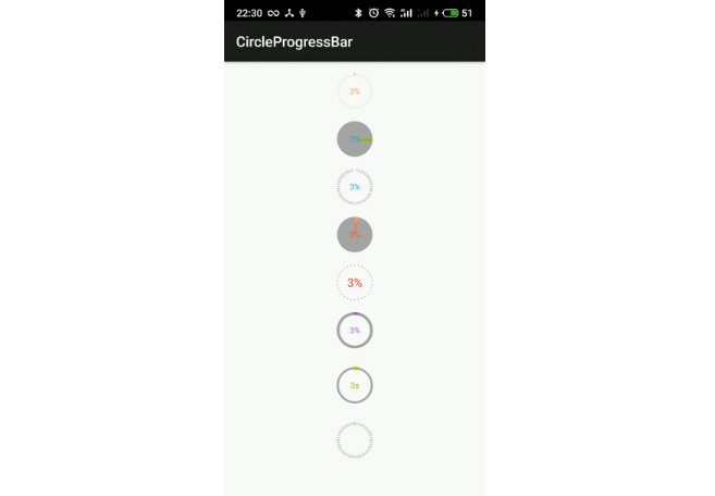
Sample

Animation last update on April, 2019
Binaries
Binaries and dependency information for Gradle, Maven, Ivy and others can be found here.
Dependencies
Bugs and Feedback
For bugs, questions and discussions please use the Github Issues.