PrimeDatePicker
First, PrimeDatePicker is a date picker tool which provides picking a single day in addition to a range of days. Second, you can use its MonthView and CalendarView as stand-alone views in your projects.
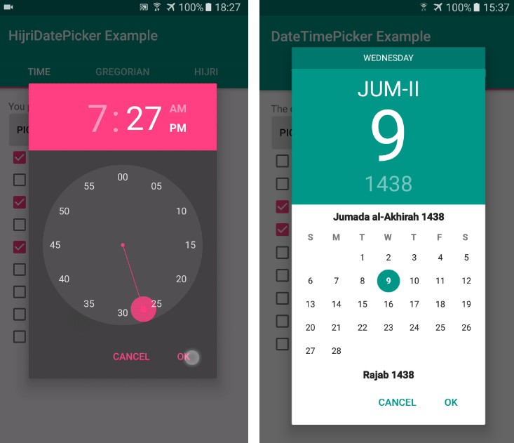
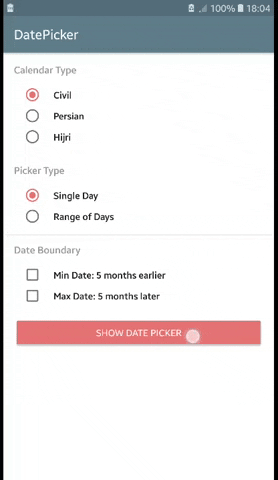
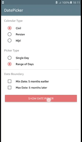
| Pick a Single Day | Pick a Range of Days | Fling Orientations |
|---|---|---|
 |
 |
 |
Download
PrimeDatePicker is available on bintray to download using build tools systems. Add the following lines to your build.gradle file:
Usage
To use PrimeDatePickerBottomSheet, simply use below snippet:
Kotlin
Java
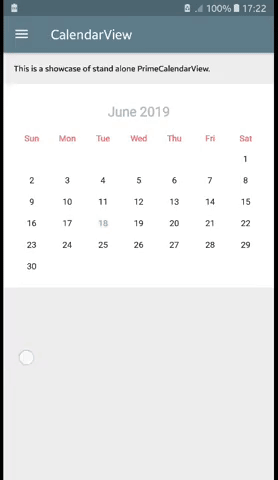
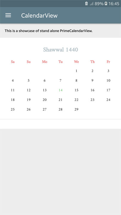
Stand-Alone Views
In addition to use PrimeDatePicker as a date picker tool, it is possible to employ stand-alone views in your project.
They are PrimeMonthView & PrimeCalendarView which can be used in layout xml files or instantiated programmatically.
For example:
xml
Programmatically
1. XML Attributes
Applying customization has been provided for PrimeMonthView and PrimeCalendarView by using xml attributes as well as setting them programmatically.
For example:
xml
Programmatically
1.1. Common attributes for PrimeMonthView & PrimeCalendarView:
| Attribute | Type |
| • calendarType | enum |
| Specifies the calendar type which is shown by this view. Its possible values are: civil, persian, hijri. | |
| • monthLabelTextColor | color |
| Specifies the text color of month name label. | |
| • weekLabelTextColor | color |
| Specifies the text color of week day name labels. | |
| • dayLabelTextColor | color |
| Specifies the text color of day number labels. | |
| • todayLabelTextColor | color |
| Specifies the text color of day number label which belongs to today. | |
| • pickedDayLabelTextColor | color |
| Specifies the text color of day number labels when they are picked. | |
| • pickedDayCircleColor | color |
| Specifies the background color of day numbers when they are picked. | |
| • disabledDayLabelTextColor | color |
| Specifies the text color of day number labels when they are disabled. | |
| • monthLabelTextSize | dimension |
| Specifies the text size of month name label. | |
| • weekLabelTextSize | dimension |
| Specifies the text size of week day name labels. | |
| • dayLabelTextSize | dimension |
| Specifies the text size of day number labels. | |
| • monthLabelTopPadding | dimension |
| Specifies the top padding of month name label. | |
| • monthLabelBottomPadding | dimension |
| Specifies the bottom padding of month name label. | |
| • weekLabelTopPadding | dimension |
| Specifies the top padding of week day name labels. | |
| • weekLabelBottomPadding | dimension |
| Specifies the bottom padding of week day name labels. | |
| • dayLabelVerticalPadding | dimension |
| Specifies the vertical padding (top and bottom) of day number labels. | |
| • showTwoWeeksInLandscape | boolean |
| When it sets true, month view shows two weeks (14 days) in each row for landscape screen orientation. | |
1.2. PrimeCalendarView Specific Attributes:
| Attribute | Type |
| • flingOrientation | enum |
| Specifies the fling orientation of calendar view. Its possible values are: vertical, horizontal. | |
| • dividerColor | color |
| Specifies the color of divider lines separating month views. | |
| • dividerThickness | dimension |
| Specifies the thickness of divider lines separating month views. | |
| • dividerInsetLeft | dimension |
| Specifies the left margin of divider lines when the fling orientation is vertical. | |
| • dividerInsetRight | dimension |
| Specifies the right margin of divider lines when the fling orientation is vertical. | |
| • dividerInsetTop | dimension |
| Specifies the top margin of divider lines when the fling orientation is horizontal. | |
| • dividerInsetBottom | dimension |
| Specifies the bottom margin of divider lines when the fling orientation is horizontal. | |
| • loadFactor | integer |
| Specifies the number of month to be load in pagination. | |
| • maxTransitionLength | integer |
| Specifies the maximum number of month that are shown between current and target in transitions. It's used when goto method has called. | |
| • transitionSpeedFactor | float |
| Specifies the speed factor of scrolling in transitions. It's used when goto method has called. | |
2. Other Variables (Common for PrimeMonthView & PrimeCalendarView)
These variables are only accessible programmatically to get or set. (Available by getter and setter methods in java)
| Variable | Type |
| • typeface | Typeface |
| Specifies the typeface of showing texts. | |
| • pickedSingleDayCalendar | PrimeCalendar |
| Specifies the single picked date. | |
| • pickedRangeStartCalendar | PrimeCalendar |
| Specifies the start date of the picked range. | |
| • pickedRangeEndCalendar | PrimeCalendar |
| Specifies the end date of the picked range. | |
| • minDateCalendar | PrimeCalendar |
| Specifies the minimum feasible date of the view. | |
| • maxDateCalendar | PrimeCalendar |
| Specifies the maximum feasible date of the view. | |
| • pickType | PickType |
| Specifies the date picking type of the view. Its possible values are: SINGLE, RANGE_START, RANGE_END, NOTHING. | |
3. Listener (Common for PrimeMonthView & PrimeCalendarView)
You can listen to day picking actions by setting an instance of OnDayPickedListener to the views.
For example:
Locale
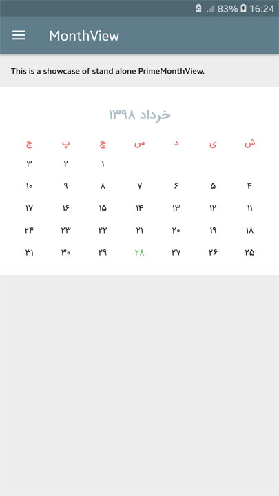
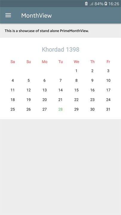
PrimeMonthView and PrimeCalendarView (consequently PrimeDatePickerBottomSheet) have been implemented with localization capabilities.
By choosing locale for the PrimeCalendar instance which is passed to goto method, or by setting it directly to the views, you can localize names, digits, and layout direction.
Localization example for PrimeMonthView using PersianCalendar:
| monthView.goto(PersianCalendar()) // or monthView.locale = Locale("fa") |
monthView.goto(PersianCalendar(Locale.ENGLISH)) // or monthView.locale = Locale.ENGLISH |
 |
 |
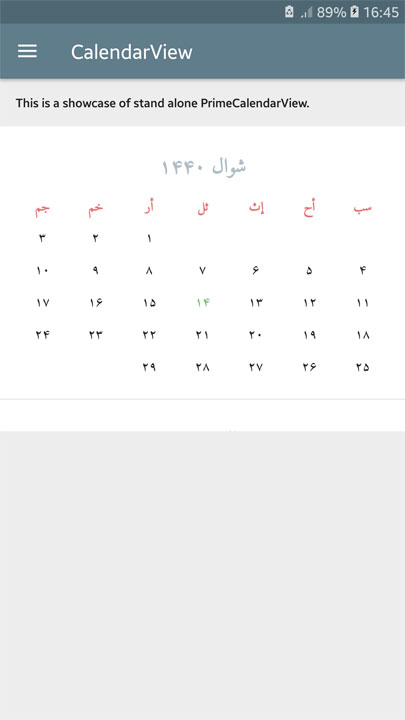
Localization example for PrimeCalendarView using HijriCalendar:
| calendarView.goto(HijriCalendar()) // or calendarView.locale = Locale("ar") |
calendarView.goto(HijriCalendar(Locale.ENGLISH)) // or calendarView.locale = Locale.ENGLISH |
 |
 |
Customizing Texts in Date Picker Bottom Sheet
If you want to change the texts of the date picker bottom sheet, define some strings in your project's strings.xml with equal name defined in the library's strings.xml, to override them.