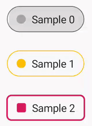
CheckableChipView
A checkable widget for Android. Based on the EventFilterView from the Google I/O 2018 app.
Requires Android minSdkVersion 21.
Setup
Make sure you have the jcenter repo in your project level build.gradle
Add the dependency to your lib/app build.gradle
Usage
XML
Include the widget into your xml layout like this
The following xml attributes are supported
| Attribute | Description |
|---|---|
android:text |
The text to display |
android:textColor |
The default text color |
android:color |
The color of the indicator dot as well as the background color when the widget is checked |
android:background |
The default background color |
android:checked |
The checked state of the widget, either true or false |
app:ccv_outlineColor |
The color of the outline |
app:ccv_outlineCornerRadius |
The corner radius of the outline, in dp. Defaults to a pill shape if not set |
app:ccv_outlineWidth |
The stroke width of the outline, in dp |
app:ccv_checkedTextColor |
The text color when the widget is checked |
app:ccv_foreground |
The foreground drawable to display |
In code
The state of the widget can be observed like this
To switch between checked/unchecked state programatically with animation, use the following method:
Plus, there are following methods at your service for changing the state without animation: