? Blueprint
Visualize dimensions of your composables on a blueprint


The Problem
Have you ever desired to see, what exactly is that padding’s value while looking at the composable preview window? Especially when you are developing a button with 5 color styles, 3 sizes and 2 optional icons, and each combination of these parameters has different paddings?
Combinatorial explosion of UI components in design systems requires having a lot of context about paddings, dp’s, sizes, corer radiuses and other dimensional information in your head at the same time.


In addition, code to produce those combinations can get tricky to analyze. So, verification also becomes hard: you make screenshots, move them to figma, overlay them on top, and try to see the difference. Tedious ?!
The Solution
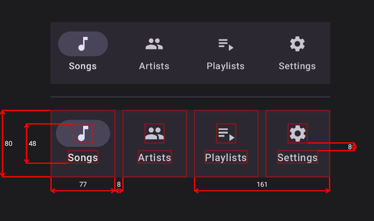
The Blueprint library provides a way to visualize dimensional information in your UI using simple DSL-based definition:
- Just wrap your target UI in
Blueprintcomposable - Mark children with
Modifier.blueprintId(id: String)modifier - Write the blueprint definition
Blueprint(
    blueprintBuilder = {
        widths {
            group {
                "item0".right lineTo "item1".left
                "item0" lineTo "item0"
                "item2" lineTo "item3"
            }
        }
        heights {
            group { "item0Icon" lineTo "item0Text" }
            group { "item0" lineTo "item0" }
            group(End) { "item3Icon".bottom lineTo "item3Text".top }
        }
    }
) {
    val items = remember { listOf("Songs", "Artists", "Playlists", "Settings") }
    NavigationBar {
        items.forEachIndexed { index, item ->
            NavigationBarItem(
                modifier = Modifier.blueprintId("item$index"),
                icon = { Icon(Modifier.blueprintId("item${index}Icon"), TODO()) },
                label = { Text(Modifier.blueprintId("item${index}Text"), TODO()) },
                selected = index == 0,
                onClick = { TODO() }
            )
        }
    }
}
Preview


And another example:


More examples
These are snapshots from snapshot testing:
 |
 |
 |
 |
 |
 |
 |
.png) |
 |
.png) |
 |
 |
 |
 |
 |
 |
 |
.png) |
 |
.png) |
Features
You can customize
- Line and border strokes (width and color)
- Font size and color
- Arrow style (length, angle, round or square cap)
- Decimal precision of the dimensional values
Of course, Blueprint works in Android Studio’s Preview✨!
Also, you can disable all the overhead of this library in your release builds by
disabling blueprint rendering using blueprintEnabled property.
Getting Started
Groovy
Add the following code to your project’s root build.gradle file:
repositories {
    maven { url "https://jitpack.io" }
}
Next, add the dependency below to your module‘s build.gradle file:
dependencies {
    implementation "com.github.popovanton0:blueprint:LATEST_VERSION"
}
Kotlin
Add the following code to your project’s root settings.gradle.kts file:
dependencyResolutionManagement {
    // ...
    repositories {
        // ...
        maven { url = uri("https://jitpack.io") }
    }
}
Next, add the dependency below to your module‘s build.gradle.kts file:
dependencies {
    implementation("com.github.popovanton0:blueprint:LATEST_VERSION")
}
Or using Gradle Version Catalog:
[versions]
blueprint = "LATEST_VERSION"

[libraries]
blueprint = { module = "com.github.popovanton0:blueprint", version.ref = "blueprint" }
Licence
Copyright 2023 Anton Popov

Licensed under the Apache License, Version 2.0 (the "License");
you may not use this file except in compliance with the License.
You may obtain a copy of the License at

http://www.apache.org/licenses/LICENSE-2.0

Unless required by applicable law or agreed to in writing, software
distributed under the License is distributed on an "AS IS" BASIS,
WITHOUT WARRANTIES OR CONDITIONS OF ANY KIND, either express or implied.
See the License for the specific language governing permissions and
limitations under the License.


