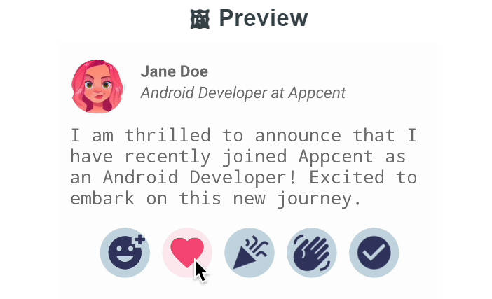
Like Button
Like Button is a library that allows you to create a button with animation effects similar to Twitter's heart when you like something.

Gradle Dependency
Repository
Add this in your root build.gradle file (not your module build.gradle file):
Dependency
Add this to your module's build.gradle file:
Basic Usage
Like Button XML
To use this like button in your layout simply copy and paste the xml below. This provides the default heart button.
Attributes
There are several other attributes that can be used to configure the button's behaviour and appearance. They are shown below and will be explained in the sections that follow long with their java counterparts.
Button State
To set the inital liked state of the button you simply use the setLiked functionality via XML or Java. This will show the button in the liked state with the drawable that you selected.
XML
app:liked="true"
Java
You can also set if the button is to be enabled or disabled. Once disabled, the animation, listener or any other functionality of the button won't be triggered.
XML
app:is_enabled="false"
Java
Like Event Listener
To listen to events from your like button, simply implement the listener that's triggered once the button is tapped.
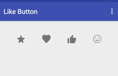
Icon Types
The libary is bundled with three icons that you can use. A heart,thumb and a star.
XML
To set the respective icon via xml simply use the word in the icon type attribute.
app:icon_type="heart"
Java
If you would like to set the icon via Java then simply call the set icon method on the button.
Icon Size
XML
To set the icon size via xml simply use this attribute
Java
If you are doing it programmatically you can set it with either the method for pixels or dp.
Note, it's very important that the size of the button is set even if you are planning to use custom drawables as described below as the library uses this value to determine the width and height of the effects that occur when the button is tapped.
Custom Icons
XML
In order to use custom icons instead of the ones bundled with the library you simply set the drawables that represent the liked and unliked state of the button.
app:like_drawable="@drawable/thumb_on"
app:unlike_drawable="@drawable/thumb_off"
Java
Circle Color Config
If you watch the animation closely you will notice that there's a circle that begins from the center of the icon and and then it animates away from the center before the exploding dots animate. These colours can be changed to suit the theme of your icon.
XML
app:circle_start_color="@color/colorPrimary"
app:circle_end_color="@color/colorAccent"
Java
Dots Color Config
The dots that represent the outer animation can be coloured also.
XML
app:dots_primary_color="@color/colorAccent"
app:dots_secondary_color="@color/colorPrimary"
Java
likeButton.setExplodingDotColorsRes(R.color.colorPrimary,R.color.colorAccent);
Animation Size
To change the size of the dots that also contributes to the size of the overall like button view you can use the animation scale factor attribute via XML or it's Java equivalent
XML
app:anim_scale_factor="2.5"
Java
likeButton.setAnimationScaleFactor(2);