Android Spantastic
Spantastic is an Android library that provides a simple and Kotlin fluent API for creating Android Spannable.
This library wrappers SpannableStringBuilder and add methods to easily decorate the text with multiple spans.
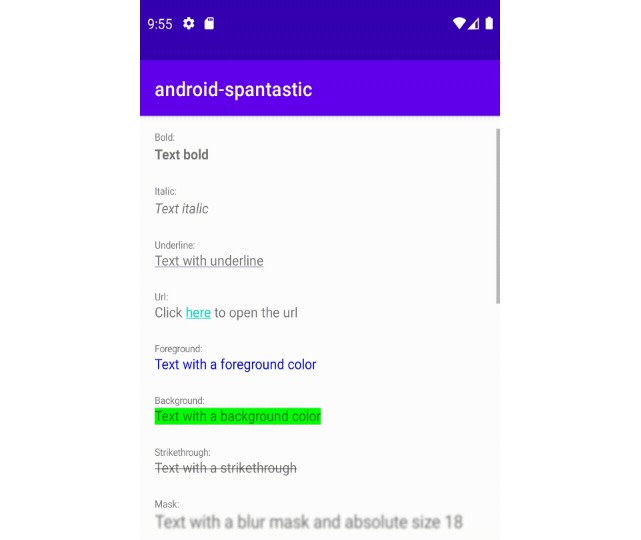
Supported Spans:
absoluteSize align background bold bullet clickable drawableMargin foreground iconMargin image italic leadingMargin lineHeight mask monospace quote relativeSize sansSerif scaleX serif strike style subscript superscript tab textAppearance typeface underline url
How to add
Step 1. Add the JitPack repository to your build file
allprojects {
    repositories {
      ...
      maven { url 'https://jitpack.io' }
    }
}
Step 2. Add the dependency
Gradle:
dependencies {
    implementation 'com.github.wellingtoncabral:android-spantastic:<LATEST-VERSION>'
}
Kotlin:
dependencies {
    implementation ("com.github.wellingtoncabral:android-spantastic:$LATEST_VERSION")
}
How to use
Use the spantastic{} builder to decorate texts from the SpantasticBuilder context.
This method will return a SpannableStringBuilder.
val span = spantastic {

}
binding.textView.text = span
Adding text
You can add text in many more ways.
val span = spantastic {
    +"This is an example using unary plus operator\n"

    "This is an example using a string invoke\n" {
        // Add decorators
    }

    text("This is an example using text function\n") {
        // Add decorators
    }

    text(context, R.string.my_string) {
        // Add decorators
    }
}
binding.textView.text = span
It looks like:
Adding decorators
To manipulate the text, add decorators inside the text block.
In the example below, mark the text with multiple decorators/spans.
val span = spantastic {
    "Text with bold, underline, absolute size, foreground, and background decorations" {
        bold()
        underline()
        foreground(Color.WHITE)
        background(Color.BLACK)
        absoluteSize(20)
    }
}
binding.textView.text = span
It looks like:
Note that the decorators are applied for a specific block of text. See an example:
val span = spantastic {
    + "Text with "
    "bold" {
        bold()
    }
    + ", "
    "relative size" {
        relativeSize(2f)
    }
    + ", "
    "absolute size" {
        absoluteSize(22)
    }
    + ", "
    "foreground" {
        foreground(Color.RED)
        absoluteSize(18)
    }
    + ", and "
    "background "{
        background(Color.MAGENTA)
        foreground(Color.WHITE)
        absoluteSize(18)
    }
    + "decorations."
}
binding.textView.text = span
It looks like:
If you prefer put full text first and then apply decorators, you can set up the start and end position.
Let’s take a look at this example that draws the molecular formula of caffeine:
val span = spantastic {
    // Example using custom positions
    "☕- C8H10N4O2" {
        subscript {
            start = 4
            end = 5
        }
        subscript {
            start = 6
            end = 8
        }
        subscript {
            start = 9
            end = 10
        }
        subscript {
            start = 11
            end = 12
        }
    }
}
binding.textView.text = span
In the same way without custom positions:
val span = spantastic {
    + "☕- C"
    "8" { subscript() }
    + "H"
    "10" { subscript() }
    + "N"
    "4" { subscript() }
    + "O"
    "2" { subscript() }
}
binding.textView.text = span
It looks like:
Creating extensions like components
You can create extension functions to build custom decoration components.
In the example below, we created 3 custom components: h1, title, divider, and contactList.
fun SpantasticBuilder.h1(text: String) {
    text {
        bold()
        absoluteSize(22)
        align(Layout.Alignment.ALIGN_CENTER)
        divider()
    }
}

fun SpantasticBuilder.title(text: String, shouldBreakLine: Boolean = true) {
    text {
        absoluteSize(10)
        underline()
        bold()
        if (shouldBreakLine) newLine()
    }
}

fun SpantasticBuilder.divider() {
    newLine()
    newLine()
}

fun SpantasticBuilder.contactList(
    vararg contacts: String,
    onClick: (String) -> Unit
) {
    contacts.forEachIndexed { index, contact ->
        "@$contact" {
            clickable { onClick(contact) }
            bold()
            foreground(Color.MAGENTA)
        }
        if (index < contacts.size-1) + ", " else + "."
    }
}
So, you can use them easily like that:
val span = spantastic {
    h1("Example")

    title("Contact list: ")

    + "Click to show the contact info "
    contactList("Wellington", "Thiago", "Patrick", "Geovana", "Júlia") { contact ->
        showContactInfo(contact)
    }

    divider()
}
binding.textView.text = span
It looks like:
Initializing the spantastic with a known text
If you already have an instance of SpannableStringBuilder, you can pass it to the spantastic builder to be appended in the context. For example, you can pass the editText.text as SpannableStringBuilder to the spantastic calling asSpannableStringBuilder like that:
binding.editText.text = spantastic(binding.editText.text.asSpannableStringBuilder()) {
    bold()
}
The bold decorator will be applied to the existing text in the EditText component.
Show case
Adding clickable areas
Spantastic provides 2 ways to work with clickable areas: url and clickable.
Take a look in this simple example:
val span = spantastic {
    "Text with url" {
        url("https://github.com/wellingtoncabral")
    }

    newLine()

    "Text with clickable area" {
        clickable(isUnderlineText = true) {
            showActivity()
        }
    }
}
binding.textView.text = span
It looks like:
The first example uses url to open the brownser with the given url and the second one uses clickable which invokes the lambda method, in this case showActivity().
Let’s take a look in a real use case:
val span = spantastic {
    "By continuing, you agree to the Terms os Service and Privacy Policy." {
        url("https://github.com/wellingtoncabral") {
            start = 32
            end = 48
        }

        clickable(
            isUnderlineText = true,
            init = {
                start = 53
                end = 67
            }
        ) {
            showActivity()
        }
    }
}
binding.textView.text = span
It looks like:
Adding images
Spantastic provides many ways to add images.
val span = spantastic {
    "Text with image from resource id " {
        image(context, R.drawable.ic_android, DynamicDrawableSpan.ALIGN_BASELINE)
    }

    newLine()

    "Text with image " {
        image(context, bitmap, DynamicDrawableSpan.ALIGN_CENTER)
    }

    + " from the Bitmap "
}
binding.textView.text = span
It looks like:
See also drawableMargin and iconMargin.
Adding Android Style Resource
Use the textAppearance to set up a Android style resource.
val span = spantastic {
    "Text with a custom appearance" {
        textAppearance(context, R.style.CustomStyle)
    }
}
binding.textView.text = span
<resources>
    <style name="CustomStyle">
        <item name="android:textColor">@color/teal_700</item>
        <item name="android:textSize">18sp</item>
        <item name="android:textStyle">bold|italic</item>
    </style>
</resources>
It looks like:
Adding alignments
val span = spantastic {
    "Text with normal alignment" {
        align(Layout.Alignment.ALIGN_NORMAL)
    }

    newLine()

    "Text with center alignment" {
        align(Layout.Alignment.ALIGN_CENTER)
    }

    newLine()

    "Text with opposite alignment" {
        align(Layout.Alignment.ALIGN_OPPOSITE)
    }
}
binding.textView.text = span
It looks like:
Adding custom fonts
val span = spantastic {
    val myTypeface = Typeface.create(
        ResourcesCompat.getFont(context, R.font.aguafina_script), Typeface.NORMAL
    )
    "Text with a custom typeface" {
        typeface(myTypeface)
        absoluteSize(24)
    }
}
binding.textView.text = span
It looks like:
Adding mask
val span = spantastic {
    "Text with a blur mask and absolute size 18" {
        mask(BlurMaskFilter(radius = 5f, BlurMaskFilter.Blur.NORMAL))
        absoluteSize(18)
    }
}
binding.textView.text = span
It looks like:
More examples
To see more and use case implementations, please take a look at the sample app.
https://github.com/wellingtoncabral/android-spantastic/tree/main/sample/src/main/java/com/wcabral/spantastic
References
- https://developer.android.com/reference/android/text/Spannable.html
- https://developer.android.com/guide/topics/text/spans
- https://medium.com/androiddevelopers/spantastic-text-styling-with-spans-17b0c16b4568


