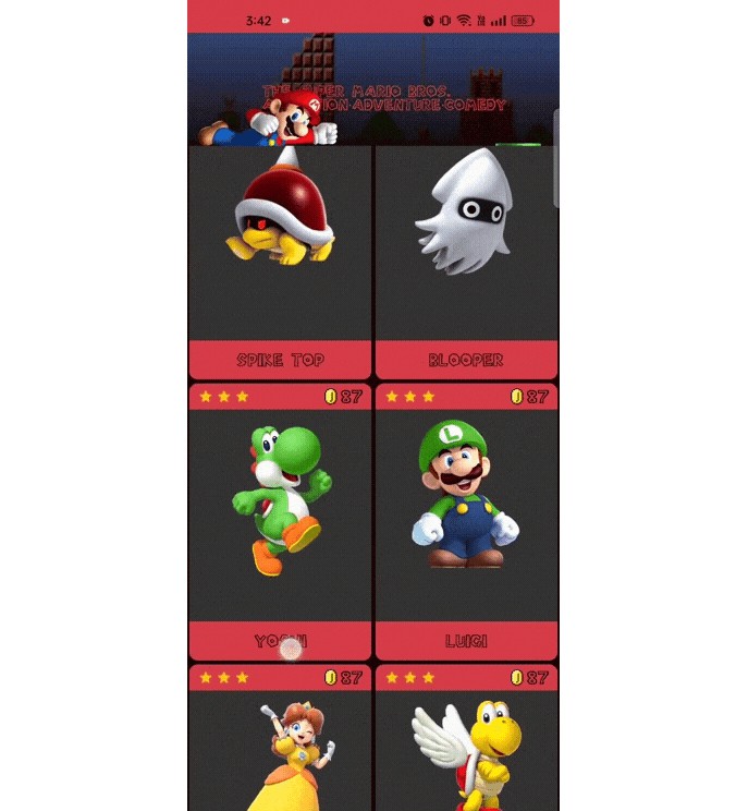
Showcase Layout Compose
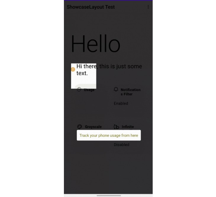
Create a beautiful animated showcase effect for you android app easily !
Demo
Usage
Showcase Layout Compose is available on mavencentral().
Add the dependency to your module’s build.gradle file like below
implementation("ly.com.tahaben:showcase-layout-compose:1.0.1")
Step 1
Create a ShowcaseLayout and make it the root composable (put all screen composables inside it)
    var isShowcasing by remember {
    mutableStateOf(true)
}
ShowcaseLayout(
    isShowcasing = isShowcasing,
    onFinish = { isShowcasing = false }
) {
    //screen content here
    Column(
        modifier = Modifier
            .fillMaxSize()
    ) {
        Text(text = "ShowcaseLayout Test 1")
        Spacer(modifier = Modifier.height(16.dp))
        Text(text = "ShowcaseLayout Test 2")
        Spacer(modifier = Modifier.height(16.dp))
        Text(text = "ShowcaseLayout Test 3")
    }
}
Step 2
Wrap the composables you want to showcase with Showcase(), Lets say we want to showcase the first
text “ShowcaseLayout Test 1”
    Showcase(
    //should start with 1 and increment with 1 for each new composable you wrap with Showcase()
    k = 1, message =
) {
    Text(text = "ShowcaseLayout Test 1")
}
Step 3
Start showcasing by making isShowcasing = true, and stop showcasing by making it false
above we stop showcasing after we showcase the last item using onFinished which is called whenever
all items are showcased,
Done, our text is now showcased!, customize it further with Additional parameters
Additional parameters
isDarkLayout
Makes the showcase view white instead of black (useful for dark UI).
ShowcaseLayout(
    isShowcasing = isShowcasing,
    onFinish = { isShowcasing = false },
    isDarkLayout = isSystemInDarkTheme()
)
greeting
A customizable greeting message of type showcaseMsg()
ShowcaseLayout(
    isShowcasing = isShowcasing,
    onFinish = { isShowcasing = false },
    isDarkLayout = isSystemInDarkTheme(),
    greeting = ShowcaseMsg(
        "Welcome to my app, lets take you on a quick tour!, tap anywhere to continue",
        textStyle = TextStyle(color = Color.White)
    )
)
initKey
the initial value of the counter, set this to 1 if you don’t want a greeting message before showcasing targets.
animationDuration
total animation time taken when switching from current to next target in milliseconds(default is 1000ms).
    ShowcaseLayout(
    isShowcasing = isShowcasing,
    onFinish = { isShowcasing = false },
    isDarkLayout = isSystemInDarkTheme(),
    greeting = ShowcaseMsg("Welcome to my app, lets take you on a quick tour!, press anywhere to continue"),
    animationDuration = 1000
)
ShowcaseMsg
Use ShowcaseMsg() to add a message and customize it with arrow, background and more.
ShowcaseMsg(
    //the message text to be displayed
    "Track your phone usage from here",
    //text style for the message text
    textStyle = TextStyle(color = Color(0xFF827717)),
    //a background color for the text
    msgBackground = MaterialTheme.colors.primary,
    //control corner radius of msgBackground
    roundedCorner = 15.dp,
    //determin if the message will be displayed above or below the target composable
    gravity = Gravity.Bottom,
    //adds an arrow to be displayed with the message
    arrow = Arrow(color = MaterialTheme.colors.primary)
)
| ShowcaseMsg | without ShowcaseMsg |
|---|---|
 |
 |
Arrow
Used with ShowcaseMsg to add an arrow pointing to the target
arrow = Arrow(
    //From where the arrow will point at the target, can be: Top, Bottom, Right or Left
    targetFrom = Side.Top,
    // animates a curved arrow from the message to the target(if true targetFrom is ignored)
    // might not work properly depending on the location of the target on the screen
    animateFromMsg = true,
    // if false then just draw a line (an arrow without head :P)
    hasHead = false,
    //color of the arrow
    color = MaterialTheme.colors.primary
)
| Default Arrow | animateFromMsg = true |
hasHead = false |
|---|---|---|
 |
 |
 |
Complete Example
For a complete example check out MainScreen.kt or clone/downoad this repository and check the app module.
Contributing
Contributions are always welcome!
Used By
Showcase Layout is used by:
Contact me if you used ShowcaseLayout in your app and you want it added to this list
