NativeScript-FloatingActionButton
NativeScript plugin for Material Design Floating Action Button UI component.
Installation
Nativescript 7+:
ns plugin add @nstudio/nativescript-floatingactionbutton
NativeScript lower than 7:
tns plugin add @nstudio/nativescript-floatingactionbutton@2.1.0
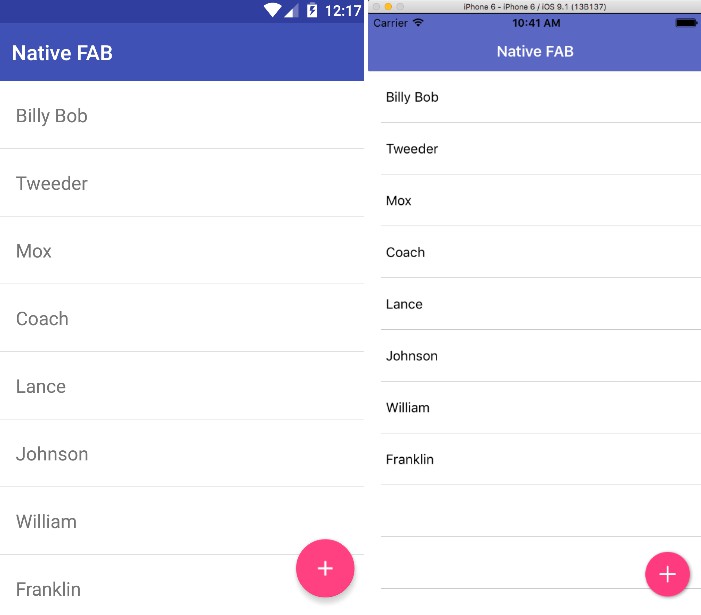
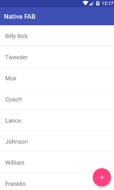
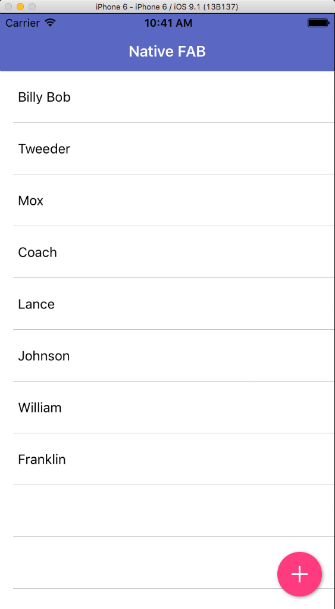
Screenshot
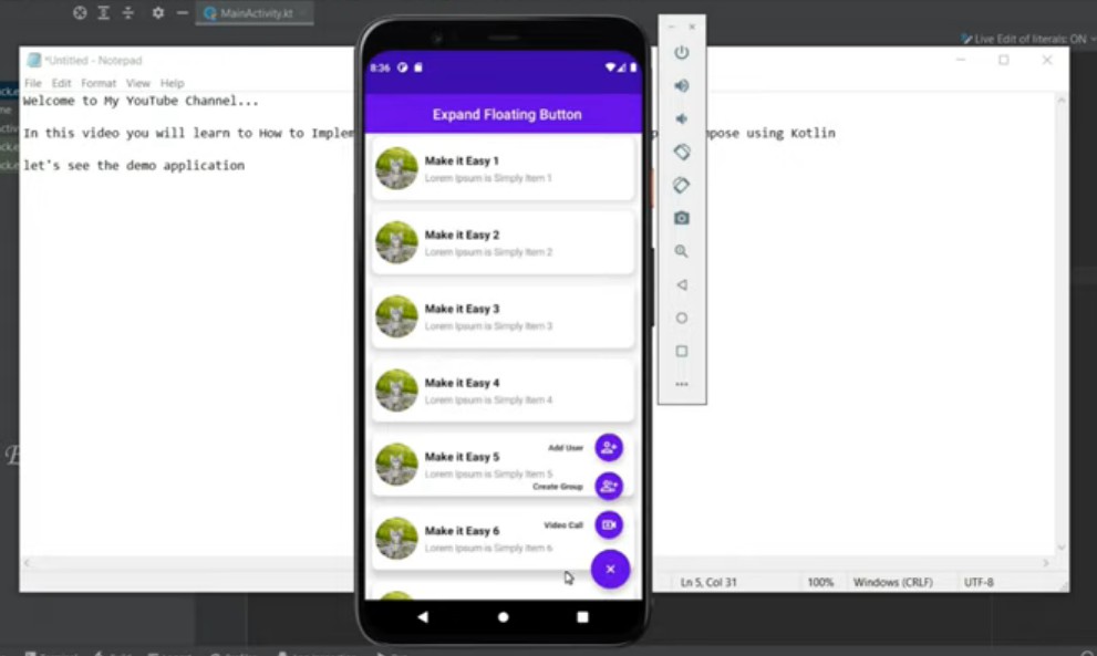
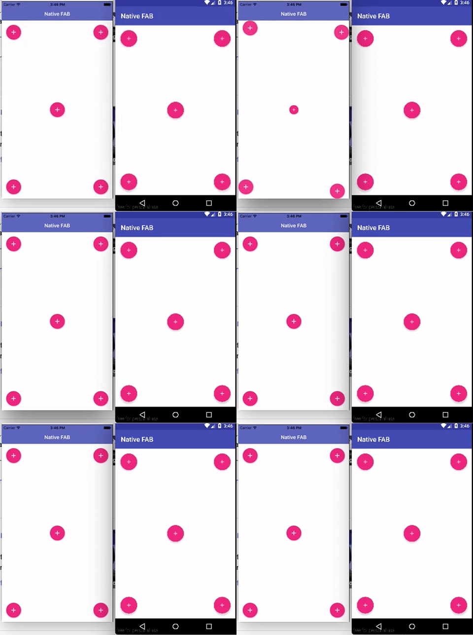
Multiple FAB/Swipe Animation Support
Usage
The icon for the FAB can be a local image in your app or an image/icon from the App_Resources.
Plain NativeScript
NativeScript Angular
HTML
NativeScript Vue
Template
CSS
Recommended CSS styles.
Use Icon Fonts
First you need to setup icon fonts as described in NativeScript documentation.
After this, you can use icon fonts on FAB by specifiying the unicode as text and add the fas/far class:
<FAB:fab text="" class="fab-button fas" />
API
| Property | Android | iOS | Description | Note |
|---|---|---|---|---|
| backgroundColor | X | X | Sets the background color of the button | |
| icon | X | X | Supports the same image source options that NativeScript images support | Required on android |
| text | X | X | Allows to use text instead of image | Can be styled with font-* and color CSS properties |
| rippleColor | X | Ripple color on lollipop devices, it will fill the FAB on pre-lollipop devices | None | |
| hideOnSwipeOfView | X | X | Directs the fab to animate itself in and out on scroll | Pass it the name of the view to monitor for a scroll event example: hideOnSwipeOfView="userListView" |
| hideAnimationDuration | X | X | How many milliseconds it takes for the button to hide. | Default if not set: 300ms |
| swipeAnimation | X | X | slideDown, slideUp, slideLeft, slideRight, scale | Default is slideDown |
| androidScaleType | X | center, centerCrop, centerInside, fitCenter, fitEnd, fitStart, fitXY, matrix for more details see Android-Docs |
Default is center |
iOS Notes
- We're using MNFloatingActionButton by Matt Nydam
- Width\Height are requried properties
- icon is a required property, if left as empty string default will be shown
