MaterialChipsInput
Implementation of Material Design Chips component for Android. The library provides two views : ChipsInput and ChipView.
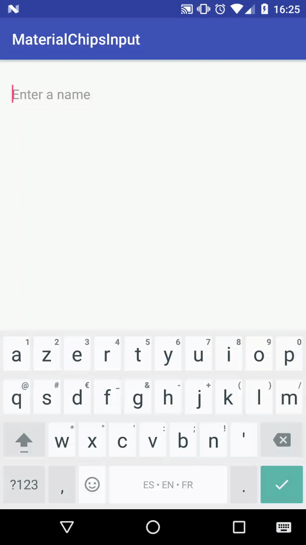
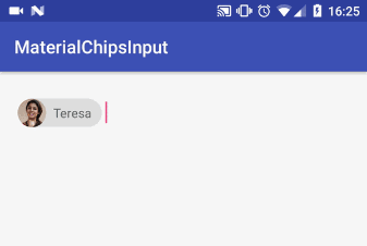
Demo
Setup
To use this library your minSdkVersion must be >= 15.
In your project level build.gradle :
In your app level build.gradle :
ChipsInput
This view implements the Material Design Contact chips component.
It is composed of a collection of chips (ChipView) and an input (EditText). Touching a chip open a full detailed view (if non disable). The GIF above describes the behavior of the ChipsInput view.
But everything is configurable (optional avatar icon, optional full detailed view, ...) so you can use the ChipsInput view for non contact chips.
Basic Usage
XML
Use the ChipsInput view in your layout with default options :
You can also customize it (see all attributes) :
Suggestions
You can pass a List<? extends ChipInterface> object, which represents your suggestions, to the ChipsInput view, so it will work as a
MultiAutoCompleteTextView :
1. Create a class that implements ChipInterface (or use directly the Chip class included in the library) :
2. Then in your activity, or anything else, build your suggestion list of ContactChip (or Chip) and pass it to the ChipsInput view :
Get the selected list
When you want you can get the current list of chips selected by the user :
That's it, there is nothing more to do.
Advanced Usage
ChipsListener
The ChipsInput view provides a listener to interact with the input :
Add and remove chips manually
You don't have to pass a List<? extends ChipInterface> to the ChipsInput view and you can do the trick manually. Thanks to the ChipsListener you can be notified when the user is typing and do your own work.
Add a chip
There are multiple implementations :
Remove a chip
There are multiple implementations :
After you added or removed a chip the ChipsListener will be triggered.
Get the selected list
When you want you can get the current list of chips selected by the user :
ChipsInput attributes
| Attribute | Type | Description | Default |
|---|---|---|---|
app:hint |
string |
Hint of the input when there is no chip | null |
app:hintColor |
color |
Hint color | android default |
app:textColor |
color |
Text color when user types | android default |
app:maxRows |
int |
Max rows of chips | 2 |
app:chip_labelColor |
color |
Label color of the chips | android default |
app:chip_hasAvatarIcon |
boolean |
Whether the chips have avatar icon or not | true |
app:chip_deletable |
boolean |
Whether the chips are deletable (delete icon) or not | false |
app:chip_deleteIconColor |
color |
Delete icon color of the chips | white/black |
app:chip_backgroundColor |
color |
Background color of the chips | grey |
app:showChipDetailed |
boolean |
Whether to show full detailed view or not when touching a chip | true |
app:chip_detailed_textColor |
color |
Full detailed view text color | white/balck |
app:chip_detailed_backgroundColor |
color |
Background color of the full detailed view | colorAccent |
app:chip_detailed_deleteIconColor |
color |
Delete icon color of the full detailed view | white/black |
app:filterable_list_backgroundColor |
color |
Background color of the filterable list of suggestions | white |
app:filterable_list_textColor |
color |
Text color of the filterable list of suggestions | black |
ChipView
This view implements the chip component according to the Material Design guidelines with configurable options (background color, text color, ...).

Usage
ChipView attributes
| Attribute | Type | Description | Default |
|---|---|---|---|
app:label |
string |
Label of the chip | null |
app:labelColor |
color |
Label color of the chip | android default |
app:hasAvatarIcon |
boolean |
Whether the chip has avatar icon or not | false |
app:avatarIcon |
drawable |
Avatar icon resource | null |
app:deletable |
boolean |
Whether the chip is deletable (delete icon) or not | false |
app:deleteIconColor |
color |
Delete icon color of the chip | grey |
app:backgroundColor |
color |
Background color of the chip | grey |
Listeners
On chip click listener :
On delete button click listener :
Sample
A sample app with some use cases of the library is available on this link
You can also download the sample APK here