sliding-panel
A ViewGroup that implements a sliding panel that is part of the view hierarchy, not above it.
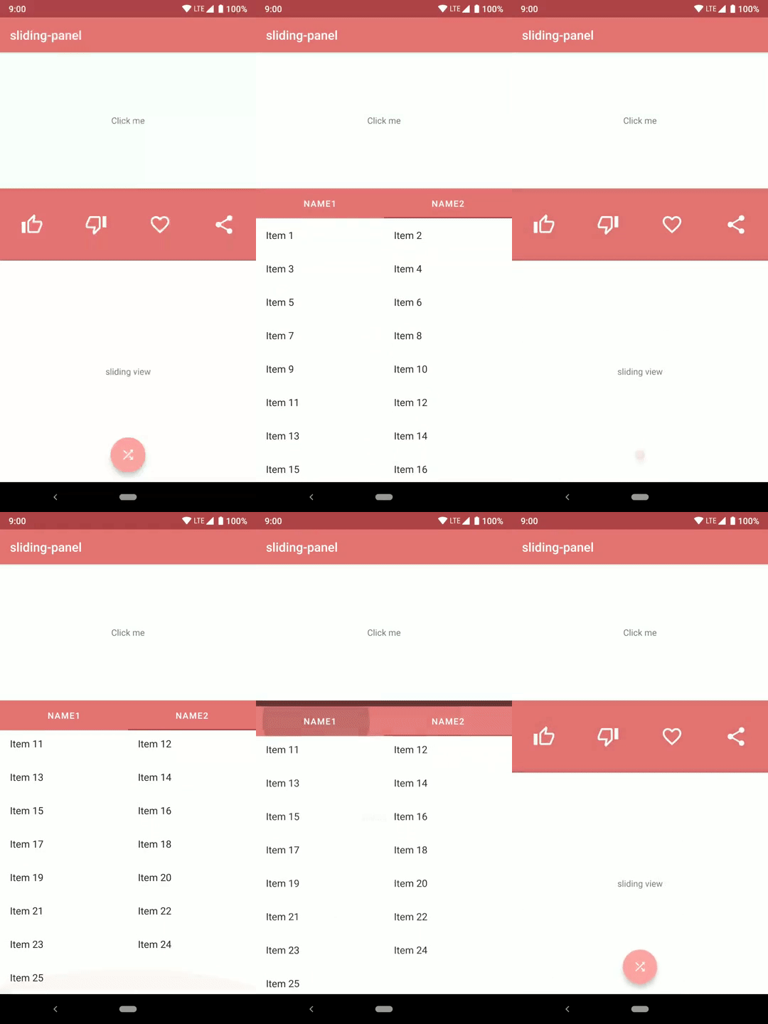
Difference from other libraries
All other implementations of the bottom sheet pattern and sliding panel pattern implement a panel that sits above all the other Views of the app. When the panel is collapsed (but visible) the only way to set its position is by using a peek factor (its distance from the bottom of the screen).
With this library the sliding panel is placed exactly where it is supposed to be in the view hierarchy, just like it would be in a vertical (or horizontal) LinearLayout. It doesn't sit above other Views.
Overview
SlidingPanel is a ViewGroup exending FrameLayout.
It has exacly two children: a non sliding view and a sliding view.
- The non sliding view is just a view that doesn't move, positioned as if
SlidingPanelwas aLinearLayout. - The sliding view is a View that can be dragged by the user. It slides over the non sliding view, both vertically and horizontally.
The sliding view can be collapsed or expanded.
- When collapsed, the sliding view is exactly where it would be if
SlidingPanelwas a LinearLayout. - When expanded, the sliding view is positioned to exactly cover the non sliding view. (Therefore the maximum amount of movement allowed to the sliding view is equal to the height (or width) of the non sliding view)
Sample app

Having the sample apps installed is a good way to be notified of new releases. Although watching this repository will allow GitHub to email you whenever a new release is published.
Download
The Gradle dependency is available via jCenter. jCenter is the default Maven repository used by Android Studio.
The minimum API level supported by this library is API 15.
dependencies {
  implementation 'com.psoffritti.slidingpanel:core:1.0.0'
}
Quick start
In order to start using the library you need to add a SlidingPanel to your layout.
non_sliding_view and sliding_view can be whatever View or ViewGroup you need.
If you want to listen to slide events, you can add a OnSlideListener to the SlidingPanel.
API documentation
SlidingPanel attributes
SlidingPanel has a set of attributes that you can set to customize its behviour. Some of this attributes are mandatory.
slidingView
Mandatory: yes -- Value: view reference -- Default: null
This mandatory attribute is used to tell SlidingPanel which of its two children is the sliding view. If this attribute is not set SlidingPanel will throw an Excpetion.
nonSlidingView
Mandatory: yes -- Value: view reference -- Default: null
This mandatory attribute is used to tell SlidingPanel which of its two children is the non sliding view. If this attribute is not set SlidingPanel will throw an Excpetion.
dragView
Mandatory: no -- Value: view reference -- Default: slidingView
This attribute is used to tell SlidingPanel which View should be used to drag the sliding view. If not set this value defaults to the sliding view. Therefore the whole panel will be sensible to dragging.
Note that if the whole panel is draggable it won't be possible to use scrollable views inside the sliding view.
fitToScreenView
Mandatory: no -- Value: view reference -- Default: null
When collapsed, the sliding view is shifted down (or right) by an amount equal to the height (or width) of the non sliding view. Therefore, when collapsed, the bottom (or right) part of the sliding view will be out of the screen.
This attribute is used to tell SlidingPanel that we want a view to be shifted up (or left) so that it is always visible.
See the screenshots below to better understand. In the first one fitToScreenView is set, in the second one it isn't.
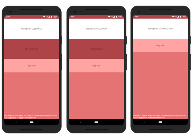
Notice the white text at the bottom of the screen. It is not visible in the second screen, it is visible only when the panel is expanded.
The sample app has an example specific for this attribute.
orientation
Mandatory: no -- Value: vertical | horizontal -- Default: vertical
This attribute is used to set the orientation of SlidingPanel in the same way that it is used for a LinearLayout. By default it is set to vertical.
elevation
Mandatory: no -- Value: dimension -- Default: 4dp
This attribute is used to set the length of the shadow drawn to the top (or left) side of the sliding view.
API
You can interact with SlidingPanel programmatically through its API.
Panel state
SlidingPanel has a state that can be one of: EXPANDED, COLLAPSED and SLIDING.
You can get the state but are not allowed to set it directly.
To programmatically change the state of the panel you should use the slideTo method.
slideTo
This method takes as argument one of the possible states of the panel: EXPANDED, COLLAPSED. If you try to pass SLIDING the panel will throw an IllegalArgumentException.
When this method is called the panel will automatically animate to to match the state passed as argument.
slideDuration
You can set the duration of the slide animation using the slideDuration property.
This property affects:
- the duration of the slide triggered by
slideTo. - the speed at which the panel autocompletes the slides when the user stops dragging it before reaching the
EXPANDEDorCOLLAPSEDstate.
You can use the constants defined in SlidingPanel (SlidingPanel.SLIDE_DURATION_SHORT, SlidingPanel.SLIDE_DURATION_LONG) or set it to an arbitrary duration in millisecond.
Programmatically set drag view
Sometimes it is usefull to change the dragView at runtime.
An example is give in the sample app, in the "advanced example" In this case a list is shown when the panel is expanded, therefore the drag view has to be changed. Otherwise the list wouldn't be scrollable.
Use the setDragView(view: View) method to programmatically set the drag view.
Listen to events
You can listen to slide events, by adding an OnSlideListener to the SlidingPanel.
or
- The first argument is a referece to the
SlidingPanelemitting the event. - The second argument is the current state of the panel.
- The third argument is a value between 0 and 1. The value is 0 when the state is
COLLAPSEDand 1 whenEXPANDED.

