GroovinCollapsingToolBar
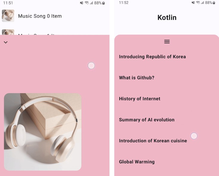
This library offers a Box Composable that can be expanded/reduced through up/down swipe gestures.
| MusicPlayer Sample | Article Page Sample |
|---|---|
 |
 |
Including in your project
Gradle
Add below codes to settings.gradle.
dependencyResolutionManagement {
    repositoriesMode.set(RepositoriesMode.FAIL_ON_PROJECT_REPOS)
    repositories {
        maven { url "https://jitpack.io" }
    }
}
for old gradle version, Add below codes to your project‘s build.gradle.
allprojects {
    repositories {
        maven { url "https://jitpack.io" }
    }
}
And add a dependency code to your module‘s build.gradle file.
dependencies {
    implementation 'com.github.gaiuszzang:GroovinExpandableBox:x.x.x'
}
Usage
ExpandableBox
ExpandableBox is Expandable Layout based on Box through up/down swipe gestures.
ExpandableBox(
    modifier = modifier,
    swipeableState = rememberSwipeableState(initialValue = ExpandableBoxState.FOLD),
    isDownDirection = true,
    isHideable = false,
    foldHeight = 200.dp
) {
    Content(...)   //Contents Composable
}
There are 4 arguments to be aware of use.
swipeableState: ExpandableBox needs SwipeableState for store and use its status. See the section below for details.isDownDirection: In true case, It expands with a swipe up gesture and fold with a swipe down gesture.default = trueisHideable: In true case, User try to fold one more time in the folded state, it will be hidden.default = falsefoldHeight: Define the Fold Status Height.Mandatory
SwipeableState
ExpandableBox needs SwipeableState<ExpandableBoxState> instance for store and use its status.
val swipeableState = rememberSwipeableState(initialValue = ExpandableBoxState.FOLD)
One of the values below must be set as the initial value.
ExpandableBoxState.HIDE: Begin with no visible.ExpandableBoxState.FOLD: Begin with Folding Status.ExpandableBoxState.EXPAND: Begin with Expanding Status.
ExpandableBoxScope
A ExpandableBoxScope provides a scope with attributes for the content of ExpandableBox.
progress: Float: Progress value(0 ~ 1f) betweenHIDEtoFOLD, orFOLDtoEXPAND.progressState: ExpandableBoxState: It means the current state and provide one of the following States :HIDE, HIDING, FOLD, FOLDING, EXPANDcompletedState: ExpandableBoxState: It means the state that swipable action is completed, and provide one of the following States :HIDE, FOLD, EXPAND
also, ExpandableBoxScope inheriting BoxScope, it can be used the same as BoxScope.
License
Copyright 2023 gaiuszzang (Mincheol Shin)

Licensed under the Apache License, Version 2.0 (the "License");
you may not use this file except in compliance with the License.
You may obtain a copy of the License at

   http://www.apache.org/licenses/LICENSE-2.0

Unless required by applicable law or agreed to in writing, software
distributed under the License is distributed on an "AS IS" BASIS,
WITHOUT WARRANTIES OR CONDITIONS OF ANY KIND, either express or implied.
See the License for the specific language governing permissions and
limitations under the License.


