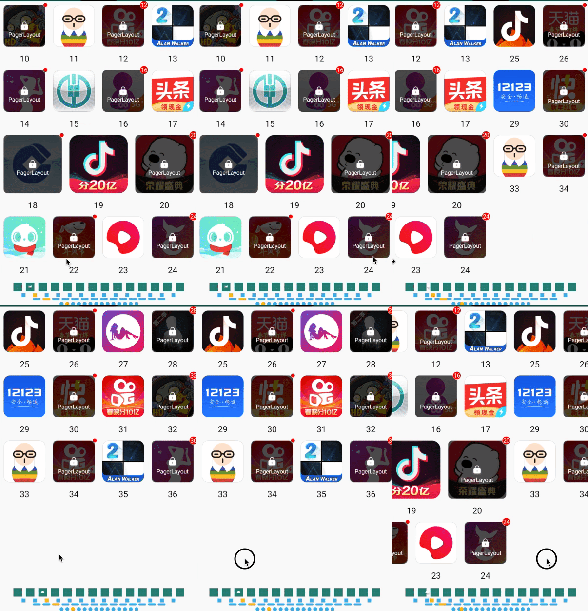
PagerLayout
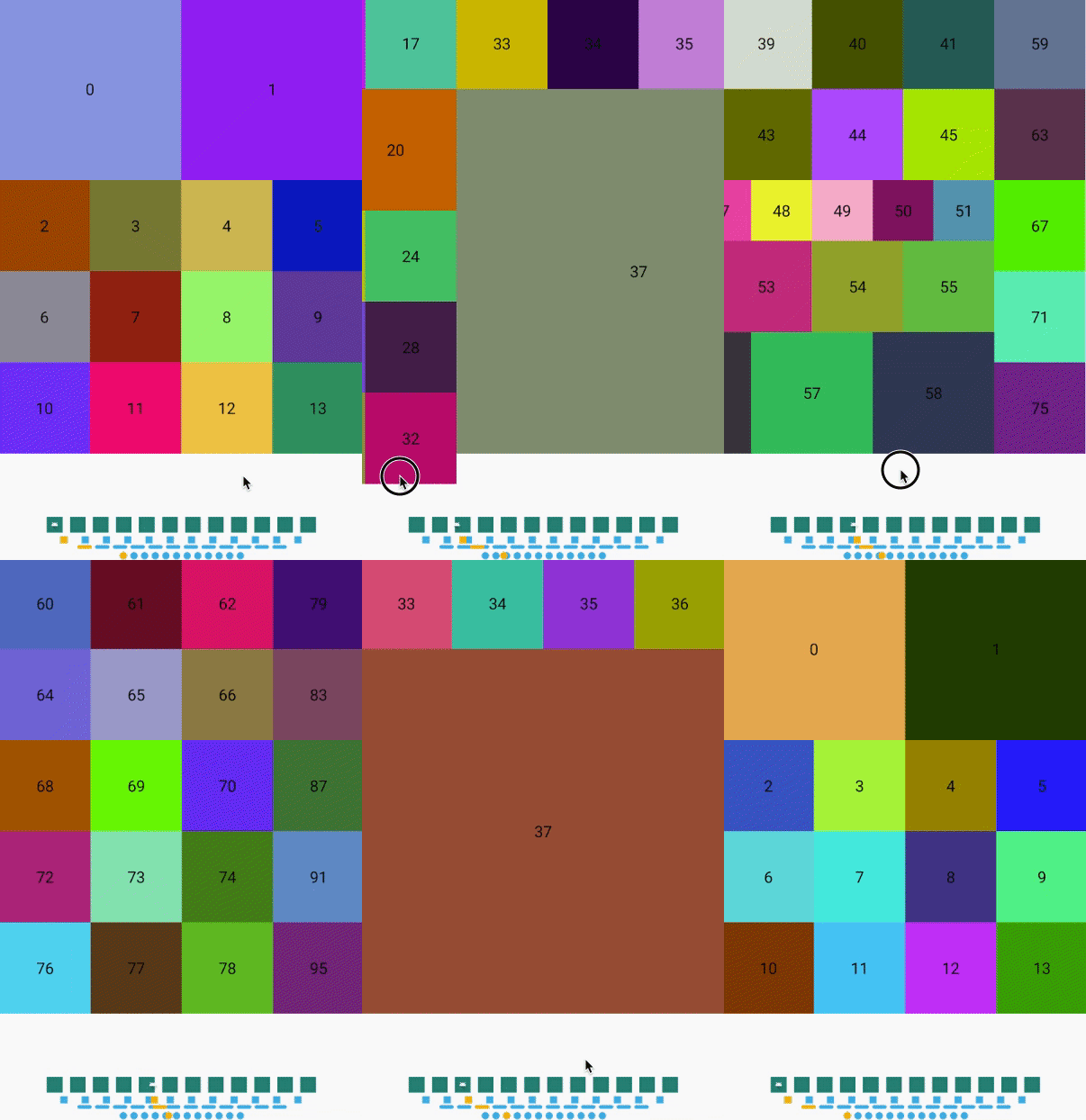
A PagerGridLayoutManager combine PageView and GridLayoutManager.
- replace "viewPager>recyclerView" with just only a "RecyclerView"
- reduce memory using by cache all items
- grid layout support
- custom indicator drawable support
- add lock, dot and corner for each item
Quick View
Install
Please using latest version:
- pagerlayout:
- lockitem:
// 翻页网格布局,本地或者网络库
implementation 'com.github.qicodes:pagerlayout:1.0.0'
// 加锁红点item(如果需要加锁或者红点可以添加)
implementation 'com.github.qicodes:lockitem:1.0.0'
How To Use
- add
PagerLayoutManager
asrecyclerView
'slayoutManager
recyclerView.layoutManager = PagerLayoutManager()
- set a
adapter
torecyclerView
as usual
recyclerView.adapter = SlideAdapter(baseContext)
- set
PagerSnapHelper
to scroll like aPageView
PagerSnapHelper().attachToRecyclerView(recyclerView)
That's all!
We will layout all children automatically using pager grid.
- if you want a indicator , we supply 4 kind indicators as implements of
PageIndicator
. Dot, Line, Square, Drawable.
just need aattachToRecyclerView
.
dotIndicator.attachToRecyclerView(recyclerView)
lineIndicator.attachToRecyclerView(recyclerView)
lineIndicator2.attachToRecyclerView(recyclerView)
drawIndicator.attachToRecyclerView(recyclerView)
- if you need your item in
RecyclerView
with lock or dot, you can implementationlockitem
,and control the value with xml define in Demo or java/kotlin code Demo
What's More
PagerLayout
Custom Grid
just like
GridLayoutManager
you can set the grid weights of each item
The default spanCount
is 12
, you can using this to layout children by all (1,2,3,4,6,12). Also you can custom this spanCount
.
Here is a simple example with kotlin code:
recyclerView.layoutManager = PagerLayoutManager(12) {
when (it) {
37 -> SlideAdapter.TYPE_1
in 0..1 -> SlideAdapter.TYPE_2
in 18..20 -> SlideAdapter.TYPE_3
in 46..51 -> SlideAdapter.TYPE_6
in 56..58 -> SlideAdapter.TYPE_3
else -> SlideAdapter.TYPE_4
}
}
Cache Item By Type
Control to cache item just like RecyclerView
for each type of item.
recyclerView.recycledViewPool.setMaxRecycledViews(SlideAdapter.TYPE_6, 20)
recyclerView.recycledViewPool.setMaxRecycledViews(SlideAdapter.TYPE_4, 20)
recyclerView.recycledViewPool.setMaxRecycledViews(SlideAdapter.TYPE_3, 4)
recyclerView.recycledViewPool.setMaxRecycledViews(SlideAdapter.TYPE_2, 4)
recyclerView.recycledViewPool.setMaxRecycledViews(SlideAdapter.TYPE_1, 4)
Indicator
You can set width
, height
, normalColor
, selectColor
, padding
, round
to indicator
.
Also you can set a Bitmap
as indicator
android:padding="8dp"
app:indicatorHeight="26dp"
app:indicatorWidth="26dp"
app:normalColor="@android:color/holo_blue_light"
app:selectColor="@android:color/holo_orange_light"
app:round="true"
For detail config, here is a Demo for you.
Lock && Dot
Each item can be covered with lock and dot, and the number in dot, here is a Demo
lockItem.showNumber = false
lockItem.dotNumber = -1
lockItem.showLock = false
Also, you can control this with xml:
<com.abelhu.lockitem.LockItem
android:id="@+id/iconView"
android:layout_width="0dp"
android:layout_height="0dp"
android:padding="8dp"
android:src="@color/colorAccent"
app:cornerSize="8dp"
app:dotBackgroundColor="@android:color/white"
app:dotBackgroundRadio="0.5dp"
app:dotBigRadio="8dp"
app:dotNormalRadio="4dp"
app:dotNumber="88"
app:dotTextSize="12sp"
app:layout_constraintDimensionRatio="w, 1:1"
app:layout_constraintEnd_toEndOf="parent"
app:layout_constraintStart_toStartOf="parent"
app:layout_constraintTop_toTopOf="parent"
app:lock="@mipmap/icon_lock"
app:lockBackgroundColor="#aa000000"
app:lockHeight="23.5dp"
app:lockText="@string/app_name"
app:lockTextColor="@android:color/white"
app:lockTextMargin="8dp"
app:lockTextSize="12sp"
app:lockWidth="21dp"
app:showLock="true"
app:showNumber="true"
app:srcCompat="@drawable/ic_launcher_foreground"
tools:ignore="ContentDescription" />